BBC iPlayer - Clustering Analysis


Introduction and BBC iPlayer streaming data
Learning Objectives
Cleaned Data
The original view data is already processed and cleaned. In this step, we first generate a user-based database which we will use to train clustering algorithms to identify meaningful clusters in the data.
Let’s load the cleaned data and investigate what’s in the data. See below for column descriptions.
cleaned_BBC_Data <- vroom(here::here("data", "Results_Step1.csv"))## Rows: 313,256
## Columns: 17
## Delimiter: ","
## chr [7]: user_id, program_id, series_id, genre, streaming_id, weekend, time_of_day
## dbl [9]: prog_duration_min, time_viewed_min, duration_more_30s, time_viewed_more_5s, pe...
## dttm [1]: start_date_time
##
## Use `spec()` to retrieve the guessed column specification
## Pass a specification to the `col_types` argument to quiet this messageglimpse(cleaned_BBC_Data) ## Rows: 313,256
## Columns: 17
## $ user_id <chr> "cd2006", "cd2006", "cd2006", "cd2006", "cd…
## $ program_id <chr> "b8fbf2", "e2f113", "0e0916", "ca03b9", "cf…
## $ series_id <chr> "e0480e", "933a1b", "b68e79", "5d0813", "eb…
## $ genre <chr> "Comedy", "Factual", "Entertainment", "Spor…
## $ start_date_time <dttm> 2017-01-19 22:17:04, 2017-02-14 19:12:36, …
## $ streaming_id <chr> "1484864257965_1", "1487099603980_1", "1484…
## $ prog_duration_min <dbl> 1.850000, 0.500000, 1.366667, 1.616667, 8.5…
## $ time_viewed_min <dbl> 1.85000000, 0.49908333, 1.36666667, 1.61666…
## $ duration_more_30s <dbl> 1, 1, 1, 1, 1, 1, 1, 1, 1, 1, 1, 1, 1, 1, 1…
## $ time_viewed_more_5s <dbl> 1, 1, 1, 1, 1, 1, 1, 1, 1, 1, 1, 1, 1, 1, 1…
## $ percentage_program_viewed <dbl> 1.000000000, 0.998166667, 1.000000000, 1.00…
## $ watched_more_60_percent <dbl> 1, 1, 1, 1, 1, 0, 0, 1, 1, 0, 0, 1, 1, 0, 0…
## $ month <dbl> 1, 2, 1, 2, 3, 2, 4, 3, 4, 3, 3, 4, 3, 3, 2…
## $ day <dbl> 5, 3, 4, 1, 1, 3, 1, 6, 7, 7, 1, 5, 7, 3, 2…
## $ hour <dbl> 22, 19, 21, 14, 20, 19, 20, 21, 21, 20, 18,…
## $ weekend <chr> "weekday", "weekday", "weekday", "weekend",…
## $ time_of_day <chr> "Evening", "Evening", "Evening", "Day", "Ev…Before we proceed let’s consider the usage in January only.
cleaned_BBC_Data<-filter(cleaned_BBC_Data,month==1)User based data
We will try to create meaningful customer segments that describe users of the BBC iPlayer service. First we need to change the data to user based and generate a summary of their usage.
Data format
The data is presented to us in an event-based format (every row captures a viewing event). However we need to detect the differences between the general watching habits of users.
How can we convert the current date set to a customer-based dataset (i.e., summarizes the general watching habits of each user)? In what dimensions could BBC iPlayer users be differentiated? Can we come up with variables that capture these?
Feature Engineering
Let’s generate the following variables for each user:
- Total number of shows watched and ii. Total time spent watching shows on iPlayer by each user in the data
userData<-cleaned_BBC_Data %>% group_by(user_id) %>% summarise(noShows=n(), total_Time=sum(time_viewed_min)) ## `summarise()` ungrouping output (override with `.groups` argument)- Proportion of shows watched during the weekend for each user.
#Let's find the number of shows on weekend and weekdays
userData2<-cleaned_BBC_Data %>% group_by(user_id,weekend) %>% summarise(noShows=n())
## `summarise()` regrouping output by 'user_id' (override with `.groups` argument)#Let's find percentage in weekend and weekday
userData3 = userData2%>% group_by(user_id) %>% mutate(weight_pct = noShows / sum(noShows))
#Let's create a data frame with each user in a row.
userData3<-select (userData3,-noShows)
userData3<-userData3%>% spread(weekend,weight_pct,fill=0) %>% as.data.frame()
#Let's merge the final result with the data frame from the previous step.
userdatall<-left_join(userData,userData3,by="user_id")- Proportion of shows watched during different times of day for each user.
#Code in this block follows the same steps above.
userData2<-cleaned_BBC_Data %>% group_by(user_id,time_of_day) %>% summarise(noShows=n()) %>% mutate(weight_pct = noShows / sum(noShows))
## `summarise()` regrouping output by 'user_id' (override with `.groups` argument)userData4<-select (userData2,-c(noShows))
userData4<-spread(userData4,time_of_day,weight_pct,fill=0)
userdatall<-left_join(userdatall,userData4,by="user_id")Question 1. Find the proportion of shows watched in each genre by each user.
# creating weight_pct_genre following steps above
userData5 <- cleaned_BBC_Data %>%
  group_by(user_id, genre) %>%
  summarise(noShows=n()) %>%
  mutate(weight_pct_genre = noShows / sum(noShows))
## `summarise()` regrouping output by 'user_id' (override with `.groups` argument)# select relevant columns and pivot wider
userData6 <- select(userData5,
-c(noShows))
userData6 <- spread(userData6,
genre,
weight_pct_genre,
fill=0)
#add results to userdatall
userdatall <- left_join(userdatall,
userData6,
by="user_id")Question 2. Adding one more variable. Describe why this might be useful for differentating viewers in 1 or 2 lines.
# create weight_pct_60 variable and add it to userdatall
userData2_60 <- cleaned_BBC_Data %>%
  group_by(user_id) %>%
  summarise(noShows = n(),
            no_60 = sum(watched_more_60_percent)) %>%
  mutate(weight_pct_60 = no_60 / noShows)
## `summarise()` ungrouping output (override with `.groups` argument)userData6 <- select (userData2_60, -c(noShows, no_60))
userdatall <-left_join(userdatall, userData6, by = "user_id")
# create weight_pct_90 variable and add it to userdatall
userData2_90 <- cleaned_BBC_Data %>%
group_by(user_id) %>%
# add binary variable per viewing first: 1 if watched more than 90%, 0 if not
mutate(watched_more_90_percent = ifelse(percentage_program_viewed > 0.9, 1, 0)) %>%
summarise(noShows=n(), no_90 = sum(watched_more_90_percent)) %>%
# add weighted pct variable
mutate(weight_pct_90 = no_90 / noShows)## `summarise()` ungrouping output (override with `.groups` argument)userData7 <- select(userData2_90, -c(noShows,no_90))
userdatall <- left_join(userdatall, userData7, by="user_id")Answer:
We’re adding the variable weight_pct_60 and weight_pct 90 which describe the proportion of times a user has watched more than 60% or 90% of any program respectively. The resulting columns will show us how likely users are to watch more than 60% or 90% of a show. At the same time, we can understand how likely people are to follow through with watching a complete program (e.g. if they watch more than 60%, do they also watch more than 90%? Or do they often stop inbetween?). Lastly the weight_pct_90 variable will help us understand how likely people are to finish a program (assuming 90% is usually finishing a program but perhaps skipping the credits) .
Visualizing user-based data
Next, we visualize the information captured in the user based data. Let’s start with the correlations.
library("GGally")
userdatall %>%
  select(-user_id) %>% #keep Y variable last
  ggcorr(method = c("pairwise", "pearson"), layout.exp = 3,label_round=2, label = TRUE, label_size = 2,hjust = 1) +
  labs(title = "Correlation matrix",
       subtitle = "Correlations between each variable pair of the userdatall data set")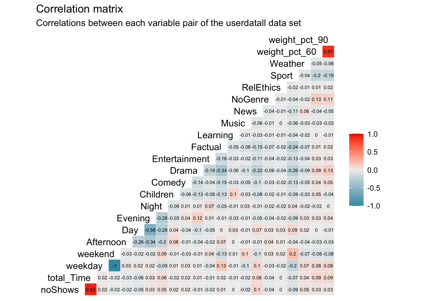
Question 3. Which variables are most correlated? What’s the implication of this for clustering?
Answer:
The highest correlation is a perfect negative correlation (-1) between weekend and weekday. This is obvious as they effectively represent the same concept as every viewing can only be either weekend or weekday. Per viewing, these variables are dependent as an overlap is not possible. Therefore, the share of these two variables per user will always be 100%. As this represents a multi-collinearity issue, we eliminate weekday to not double count the influence of weekday and weekend in our cluster analysis.
Further, we find an extremely high, positive correlation of 0.92 between total_Time and noShows. This, again, makes sense as the more shows a user watches, the higher his/her total time watched will be and vice versa. The correlation is not perfect though as different shows have different time lenghts.
Finding another high correlation of 0.87 between weight_pct_60 and weight_pct_90 indicates an answer to our previous question. This high and positive correlations tells us that most of the time, if people watch more than 60% of a show, they are more likely to also watch 90% of that show, following through with the program and not stopping halfway through.
We can also see relatively high, negative correleation between Evening and Day (-0.58) as well as Evening and Afternoon (0.34). This tells us that people that watch in the evening, are less likely to watch during the day or the afternoon. Nevertheless, this negative correlation is not high enough to present a significant multi-collinearity issue. As the day is split into four time variables, we gain new information from all of them so that we decide to keep them in our cluster analysis. The correlations between genres may also be interesting to interpret and with a relatively high correlation of -0.34 between Drama and Factual, we see a trend of people favoring one or the other but not necessarily both.
Question 4. We ivestigate the distribution of noShows and total_Time using box-whisker plots and histograms. Are we worried about outliers?
# Start investigation by looking at favstats of noShows and total_time
favstats(userdatall$noShows)
## min Q1 median Q3 max mean sd n missing
## 1 1 3 9 782 10.08106 24.29072 9351 0favstats(userdatall$total_Time)## min Q1 median Q3 max mean sd n missing
## 0.0834 4.142034 39.53109 158.9661 25822.2 190.6265 570.607 9351 0# investigating noShows - Boxplot
noShows_bp1 <- ggplot(userdatall, aes(y = noShows))+
geom_boxplot()+
theme_minimal()+
theme(aspect.ratio = 2/3)+
labs(title = "Where is the boxplot???",
subtitle = "# of shows per user distribution",
y = "Number of shows per user")+
NULL
noShows_bp2 <- ggplot(userdatall, aes(y = noShows))+
geom_boxplot()+
scale_y_continuous(limits = c(0, 20))+
theme_minimal()+
theme(aspect.ratio = 2/3)+
labs(title = "There it is!",
subtitle = "# of shows per user distribution\nAll users with >20 shows cut off",
y = "Number of shows per user")+
NULL
noShows_bp1 + noShows_bp2 ## Warning: Removed 1136 rows containing non-finite values (stat_boxplot).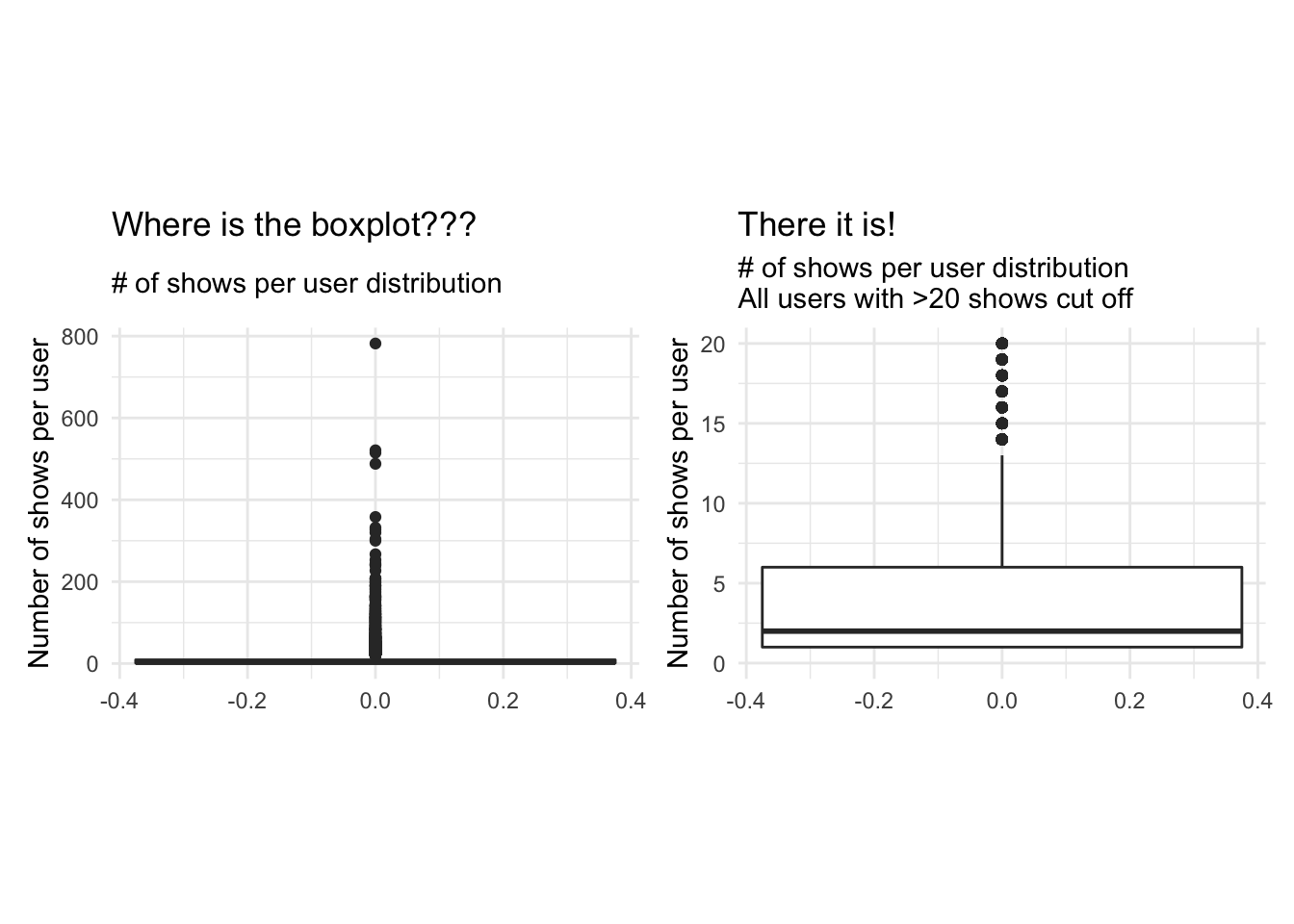
# investigating noShows - Histogram
noShows_hg1 <- ggplot(userdatall, aes(x = noShows))+
                  geom_histogram()+
                  theme_minimal()+
                  theme(aspect.ratio = 2/3)+
                  labs(title = "Mostly 0 shows per user?",
                       subtitle = "# of shows per user distribution",
                       x = "Number of shows per user",
                       y = "Count")+
                  NULL

noShows_hg2 <- ggplot(userdatall, aes(x = noShows))+
                  geom_histogram(bins = 20)+
                  scale_x_continuous(limits = c(0, 20))+
                  theme_minimal()+
                  theme(aspect.ratio = 2/3)+
                  labs(title = "That's better!",
                       subtitle = "# of shows per user distribution\nAll users with >20 shows cut off",
                       x = "Number of shows per user",
                       y = "Count")+
                  NULL

noShows_hg1 + noShows_hg2
## `stat_bin()` using `bins = 30`. Pick better value with `binwidth`.## Warning: Removed 1136 rows containing non-finite values (stat_bin).## Warning: Removed 2 rows containing missing values (geom_bar).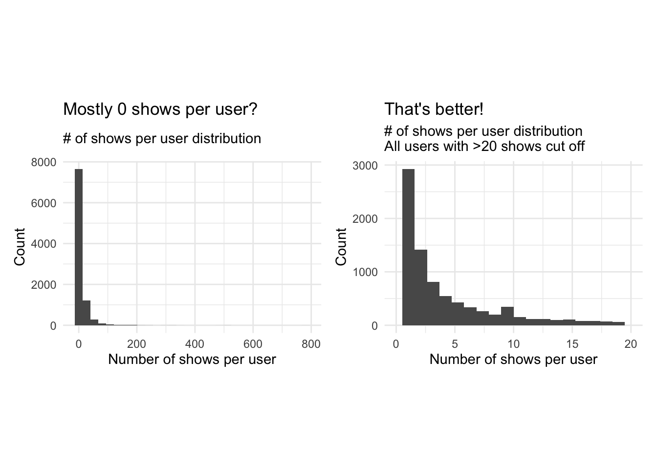
# investigating total_Time - Boxplot
total_Time_bp1 <- ggplot(userdatall, aes(y = total_Time))+
                  geom_boxplot()+
                  theme_minimal()+
                  theme(aspect.ratio = 2/3)+
                  labs(title = "Where is the boxplot???",
                       subtitle = "Total time watched per user distribution",
                       y = "Total time watched (mins)")+
                  NULL

total_Time_bp2 <- ggplot(userdatall, aes(y = total_Time))+
                  geom_boxplot()+
                  scale_y_continuous(limits = c(0, 200))+
                  theme_minimal()+
                  theme(aspect.ratio = 2/3)+
                  labs(title = "There it is!",
                       subtitle = "Total time watched per user distribution\nAll users with >200 minutes cut off",
                       y = "Total time watched (mins)")+
                  NULL

total_Time_bp1 + total_Time_bp2
## Warning: Removed 2038 rows containing non-finite values (stat_boxplot).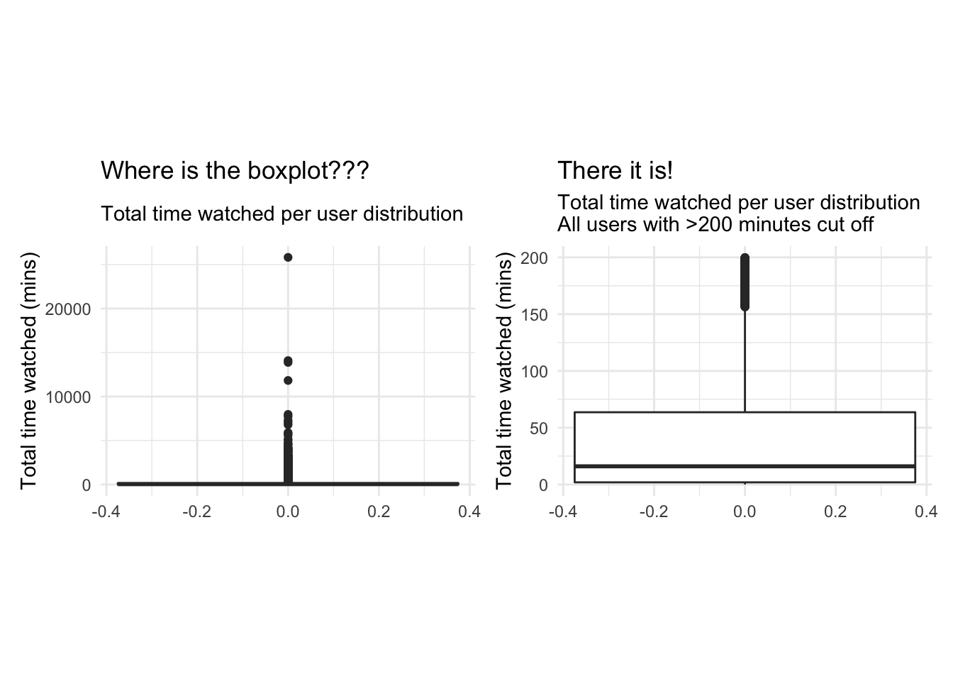
# investigating total_Time - Histogram
total_Time_hg1 <- ggplot(userdatall, aes(x = total_Time))+
                  geom_histogram()+
                  theme_minimal()+
                  theme(aspect.ratio = 2/3)+
                  labs(title = "Mostly 0 minutes watched?",
                       subtitle = "Total time watched per user distribution",
                       x = "Total time watched (mins)",
                       y = "Count of users")+
                  NULL

total_Time_hg2 <- ggplot(userdatall, aes(x = total_Time))+
                  geom_histogram(bins = 20)+
                  scale_x_continuous(limits = c(0, 200))+
                  theme_minimal()+
                  theme(aspect.ratio = 2/3)+
                  labs(title = "That's better!",
                       subtitle = "Total time watched per user distribution\nAll users with >200 minutes cut off",
                       x = "Total time watched (mins)",
                       y = "Count of users")+
                  NULL

total_Time_hg1 + total_Time_hg2
## `stat_bin()` using `bins = 30`. Pick better value with `binwidth`.## Warning: Removed 2038 rows containing non-finite values (stat_bin).
## Warning: Removed 2 rows containing missing values (geom_bar).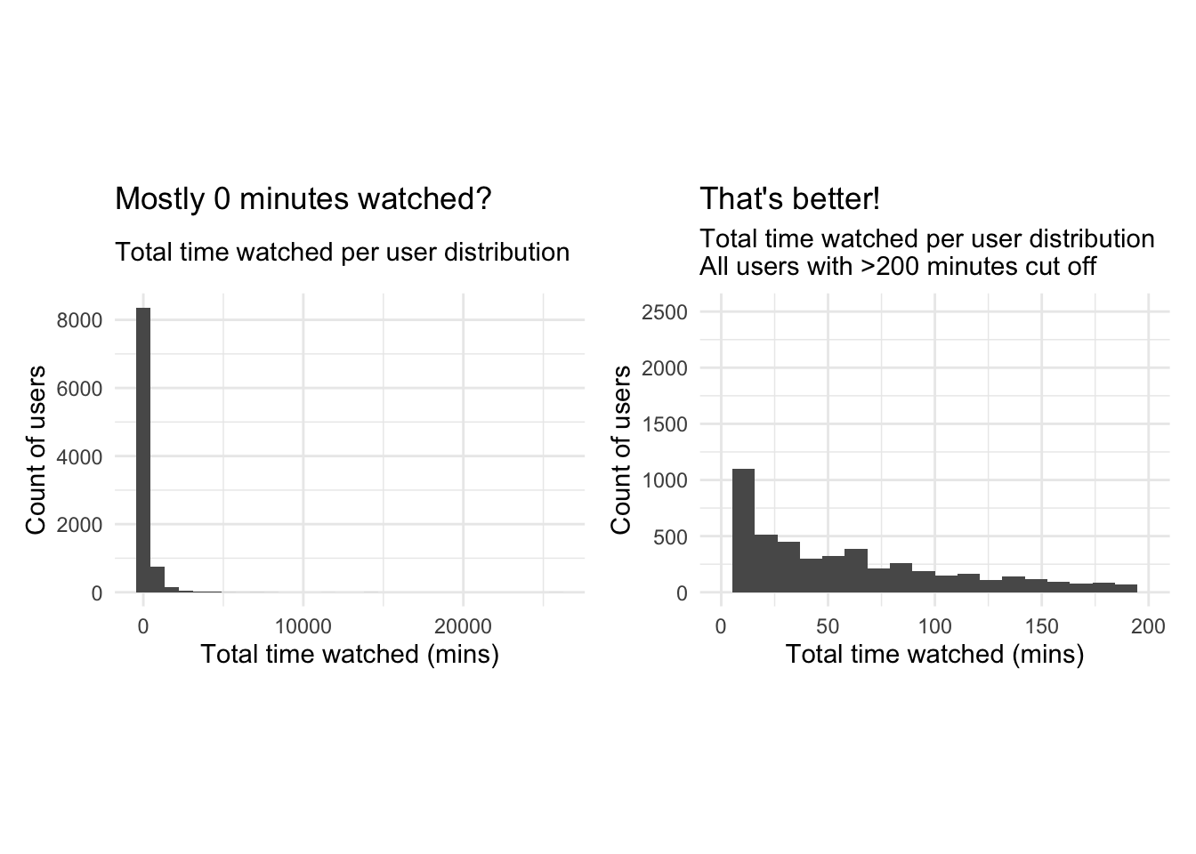
Answer:
Plotting a boxplot and a histogram for both noShows and total_Time with all the available data doesn’t reveal much information due to the existence of outliers. We notice a maximum number of shows of 782 which is heavily distanced from the 3rd quartile of 9. The mean number of shows is 10 however this may be a distorted mean due to the presence of outliers.We do how ever notice that the median is around 3 shows. the min is 1 so we know every user has watched at least one show. Similarly for total time the mean is heavily distorted by the outliers, so we focus on the median which is around 40 minutes. We thus limit our scales to focus on the distributions of the data without the influence of outliers. We notice a heavily right skewed distribution in both cases, which majority of users having watched a limited number of shows (NoShows Q3=9), for less than 160 minutes( total_time Q3). Looking at Q2 of total timewe notice 25% of users watch less than 5 minutes of the program and 50 % watch less than 3 shows. To reduce the heavy skewness we should limit out range to exclude those who watch fewer than a certain threshold number of shows and for a certain number of time, as they do not contribute to drawing meaningful conclutions if the shows weren’t actually watched or the user has nothing to compare them to. We also note that the the squared error approach with k-means clustering is highly sensitive to outliers and, thus, we should either remove the outliers and/or apply appropriate transformations to draw meaningful conclusions.
Delete infrequent users
Next, we delete the records for users whose total view time is less than 5 minutes and who views 5 or fewer programs. These users are not very likely to be informative for clustering purposes. Or we can view these users as a ``low-engagement’’ cluster.
userdata_red<-userdatall%>%filter(total_Time>=5)%>%filter(noShows>=5)
ggplot(userdata_red, aes(x=total_Time)) +geom_histogram(binwidth=25)+
  labs(x="Total Time Watched (mins)",
       y= "Count",
       title = "Total Time Watched distribution",
       subtitle = "Distribution after deleting infrequent users")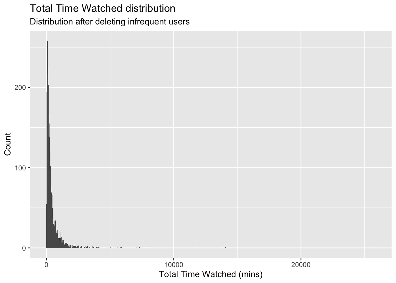
glimpse(userdata_red)## Rows: 3,625
## Columns: 23
## $ user_id <chr> "002b2e", "0059d9", "00aad3", "00c6e6", "00caa7", "00e3…
## $ noShows <int> 31, 20, 8, 16, 16, 5, 6, 7, 5, 7, 36, 5, 8, 5, 11, 6, 8…
## $ total_Time <dbl> 534.355573, 446.054906, 38.004417, 148.464367, 167.2381…
## $ weekday <dbl> 0.8709677, 0.7500000, 1.0000000, 0.8125000, 0.2500000, …
## $ weekend <dbl> 0.12903226, 0.25000000, 0.00000000, 0.18750000, 0.75000…
## $ Afternoon <dbl> 0.00000000, 0.15000000, 0.00000000, 0.00000000, 0.37500…
## $ Day <dbl> 0.09677419, 0.45000000, 0.00000000, 0.00000000, 0.12500…
## $ Evening <dbl> 0.8064516, 0.4000000, 0.7500000, 1.0000000, 0.5000000, …
## $ Night <dbl> 0.09677419, 0.00000000, 0.25000000, 0.00000000, 0.00000…
## $ Children <dbl> 0.0000000, 0.0000000, 0.0000000, 0.0000000, 0.0000000, …
## $ Comedy <dbl> 0.06451613, 0.00000000, 0.25000000, 0.00000000, 0.00000…
## $ Drama <dbl> 0.3225806, 0.0000000, 0.0000000, 0.0625000, 0.8125000, …
## $ Entertainment <dbl> 0.06451613, 0.10000000, 0.00000000, 0.37500000, 0.00000…
## $ Factual <dbl> 0.41935484, 0.30000000, 0.25000000, 0.50000000, 0.18750…
## $ Learning <dbl> 0.00000000, 0.00000000, 0.00000000, 0.00000000, 0.00000…
## $ Music <dbl> 0.06451613, 0.00000000, 0.00000000, 0.00000000, 0.00000…
## $ News <dbl> 0.03225806, 0.50000000, 0.37500000, 0.00000000, 0.00000…
## $ NoGenre <dbl> 0.0, 0.0, 0.0, 0.0, 0.0, 0.0, 0.0, 0.0, 0.0, 0.0, 0.0, …
## $ RelEthics <dbl> 0.00000000, 0.00000000, 0.00000000, 0.06250000, 0.00000…
## $ Sport <dbl> 0.03225806, 0.05000000, 0.12500000, 0.00000000, 0.00000…
## $ Weather <dbl> 0.00000000, 0.05000000, 0.00000000, 0.00000000, 0.00000…
## $ weight_pct_60 <dbl> 0.2580645, 0.4000000, 0.0000000, 0.0000000, 0.1250000, …
## $ weight_pct_90 <dbl> 0.2258065, 0.3000000, 0.0000000, 0.0000000, 0.1250000, …Clustering with K-Means
Now we are ready to find clusters in the BBC iPlayer viewers. We will start with the K-Means algorithm.
Training a K-Means Model
We train a K-Means model, starting with 2 clusters and de-selecting user_id variable. We scale the data and use 50 random starts. Should we use more starts?
We will also display the cluster sizes.
We use summary("kmeans Object") to examine the components of the results of the clustering algorithm. How many points are in each cluster?
k=2

# We get rid of variables that we don't need. We do not include no shows as well because it is highly correlated with total time
userdata_for_model <- userdata_red %>%
  select(-c(user_id,
            noShows,
            weight_pct_60,  # excluding weight_pct_60 because it is highly correlated with weight_pct_90
            weekday,        # excluding weekday because it is perfectly correlated with weekend
            NoGenre))       # excluding NoGenre because it gives us no information about preferences

#log transform total time to reduce the impact of outliers
userdata_for_model$total_Time <- log(userdata_for_model$total_Time)

#scale the data
userdata_for_model_scaled <- data.frame(scale(userdata_for_model))

# check if data is correctly scaled (mean = 0, sd = 1)
print(mean(userdata_for_model_scaled$Day))
## [1] 1.770386e-17print(sd(userdata_for_model_scaled$Day))## [1] 1#train kmeans clustering
model_kmeans_2cl <- eclust(userdata_for_model_scaled, "kmeans", k = k, nstart = 50, graph = FALSE)
# check the components of this object.
summary(model_kmeans_2cl)## Length Class Mode
## cluster 3625 -none- numeric
## centers 36 -none- numeric
## totss 1 -none- numeric
## withinss 2 -none- numeric
## tot.withinss 1 -none- numeric
## betweenss 1 -none- numeric
## size 2 -none- numeric
## iter 1 -none- numeric
## ifault 1 -none- numeric
## silinfo 3 -none- list
## nbclust 1 -none- numeric
## data 18 data.frame listmodel_kmeans_2cl$size ## [1] 2404 1221#cluster sizes are 2404 1221
model_kmeans_2cl$centers## total_Time weekend Afternoon Day Evening Night Children
## 1 0.1842014 0.04171845 -0.2813756 -0.4650902 0.4126399 0.2166724 -0.2110014
## 2 -0.3626701 -0.08213855 0.5539943 0.9157058 -0.8124376 -0.4266015 0.4154360
## Comedy Drama Entertainment Factual Learning Music
## 1 0.1004824 0.1907069 0.03777675 -0.02941440 -0.1122493 -0.01006413
## 2 -0.1978377 -0.3754787 -0.07437780 0.05791336 0.2210051 0.01981505
## News RelEthics Sport Weather weight_pct_90
## 1 -0.1039504 -0.05821288 -0.05834509 -0.02252362 0.1695596
## 2 0.2046657 0.11461406 0.11487435 0.04434627 -0.3338421# repeat all for nstart = 100
model_kmeans_2cl_100 <- eclust(userdata_for_model_scaled, "kmeans", k = k, nstart = 100, graph = FALSE)
summary(model_kmeans_2cl_100)## Length Class Mode
## cluster 3625 -none- numeric
## centers 36 -none- numeric
## totss 1 -none- numeric
## withinss 2 -none- numeric
## tot.withinss 1 -none- numeric
## betweenss 1 -none- numeric
## size 2 -none- numeric
## iter 1 -none- numeric
## ifault 1 -none- numeric
## silinfo 3 -none- list
## nbclust 1 -none- numeric
## data 18 data.frame listmodel_kmeans_2cl_100$size## [1] 2404 1221#cluster sizes are 2404 1221
model_kmeans_2cl_100$centers## total_Time weekend Afternoon Day Evening Night Children
## 1 0.1842014 0.04171845 -0.2813756 -0.4650902 0.4126399 0.2166724 -0.2110014
## 2 -0.3626701 -0.08213855 0.5539943 0.9157058 -0.8124376 -0.4266015 0.4154360
## Comedy Drama Entertainment Factual Learning Music
## 1 0.1004824 0.1907069 0.03777675 -0.02941440 -0.1122493 -0.01006413
## 2 -0.1978377 -0.3754787 -0.07437780 0.05791336 0.2210051 0.01981505
## News RelEthics Sport Weather weight_pct_90
## 1 -0.1039504 -0.05821288 -0.05834509 -0.02252362 0.1695596
## 2 0.2046657 0.11461406 0.11487435 0.04434627 -0.3338421#add clusters to the data frame
userdatall_with_cl <- mutate(userdata_for_model_scaled,
cluster = as.factor(model_kmeans_2cl$cluster))Answer:
Running a k-means clustering with k=2, we derive two clusters with a respective size of 2404 data points and 1221. We reach the same cluster sizes and centers for nstart = 50 and nstart = 100 and even nstart = 500. Therefore, we conclude to stick with nstart = 50.
Visualizing the results
Cluster centers
Next, we plot the normalized cluster centers and describe the clusters that the algorithm suggests.
#Plot centers for k=2
#First generate a new data frame with cluster centers and cluster numbers
cluster_centers <- data.frame(cluster = as.factor(c(1:2)), model_kmeans_2cl$centers)

#transpose this data frame
cluster_centers_t <- cluster_centers %>%
  gather(variable, value, -cluster, factor_key = TRUE)

#plot the centers
plot_kmeans_2cl <- ggplot(cluster_centers_t,
                          aes(x = variable, y = value)) +
                      geom_line(aes(color = cluster,
                                    group = cluster),
                                linetype = "dashed", size=1) +
                      geom_point(size = 1, shape = 4) +
                      geom_hline(yintercept = 0) +
                      theme(#aspect.ratio = 3/5,
                            text = element_text(size = 10),
                            axis.text.x = element_text(angle = 45, hjust = 1)
                            ,) +
                      labs(title = "K-means Centers k=2",
                           x = "",
                           y = "Value",
                           colour = "Cluster")+
                      scale_colour_manual(values = c("darkred", "darkgreen", "blue"))

plot_kmeans_2cl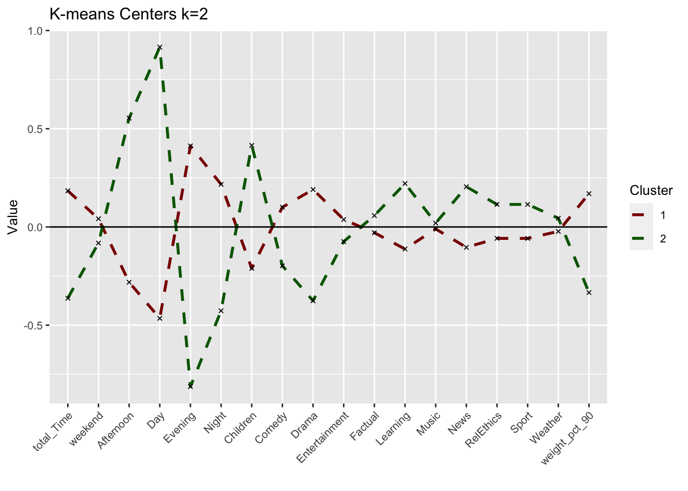
Can we interpret each cluster from this plot? Did we arrive at meaningful clusters?
Answer: We derive two noticeably different clusters with significant differences in the time of viewings rather than the genres. Cluster 1 seems to reflect evening viewers that are more interested in Drama programs rather than Children, Learning or News programs. Cluster 2 seems to reflect Day-time viewers that mainly focus on Children and Learning programs as well as the News.
While cluster 1 watchers seem to overall watch more (positive total_Time) than cluster 2 watchers, cluster 1 watchers also complete their program more frequently (positive weight_pct_90) than cluster 2 watchers. This would be expected as with the relevant genres in cluster 2 as well as day-time watching, is more likely to be interrupted than cluster 1 watchers that seem to watch and finish long programs in the evening.
We do also note some overlap or very minor difference between certain variables namely music,and weather genre suggesting these generes might not be influential for BBC iPlayer users.
These seem like meaningful clusters but as we have limited ourselves two clusters, we cannot be sure if these two clusters can be further broken down into more meaningful clusters with different viewing behaviors.
How can we use the cluster information to improve the viewer experience with BBC iPlayer? We will come back to these points below. However it is important to think about these issues at the beginning.
Answer:
Depending on the clusters we find throughout this analysis, the BBC iPlayer can use them as basis for their customer segments to better tailor targeted products and advertisements and, thereby, increase customer retention and satisfaction.
Clusters vs variables
We plot a scatter plot for the viewers with respect to total_Time and weekend variables with color set to the cluster number of the user. What do we observe? Which variable seems to play a more prominent role in determining the clusters of users?
plot_time_weekend <- ggplot(userdatall_with_cl,
                            aes(x = total_Time,
                                y = weekend,
                                colour = as.factor(cluster))) +
                        geom_jitter() +
                        labs(title = "Scatterplot depicting total time watched vs. weekend",
                               subtitle = "K-means k=2",
                           x = "Total time watched (mins)",
                           y = "Weekend",
                           colour = "Cluster")+
                      scale_colour_manual(values = c("darkred", "darkgreen", "blue"))

plot_time_weekend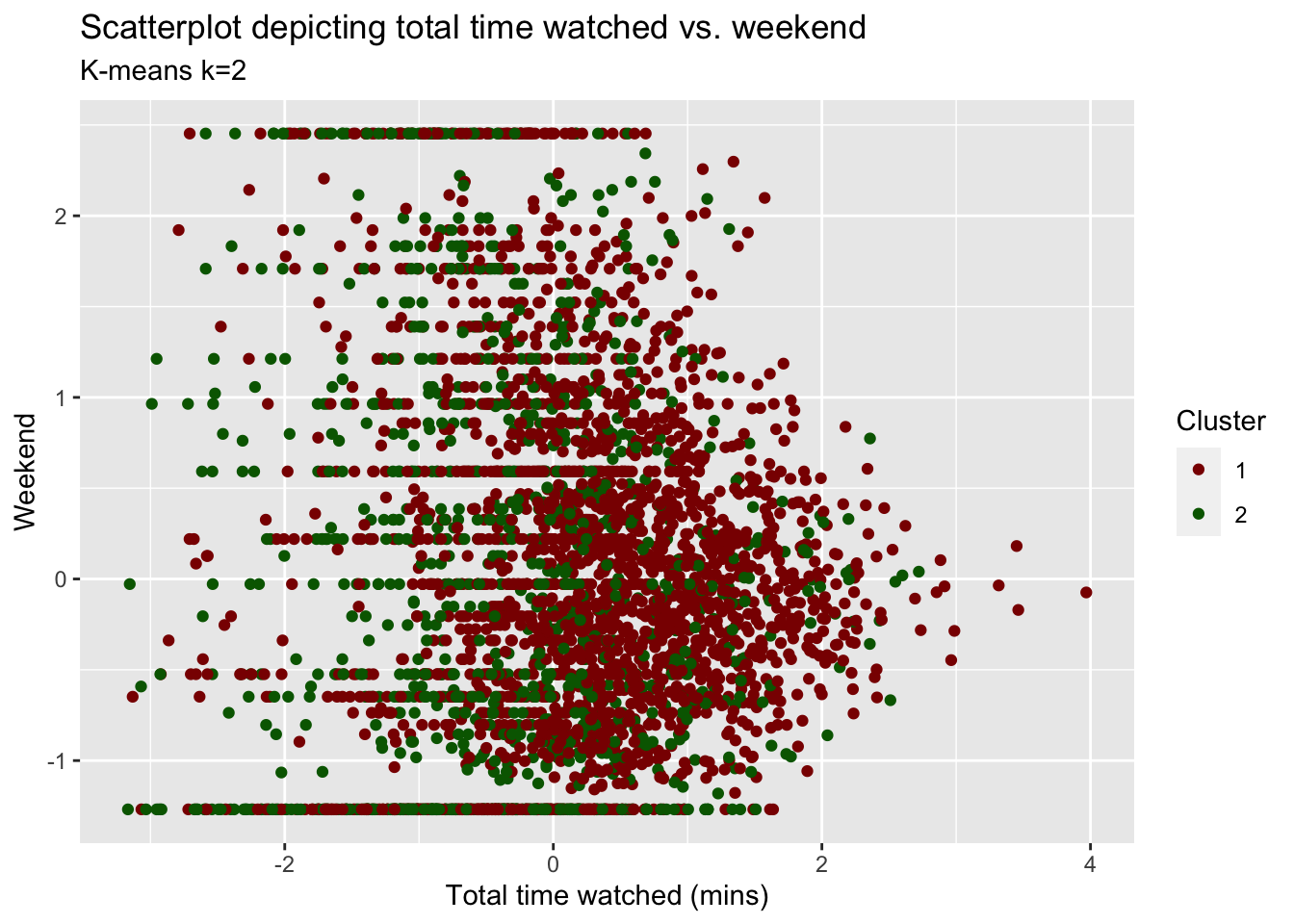
Answer:
It’s hard to observe what the unique clusters would look like based on only these two variables. We observe significant overlap of the data points and solid horizontal lines that seem to be formed due to some people only watching on either the weekend or during the week. While others watch on a combination of weekdays and weekend. Although there is a lot of overlap, total_Time seems to play a more prominent role in determining the clusters. Looking at the plot and validated by our cluster centers, both clusters seem less/not influenced by weekend (majority of points is clustered around weekend = 0) whereas cluster 1 data points tends to be positively skewed towards positive total_Time and cluster 2 seems to be negatively skewed towards total_Time.
Clusters vs PCA components
We repeat the previous step and use the first two principle components using fviz_cluster function.
plot_kmeans_2cl_pca <- fviz_cluster(model_kmeans_2cl,
             userdata_for_model_scaled,
             geom="point") +
              theme_minimal()+
              scale_colour_manual(values = c("darkred", "darkgreen"))+
              scale_fill_manual(values = c("darkred", "darkgreen"))+
              labs(title = "PCA K-means k=2")


plot_kmeans_2cl_pca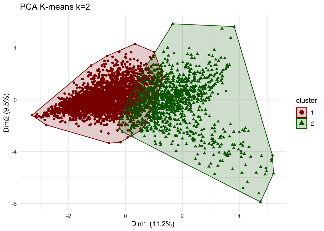
Comment:
We observe a clear distinction between the two clusters than when comparing only two variables. Nevertheless, we still observe an overlap between the clusters. we do note that the principal component graphically capture only 20.7% of the clusters.
Clusters vs PCA components without log transform
We use K-means method again but this time do not log transform total time and include no_shows as well. We compare the results to the case when we used log transformation. Then, we visualize the first two principle components using fviz_cluster function.
k=2

# new data frame without log transformation and including noShows
userdata_for_model_nolog <- userdata_red %>%
  select(-c(user_id,
            weight_pct_60,  # excluding weight_pct_60 because it is highly correlated with weight_pct_90
            weekday,        # excluding weekday because it is perfectly correlated with weekend
            NoGenre))       # excluding NoGenre because it gives us no information about preferences


#scale the data
userdata_for_model_nolog_scaled <- data.frame(scale(userdata_for_model_nolog))

#k-means
model_kmeans_2cl_nolog <- eclust(userdata_for_model_nolog_scaled, "kmeans", k = k, nstart = 50, graph = FALSE)

# check the components of this object.
summary(model_kmeans_2cl_nolog)
## Length Class Mode
## cluster 3625 -none- numeric
## centers 38 -none- numeric
## totss 1 -none- numeric
## withinss 2 -none- numeric
## tot.withinss 1 -none- numeric
## betweenss 1 -none- numeric
## size 2 -none- numeric
## iter 1 -none- numeric
## ifault 1 -none- numeric
## silinfo 3 -none- list
## nbclust 1 -none- numeric
## data 19 data.frame listmodel_kmeans_2cl_nolog$size ## [1] 2358 1267# here cluster 1 = 2358, cluster 2 = 1267
# before cluster 1 = 2404, cluster 2 = 1221
# --> slight differences in cluster size but difference seems to not be too big
# are the cluster centers different?
model_kmeans_2cl_nolog$centers## noShows total_Time weekend Afternoon Day Evening
## 1 0.05463995 0.08070963 0.04192641 -0.2954794 -0.5029226 0.4400200
## 2 -0.10168982 -0.15020782 -0.07802879 0.5499135 0.9359837 -0.8189165
## Night Children Comedy Drama Entertainment Factual
## 1 0.2354779 -0.1927854 0.09899091 0.1758927 0.03610943 -0.04106834
## 2 -0.4382454 0.3587909 -0.18423091 -0.3273521 -0.06720288 0.07643185
## Learning Music News RelEthics Sport Weather
## 1 -0.1080443 -0.01277169 -0.09299735 -0.05780145 -0.04090703 -0.02256208
## 2 0.2010800 0.02376926 0.17307637 0.10757365 0.07613163 0.04199004
## weight_pct_90
## 1 0.1390330
## 2 -0.2587529#add clusters to the data frame
userdatall_with_cl_nolog <- mutate(userdata_for_model_nolog_scaled,
cluster = as.factor(model_kmeans_2cl_nolog$cluster))
# Plot centers
cluster_centers_nolog <- data.frame(cluster = as.factor(c(1:2)), model_kmeans_2cl_nolog$centers)
#transpose this data frame
cluster_centers_nolog_t <- cluster_centers_nolog %>%
gather(variable, value, -cluster, factor_key = TRUE)
# cluster centers without log and with noShows seem to be very different - let's compare them
plot_kmeans_2cl_nolog <- ggplot(cluster_centers_nolog_t,
aes(x = variable, y = value)) +
geom_line(aes(color = cluster,
group = cluster),
linetype = "dashed", size=1) +
geom_point(size = 1, shape = 4) +
geom_hline(yintercept = 0) +
theme(#aspect.ratio = 3/5,
text = element_text(size = 10),
axis.text.x = element_text(angle = 45, hjust = 1)
) +
scale_colour_manual(values = c("darkred", "darkgreen"))+
labs(title = "K-means Centers k=2",
subtitle = "No log transformation of total_Time\n& including noShows",
colour = "Cluster")
# comparing kmeans before and after
grid.arrange(plot_kmeans_2cl, plot_kmeans_2cl_nolog, nrow = 1)![]()
# PCA
plot_kmeans_2cl_nolog_pca <- fviz_cluster(model_kmeans_2cl_nolog,
             userdata_for_model_nolog_scaled,
             palette = "Set2",
             ggtheme = theme_minimal())+
              scale_colour_manual(values = c("darkred", "darkgreen"))+
              scale_fill_manual(values = c("darkred", "darkgreen"))+
              labs(title = "PCA K-means k=2",
                   subtitle = "No log transformation of total_Time\n& including noShows")
## Scale for 'colour' is already present. Adding another scale for 'colour',
## which will replace the existing scale.## Scale for 'fill' is already present. Adding another scale for 'fill', which
## will replace the existing scale.grid.arrange(plot_kmeans_2cl_pca, plot_kmeans_2cl_nolog_pca, nrow = 2)![]()
Do we observe any outliers?
Answer:
Considering the comparison between the center plots, we observe that the centers are very similar. This could be concerning as it may means that the outliers have may not been corrected for through the log transformation as we would expect the influence of outliers to result in different means but it could also reflect that there are not that many influencing outliers skewing the attributes of the cluster centers.
Including both noShows and total_Time, however, now double weighs the influence of these factors as they are highly correlated. Adding noShows to the data set decreases the significance of total_Time on the clusters which makes it harder to draw any conclusions on high-frequency users vs. low-frequency users. Adding no_Shows and not transforming total_Time removes the meaningful difference between the two clusters on total_Time in the previous model. We can’t draw meaningful conclusions on total_Time anymore which, in turn, decreases the influence of this variable on the clusters.
However, comparing the PCA for the model with and without log transformation of total_Time, we discover several outlier users (e.g. especially user 1484). The cluster sizes from our initial k=2 clustering of 2404 and 1221 change to new cluster sizes of 2358 and 1267 in the no-log model. Although the differences are not too big, this may mean that while our cluster centers do not change significantly with the changed inputs, the allocations of users to a respective cluster changes when including noShows and not log-transforming total_Time.
We we will however proceed by removing noShows (double influence with total_Time) and assume that by applying the log-transformation to total_Total gives us a better picture of our clusters that is less influenced by outliers. We should however be cautious of these results and perhaps validate them by splitting the data and seed setting.
Elbow Chart
We produce an elbow chart and identify a reasonable range for the number of clusters.
# Run K-Means models with varying value of k
tot_withinss <- map_dbl(1:10, function(k){
model <- kmeans(x = userdata_for_model_scaled, centers = k,iter.max = 100, nstart = 10)
model$tot.withinss
})
# Generate data frame containing both k and tot_withinss
elbow_df <- data.frame(
k = 1:10 ,
tot_withinss = tot_withinss
)
# Plot elbow plot
ggplot(elbow_df, aes(x = k, y = tot_withinss)) +
geom_line() +
scale_x_continuous(breaks = 1:10)+
labs(title = "No obvious, optimal k visible",
subtitle = "Elbow chart for k-means",
x = "Number of clusters (k)",
y = "Total distance to cluster centers")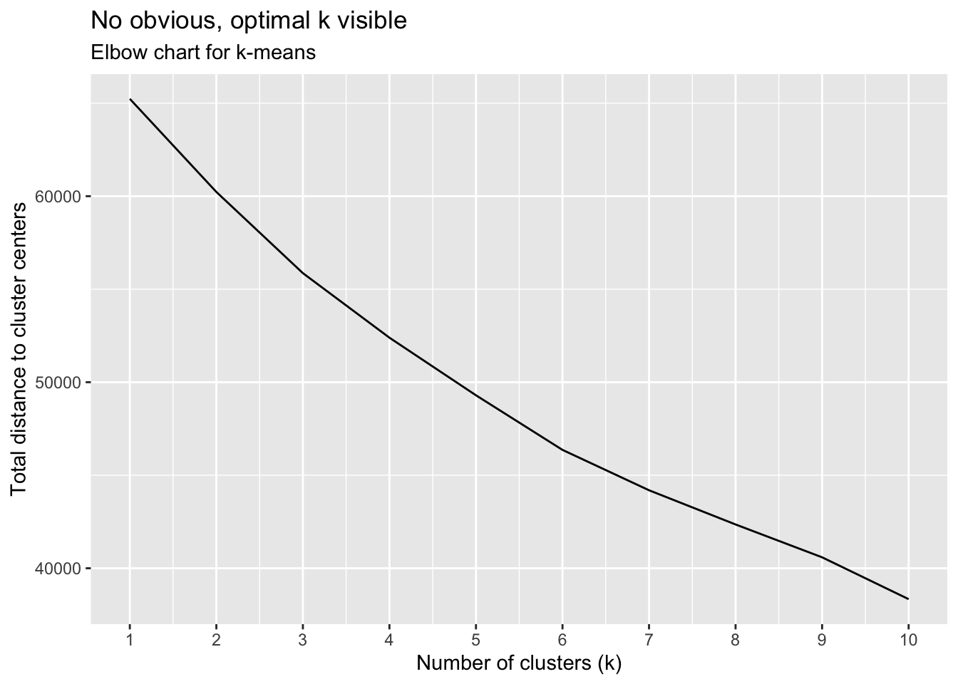
Silhouette method
We repeat the previous step for Silhouette analysis.
silh_k2 <- fviz_silhouette(model_kmeans_2cl) +
labs(title = "K-means k=2 Silhouette analysis",
subtitle = paste("k=2",
"average silhouette width = ",
format(round(model_kmeans_2cl$silinfo$avg.width, 3))),
y = "Silhouette width")+
scale_colour_manual(values = c("darkred", "darkgreen"))+
scale_fill_manual(values = c("darkred", "darkgreen"))+
theme(aspect.ratio = 2/3)## cluster size ave.sil.width
## 1 1 2404 0.22
## 2 2 1221 -0.03silh_k2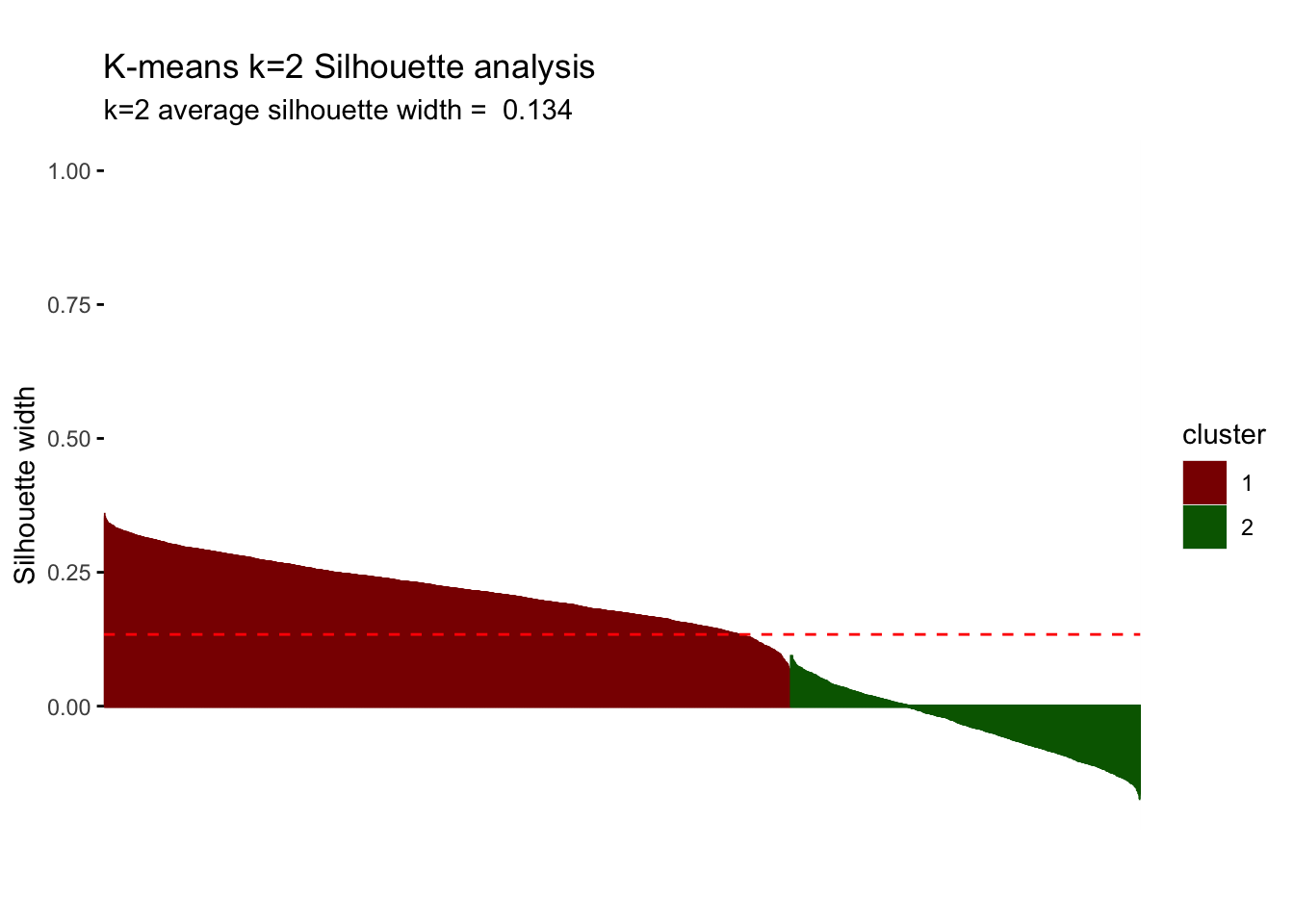
Question 5: We summarize the conclusions of our Elbow Chart and Silhoutte analysis. What range of values for the number of clusters seems more plausible?
Answer:
The elbow chart is a rather smooth line and does not show any significant kink/“elbow” that we expected to find. Although we seem to observe a smaller rate of decrease after k=6, we can’t identify one obvious k. We seem to observe the greatest rate of decrease between k=1 and k=3, implying that we will most probably end up with 2 to 3 but definitely no more than 6 clusters.
The silhouette analysis shows us that for k=2, we find an average silhouette width of 0.134. The first cluster seems to be highly influential and significant with positive silhouette widths that are almost entirely above average width. However, cluster 2 does not present any points above average silhouette width and, in fact, the majority of the points have a negative silhouette width. As observations with a negative silhouette width are probably placed in the wrong cluster, we cannot draw any meaningful conclusions on cluster 2. Consequently, we consider further clusters (increasing k) to see if we can improve this result.
Comparing k-means with different k
For simplicity, let’s focus on lower values. Now, we find the clusters using kmeans for k=3, 4 and 5. We plot the centers and check the number of observations in each cluster.
Question 6: Based on these graphs which one seems to be more plausible? Which clusters are observable in each case? Don’t forget to check the cluster sizes.
# k = 2
#cluster sizes: 2404, 1221
# k = 3
model_km3 <- eclust(userdata_for_model_scaled, "kmeans", k = 3, nstart = 50, graph = FALSE)
model_km3$size## [1] 2548 180 897# cluster sizes: 2548, 180, 897
# k = 4
model_km4 <- eclust(userdata_for_model_scaled, "kmeans", k = 4, nstart = 50, graph = FALSE)
model_km4$size## [1] 1166 181 819 1459# cluster sizes: 1166, 181, 819, 1459
# k = 5
model_km5 <- eclust(userdata_for_model_scaled, "kmeans", k = 5, nstart = 50, graph = FALSE)
model_km5$size## [1] 1068 853 181 802 721# cluster sizes: 1068, 853, 181, 802, 721Answer:
Increasing k to 3, introduces a relatively small cluster of 180 observations. Although this only represents 5% of the overall data, contextually it may makes sense considering the range of demographics and user preferences of the BBC iPlayer. Further increasing k, continues to split the clusters, reaching relatively similar cluster sizes for k=5. However, we still observe a cluster of around 180 in all three cases, meaning that it may be a small but very distinct group.
#Plot centers for k=3
#First generate a new data frame with cluster centers and cluster numbers
cluster_centers_3 <- data.frame(cluster = as.factor(c(1:3)), model_km3$centers)
#transpose this data frame
cluster_centers_3_t <- cluster_centers_3 %>%
gather(variable, value, -cluster, factor_key = TRUE)
#plot the centers
plot_kmeans_3cl <- ggplot(cluster_centers_3_t,
aes(x = variable, y = value)) +
geom_line(aes(color = cluster,
group = cluster),
linetype = "dashed", size=1) +
geom_point(size = 1, shape = 4) +
geom_hline(yintercept = 0) +
theme(#aspect.ratio = 3/5,
text = element_text(size = 10),
axis.text.x = element_text(angle = 45, hjust = 1)
) +
ggtitle("K-means Centers k=3")+
labs(x = "",
colour = "Cluster")+
scale_colour_manual(values = c("darkred", "darkgreen", "blue"))
#Plot centers for k=4
#First generate a new data frame with cluster centers and cluster numbers
cluster_centers_4 <- data.frame(cluster = as.factor(c(1:4)), model_km4$centers)
#transpose this data frame
cluster_centers_4_t <- cluster_centers_4 %>%
gather(variable, value, -cluster, factor_key = TRUE)
#plot the centers
plot_kmeans_4cl <- ggplot(cluster_centers_4_t,
aes(x = variable, y = value)) +
geom_line(aes(color = cluster,
group = cluster),
linetype = "dashed", size=1) +
geom_point(size = 1, shape = 4) +
geom_hline(yintercept = 0) +
theme(#aspect.ratio = 3/5,
text = element_text(size = 10),
axis.text.x = element_text(angle = 45, hjust = 1)
) +
ggtitle("K-means Centers k=4")+
labs(x = "",
colour = "Cluster")+
scale_colour_manual(values = c("darkred", "darkgreen", "blue", "purple"))
#Plot centers for k=5
#First generate a new data frame with cluster centers and cluster numbers
cluster_centers_5 <- data.frame(cluster = as.factor(c(1:5)), model_km5$centers)
#transpose this data frame
cluster_centers_5_t <- cluster_centers_5 %>%
gather(variable, value, -cluster, factor_key = TRUE)
#plot the centers
plot_kmeans_5cl <- ggplot(cluster_centers_5_t,
aes(x = variable, y = value)) +
geom_line(aes(color = cluster,
group = cluster),
linetype = "dashed", size=1) +
geom_point(size = 1, shape = 4) +
geom_hline(yintercept = 0) +
theme(#aspect.ratio = 3/5,
text = element_text(size = 10),
axis.text.x = element_text(angle = 45, hjust = 1)
) +
ggtitle("K-means Centers k=5")+
labs(x = "",
colour = "Cluster")+
scale_colour_manual(values = c("darkred", "darkgreen", "blue", "purple", "orange"))
grid.arrange(plot_kmeans_2cl, plot_kmeans_3cl, plot_kmeans_4cl, plot_kmeans_5cl, nrow = 2)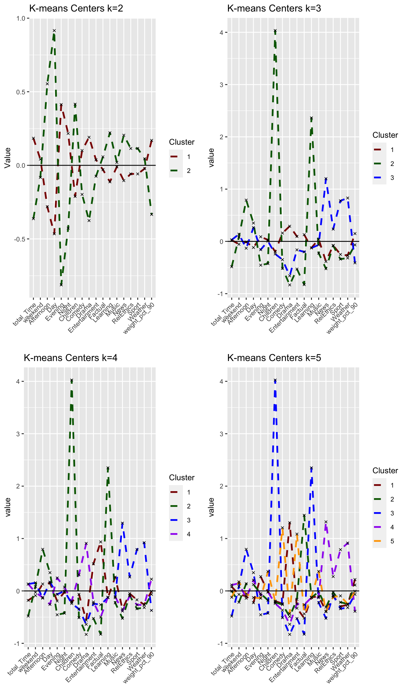
#PCA visualizations
plot_kmeans_3cl_pca <- fviz_cluster(model_km3, geom = "point", data = userdata_for_model_scaled) +
ggtitle("PCA K-means k = 3")+
scale_colour_manual(values = c("darkred", "darkgreen", "blue", "purple", "orange"))+
scale_fill_manual(values = c("darkred", "darkgreen", "blue", "purple", "orange"))+
theme(aspect.ratio = 2/3)
plot_kmeans_4cl_pca <- fviz_cluster(model_km4, geom = "point", data = userdata_for_model_scaled) +
ggtitle("PCA K-means k = 4")+
scale_colour_manual(values = c("darkred", "darkgreen", "blue", "purple", "orange"))+
scale_fill_manual(values = c("darkred", "darkgreen", "blue", "purple", "orange"))+
theme(aspect.ratio = 2/3)
plot_kmeans_5cl_pca <- fviz_cluster(model_km5, geom = "point", data = userdata_for_model_scaled) +
ggtitle("PCA K-means k = 5")+
scale_colour_manual(values = c("darkred", "darkgreen", "blue", "purple", "orange"))+
scale_fill_manual(values = c("darkred", "darkgreen", "blue", "purple", "orange"))+
theme(aspect.ratio = 2/3)
grid.arrange(plot_kmeans_2cl_pca, plot_kmeans_3cl_pca, plot_kmeans_4cl_pca, plot_kmeans_5cl_pca, nrow = 2)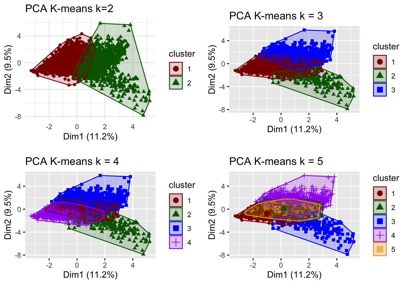
# for k = 3
silh_k3 <- fviz_silhouette(model_km3) +
labs(title = "K-means k=3 Silhouette analysis",
subtitle = paste("k=3",
"average silhouette width = ",
format(round(model_km3$silinfo$avg.width, 3))),
y = "Silhouette width")+
scale_colour_manual(values = c("darkred", "darkgreen", "blue", "purple", "orange"))+
scale_fill_manual(values = c("darkred", "darkgreen", "blue", "purple", "orange"))+
theme(aspect.ratio = 2/3)## cluster size ave.sil.width
## 1 1 2548 0.18
## 2 2 180 0.17
## 3 3 897 0.03# for k = 4
silh_k4 <- fviz_silhouette(model_km4) +
labs(title = "K-means k=4 Silhouette analysis",
subtitle = paste("k=4",
"average silhouette width = ",
format(round(model_km4$silinfo$avg.width, 3))),
y = "Silhouette width")+
scale_colour_manual(values = c("darkred", "darkgreen", "blue", "purple", "orange"))+
scale_fill_manual(values = c("darkred", "darkgreen", "blue", "purple", "orange"))+
theme(aspect.ratio = 2/3)## cluster size ave.sil.width
## 1 1 1166 0.03
## 2 2 181 0.16
## 3 3 819 0.03
## 4 4 1459 0.19# for k = 5
silh_k5 <- fviz_silhouette(model_km5) +
labs(title = "K-means k=5 Silhouette analysis",
subtitle = paste("k=5",
"average silhouette width = ",
format(round(model_km5$silinfo$avg.width, 3))),
y = "Silhouette width")+
scale_colour_manual(values = c("darkred", "darkgreen", "blue", "purple", "orange"))+
scale_fill_manual(values = c("darkred", "darkgreen", "blue", "purple", "orange"))+
theme(aspect.ratio = 2/3)## cluster size ave.sil.width
## 1 1 1068 0.21
## 2 2 853 0.12
## 3 3 181 0.15
## 4 4 802 0.00
## 5 5 721 0.00grid.arrange(silh_k2, silh_k3, silh_k4, silh_k5, nrow = 2)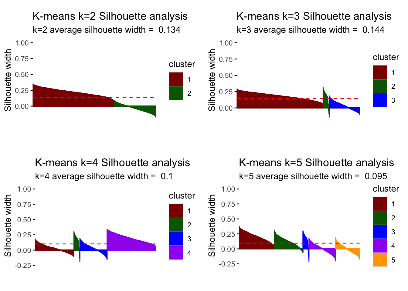
# optimal number of clusters
# cut off at k.max = 8 for simplicity sake
fviz_nbclust(userdata_for_model_scaled, (function(x, i) eclust(x, "kmeans", k = i, nstart = 50, graph = FALSE)),
method = "silhouette", k.max = 8)+
labs(subtitle = "Silhouette method")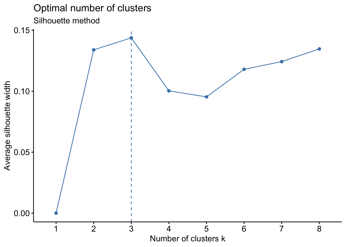
Answer:
Looking at the different center plots, we find that the introduction of a third and relatively small cluster (cluster 2, 180 observations) is relevant as this cluster is very distinguished from the other remaining clusters. This cluster 2 most likely represents Children viewers (e.g. family accounts where the children use the BBC iPlayer) as it is characterized by afternoon-watching as well as Children and Learning genres.
Considering the center plots and the different PCA analysis, increasing k to 4 or higher does not create separate/distinguishable clusters that provide meaning as there is lots of overlap of cluster centers and the clusters themselves.
Comparing the silhouette analysis, we find an improvement of average silhouette width to 0.144 for k=3. Increasing k further, reduces this width again. Looking at the individual silhouette plots, k=3 has the least observations with negative or below average silhouette width, meaning points are most accurately assigned to respective clusters. Introducing the cluster with 180 observations shows relevance for all k greater than 3 so that we conclude it’s a relevant segment of the market despite its size that we should not ignore.
For all the reasons above, we believe we can draw the most meaningful conclusions with three clusters (k=3).
Comparing results of different clustering algorithms
PAM
We fit a PAM model for the k=3 for k-means. We determine how many points each cluster has, plot the centers of the clusters and produce PCA visualization.
#choose 3 clusters
k=3
# pam model
k_pam <- eclust(userdata_for_model_scaled, "pam", k = k, graph = FALSE)
# comment out because it clutters html
# summary(k_pam)
# look at cluster sizes
k_pam$medoids ## total_Time weekend Afternoon Day Evening Night
## [1,] 0.2555614 -0.2762261 -0.2507282 -0.28752507 0.4000553 0.006737404
## [2,] 0.5784154 -0.3382532 0.0218849 0.75727286 -0.1448769 -0.694096774
## [3,] 0.2542113 0.3058741 0.2525575 0.09068232 -0.3209319 0.114558047
## Children Comedy Drama Entertainment Factual Learning
## [1,] -0.2731998 -0.3788167 0.9789724 -0.36225819 0.05652418 -0.1342938
## [2,] -0.2731998 -0.5762961 -0.9808989 0.09737743 0.18798753 -0.1342938
## [3,] -0.2731998 0.7908691 -0.7296334 0.73379600 0.37001371 -0.1342938
## Music News RelEthics Sport Weather weight_pct_90
## [1,] -0.2592311 -0.3887828 -0.1396511 -0.2096747 -0.3445985 -0.633418685
## [2,] -0.2592311 2.2109352 -0.1396511 -0.1024253 0.5638516 -0.001997787
## [3,] -0.2592311 -0.5744769 -0.1396511 0.3183225 -0.3445985 -0.147710302# generate a new data frame with cluster medoids and cluster numbers
cluster_medoids<-data.frame(cluster=as.factor(c(1:k)),k_pam$medoids)
#transpose this data frame
cluster_medoids_t<-cluster_medoids %>% gather(variable,value,-cluster,factor_key = TRUE)
#plot the medoids
plot_pam_med <- ggplot(cluster_medoids_t,
aes(x = variable, y = value)) +
geom_line(aes(color = cluster,
group = cluster),
linetype = "dashed", size=1) +
geom_point(size = 1, shape = 4) +
geom_hline(yintercept = 0) +
theme(#aspect.ratio = 3/5,
text = element_text(size = 10),
axis.text.x = element_text(angle = 45, hjust = 1)
) +
ggtitle("PAM medoids k=3")+
labs(colour = "Cluster",
x = "")+
scale_colour_manual(values = c("darkred", "darkgreen", "blue", "purple", "orange"))
plot_pam_med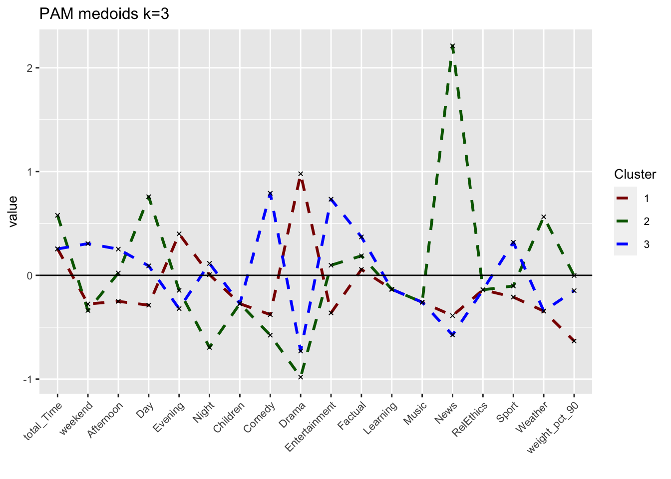
# We can also visualize the centers (instead of the medoids) to make a more fair comparison
userdata_for_model_scaled_withcluster_pam <- mutate(userdata_for_model_scaled,
cluster = as.factor(k_pam$cluster))
center_locations <- userdata_for_model_scaled_withcluster_pam %>%
group_by(cluster) %>%
summarize_at(vars(total_Time:weight_pct_90), mean)
# gather to collect information together
pam_centers <- gather(center_locations,
key = "variable",
value = "value",
-cluster,
factor_key = TRUE)
#plot centers
plot_pam_cent <- ggplot(pam_centers,
aes(x = variable, y = value)) +
geom_line(aes(color = cluster,
group = cluster),
linetype = "dashed", size=1) +
geom_point(size = 1, shape = 4) +
geom_hline(yintercept = 0) +
theme(#aspect.ratio = 3/5,
text = element_text(size = 10),
axis.text.x = element_text(angle = 45, hjust = 1),
legend.title = element_text(size=7),
legend.text = element_text(size=5)) +
scale_colour_manual(values = c("darkgreen", "orange", "red")) +
labs(title = "PAM centers k=3",
colour = "Cluster")+
scale_colour_manual(values = c("darkred", "darkgreen", "blue"))## Scale for 'colour' is already present. Adding another scale for 'colour',
## which will replace the existing scale.plot_pam_cent
grid.arrange(plot_kmeans_3cl, plot_pam_cent, nrow = 1)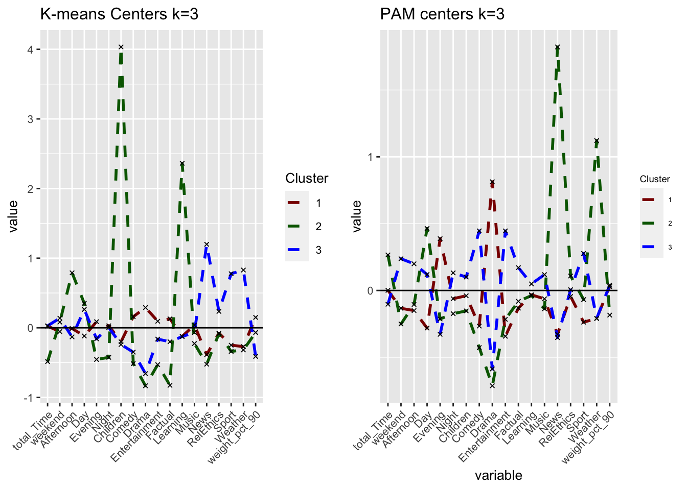
# PCA
plot_pam_pca <- fviz_cluster(k_pam,
userdata_for_model_scaled,
palette = "Set2",
geom="point",
ggtheme = theme_minimal()) +
labs(title = "PCA PAM k=3")+
scale_colour_manual(values = c("darkred", "darkgreen", "blue"))+
scale_fill_manual(values = c("darkred", "darkgreen", "blue"))+
theme(aspect.ratio = 2/3)## Scale for 'colour' is already present. Adding another scale for 'colour',
## which will replace the existing scale.## Scale for 'fill' is already present. Adding another scale for 'fill', which
## will replace the existing scale.plot_pam_pca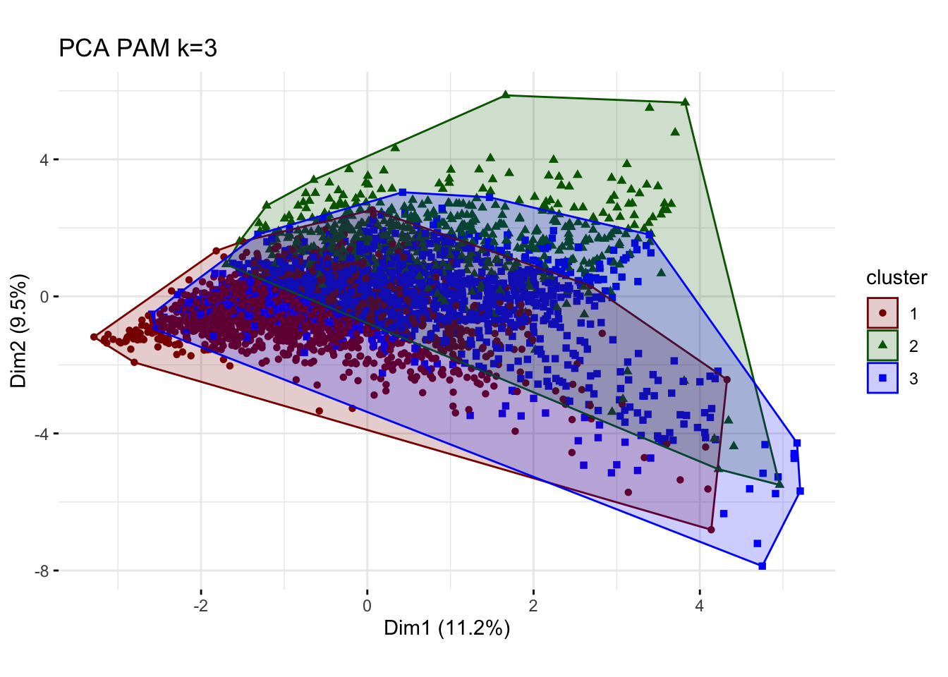
# R gets stuck here (takes too long to load)
# Elbow
#elbow_pam <- fviz_nbclust(userdata_for_model_scaled,
# FUNcluster = cluster::pam,
# method = "wss")+
# labs(subtitle = "Elbow method")
#elbow_pam
# Silhouette
silh_pam <- fviz_silhouette(k_pam) +
labs(title = "PAM k=3 Silhouette analysis",
subtitle = paste("k=3",
"average silhouette width = ",
format(round(k_pam$silinfo$avg.width, 3))),
y = "Silhouette width")+
scale_colour_manual(values = c("darkred", "darkgreen", "blue"))+
theme(aspect.ratio = 2/3)## cluster size ave.sil.width
## 1 1 1571 0.20
## 2 2 570 0.10
## 3 3 1484 -0.05silh_pam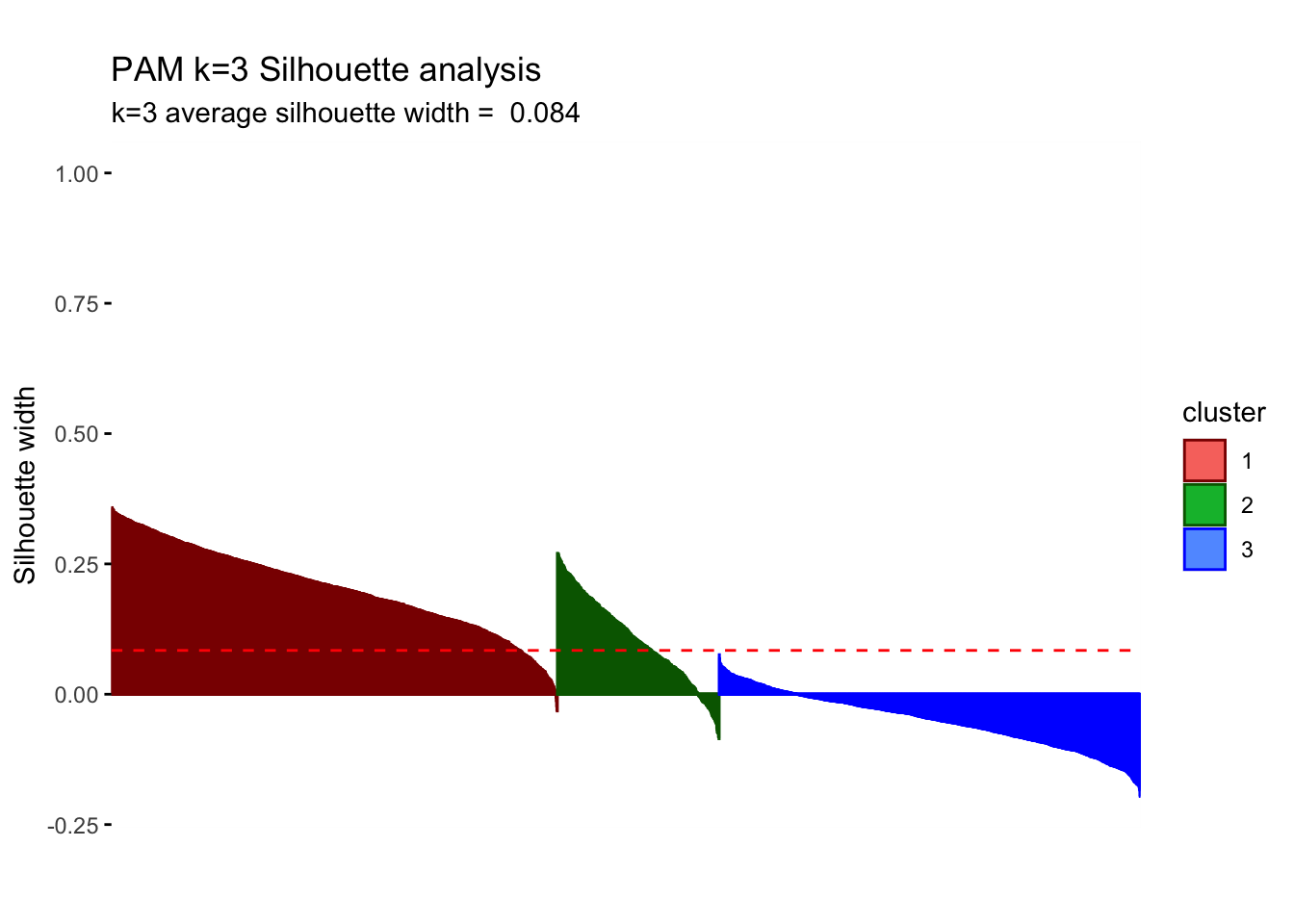
The sizes of the clusters are 1571, 570 and 1484. We still observe one relatively small group but PAM increases our initial relatively small cluster of 180 to comparatively higher 570.PAM is usually better in the handling of outliers so it is somewhat concerning that we witness some noticeable differences. Despite the center plots looking fairly different we do still notice common dynamics between the clusters using k-means and PAM method. One Cluster still has a preference for evening and drama and is adverse against the news, however, all remaining clusters seem to be characterized by different attributes. If we do look at the silhouette analysis,We do however notice really poor performance of cluster 3 in the silhouette analysis as all points lie below the average and majority of points have a negative width. This implies that the dynamics reflected by the centers is not a true reflection of the characteristics of those clusters as the points lie closer to their neighboring cluster, than their centers.Looking at the PCA plots The resulting clusters become less differentiated and the PAM method does not create the same clear distinction of between clusters(lots of overlap) Thus we should not conclude the cluster dynamics in PAM are more reflective imagine of our cluster characteristics but should be causious in our conclutions drawn in k-means.
H-Clustering
We use Hierarchical clustering with the same k as chosen above (k=3). We set hc_method equal to average and then ward.D. What differences do we observe between the results of these two methods? We visualize the results using dendrograms. How many points does each cluster have? We plot the centers of the clusters and produce PCA visualization.
k=3
# find the distances between points
res.dist <- dist(userdata_for_model_scaled, method = "euclidean")
# now determine how to form clusters
# first average method
res.hc_avg <- hcut(res.dist, hc_method = "average", k=k)
summary(res.hc_avg)## Length Class Mode
## merge 7248 -none- numeric
## height 3624 -none- numeric
## order 3625 -none- numeric
## labels 0 -none- NULL
## method 1 -none- character
## call 3 -none- call
## dist.method 1 -none- character
## cluster 3625 -none- numeric
## nbclust 1 -none- numeric
## silinfo 3 -none- list
## size 3 -none- numeric
## data 6568500 dist numericres.hc_avg$size## [1] 3623 1 1# clusters are sized 3623, 1, and 1
# then ward.D method
res.hc_wd <- hcut(res.dist, hc_method = "ward.D", k=k)
summary(res.hc_wd)## Length Class Mode
## merge 7248 -none- numeric
## height 3624 -none- numeric
## order 3625 -none- numeric
## labels 0 -none- NULL
## method 1 -none- character
## call 3 -none- call
## dist.method 1 -none- character
## cluster 3625 -none- numeric
## nbclust 1 -none- numeric
## silinfo 3 -none- list
## size 3 -none- numeric
## data 6568500 dist numericres.hc_wd$size## [1] 2538 915 172# clusters are sized 2538, 915, and 172We plot the centers of H-clusters and compare the results with K-Means and PAM.
# H-Clustering, method average
#find the averages of the variables by cluster
userdata_for_model_scaled_withcluster_hcl_avg <- mutate(userdata_for_model_scaled,
cluster = as.factor(res.hc_avg$cluster))
center_locations_hcl_avg <- userdata_for_model_scaled_withcluster_hcl_avg %>%
group_by(cluster) %>%
summarize_at(vars(total_Time:weight_pct_90), mean)
center_locations_hcl_avg_t <- gather(center_locations_hcl_avg,
key = "variable",
value = "value",
-cluster,
factor_key = TRUE)
#plot the centers
plot_hcl_cent_avg <- ggplot(center_locations_hcl_avg_t,
aes(x = variable, y = value)) +
geom_line(aes(color = cluster,
group = cluster),
linetype = "dashed", size=1) +
geom_point(size = 1, shape = 4) +
geom_hline(yintercept = 0) +
theme(#aspect.ratio = 3/5,
text = element_text(size = 10),
axis.text.x = element_text(angle = 45, hjust = 1)) +
ggtitle("H-clust Centers k=3")+
labs(subtitle = "Method: Average",
fill = "Cluster")+
scale_colour_manual(values = c("darkred", "blue", "darkgreen"))
# H-Clustering, method ward.D
#find the averages of the variables by cluster
userdata_for_model_scaled_withcluster_hcl_wd <- mutate(userdata_for_model_scaled,
cluster = as.factor(res.hc_wd$cluster))
center_locations_hcl_wd <- userdata_for_model_scaled_withcluster_hcl_wd %>%
group_by(cluster) %>%
summarize_at(vars(total_Time:weight_pct_90), mean)
center_locations_hcl_wd_t <- gather(center_locations_hcl_wd,
key = "variable",
value = "value",
-cluster,
factor_key = TRUE)
#plot the centers
plot_hcl_cent_wd <- ggplot(center_locations_hcl_wd_t,
aes(x = variable, y = value)) +
geom_line(aes(color = cluster,
group = cluster),
linetype = "dashed", size=1) +
geom_point(size = 1, shape = 4) +
geom_hline(yintercept = 0) +
theme(#aspect.ratio = 3/5,
text = element_text(size = 10),
axis.text.x = element_text(angle = 45, hjust = 1)) +
ggtitle("H-clust Centers k=3")+
labs(subtitle = "Method: ward.D",
fill = "Cluster")+
scale_colour_manual(values = c("darkred", "blue", "darkgreen"))
## Compare it with KMeans and PAM
grid.arrange(plot_kmeans_3cl, plot_pam_cent, plot_hcl_cent_avg, plot_hcl_cent_wd, nrow = 2)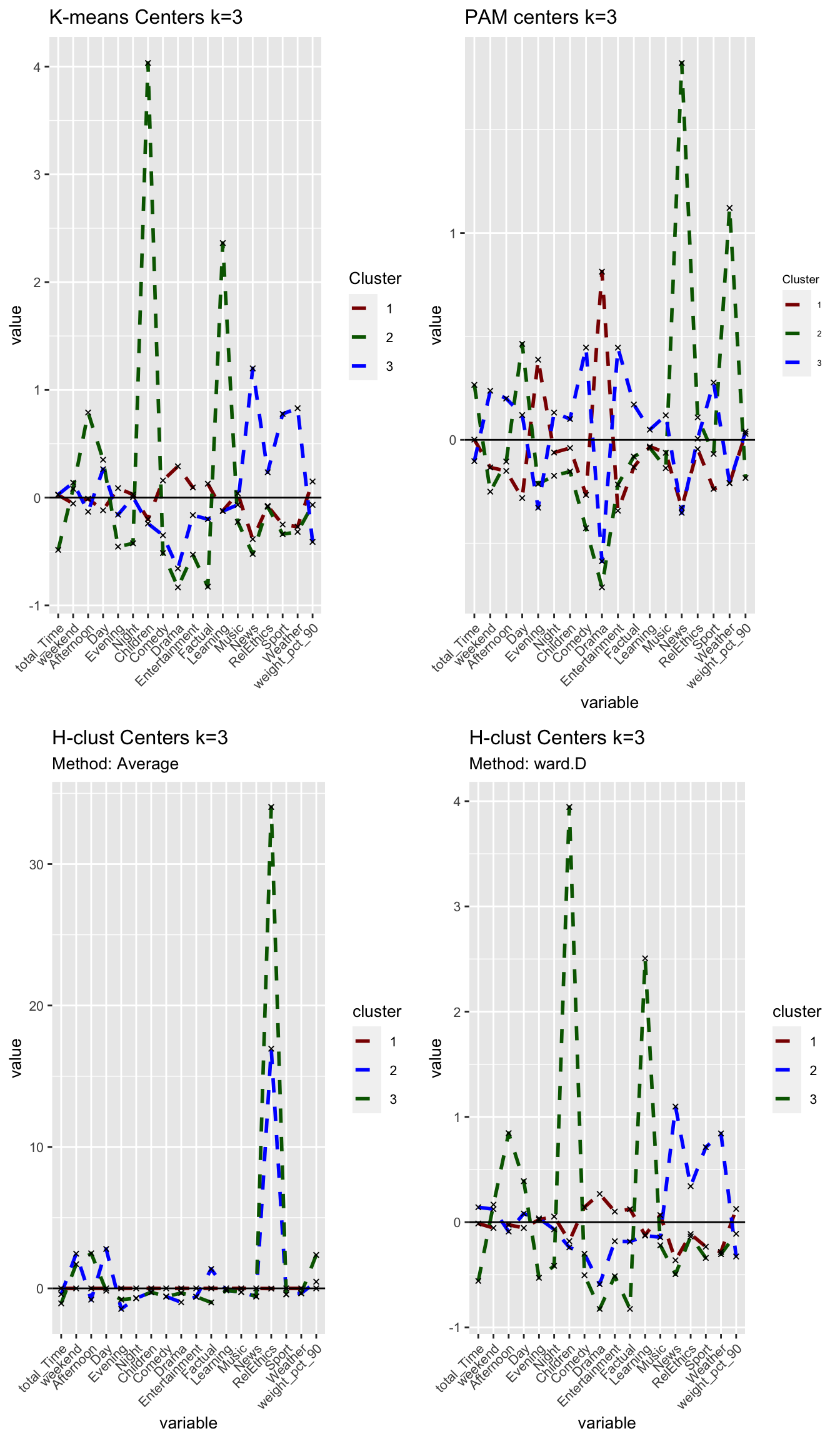
Answer:
Using the ‘Average’ method yields one large cluster with 3623 observations and two tiny clusters with only one observation each. We conclude that this method is not useful at all as can also be seen in the following visualisations. Using the ‘ward.D’ method, however, yields three clusters with sizes of 2538, 915 and 172 observations per cluster. While the first two cluster relative sizes are different to the results from kmeans, we again find a smaller cluster (here 172, in kmeans 181) that describes Children viewers. For the rest of the analysis, we use H-clustering with the ward.D method to validate our findings from kmeans.
# PCA
# method = average
plot_hcl_pca_avg <- fviz_cluster(res.hc_avg,
userdata_for_model_scaled,
palette = "Set2",
geom="point",
ggtheme = theme_minimal()) +
labs(title = "H-Clust k=3",
subtitle = "Method: Average") +
scale_colour_manual(values = c("darkred", "blue", "darkgreen"))+
scale_fill_manual(values = c("darkred", "blue", "darkgreen"))+
theme(aspect.ratio = 2/3)## Scale for 'colour' is already present. Adding another scale for 'colour',
## which will replace the existing scale.## Scale for 'fill' is already present. Adding another scale for 'fill', which
## will replace the existing scale.# method = ward.D
plot_hcl_pca_wd <- fviz_cluster(res.hc_wd,
userdata_for_model_scaled,
palette = "Set2",
geom="point",
ggtheme = theme_minimal()) +
labs(title = "H-Clust k=3",
subtitle = "Method: ward.D") +
scale_colour_manual(values = c("darkred", "blue", "darkgreen"))+
scale_fill_manual(values = c("darkred", "blue", "darkgreen"))+
theme(aspect.ratio = 2/3)## Scale for 'colour' is already present. Adding another scale for 'colour',
## which will replace the existing scale.
## Scale for 'fill' is already present. Adding another scale for 'fill', which
## will replace the existing scale.grid.arrange(plot_hcl_pca_avg, plot_hcl_pca_wd, nrow = 1)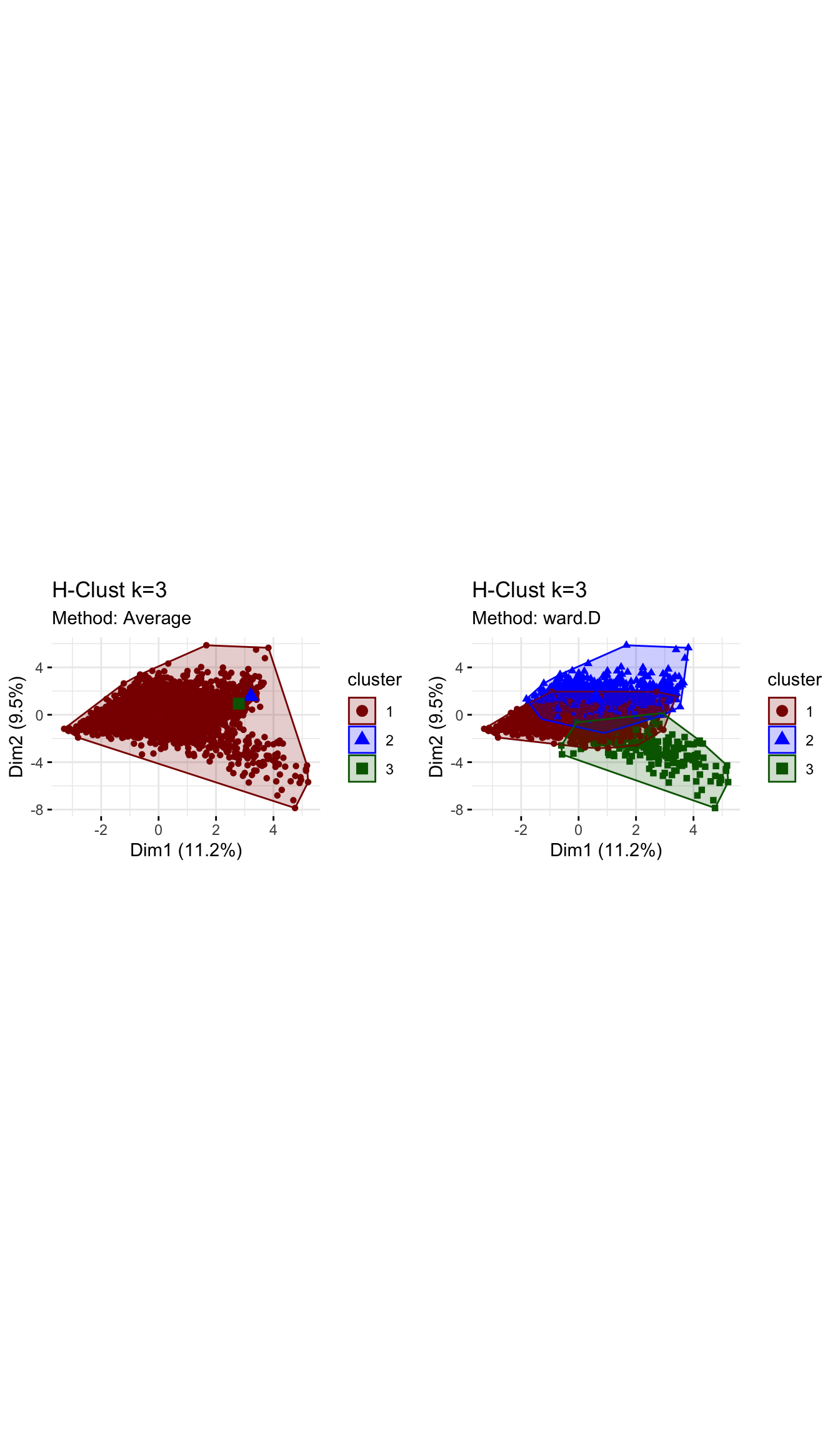
# Dendogram
# method = average
plot_hcl_den_avg <- plot(res.hc_avg,
                     hang = -1,
                     cex = 0.5,
                     main = "Dendogram - H-clust Average method",
                     lwd = 0.5)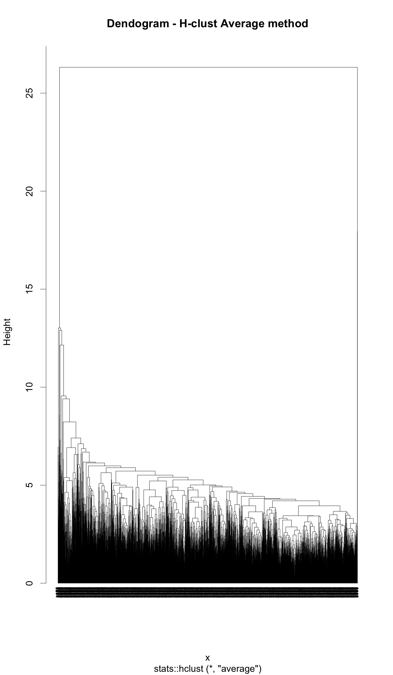
# method = ward.D
plot_hcl_den_wd <- plot(res.hc_wd,
                     hang = -1,
                     cex = 0.5,
                     main = "Dendogram - H-clust ward.D methd",
                     lwd = 0.5)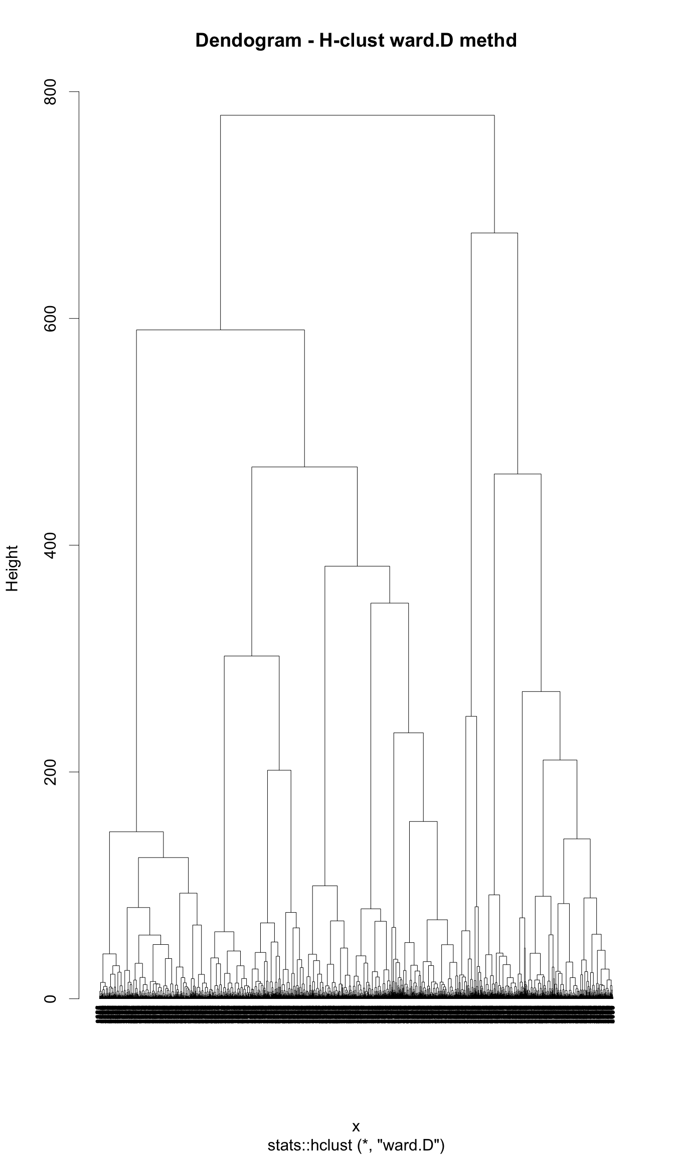
# Elbow method
plot_hcl_elb <- fviz_nbclust(userdata_for_model_scaled,
                             FUN = hcut,
                             method = "wss")
plot_hcl_elb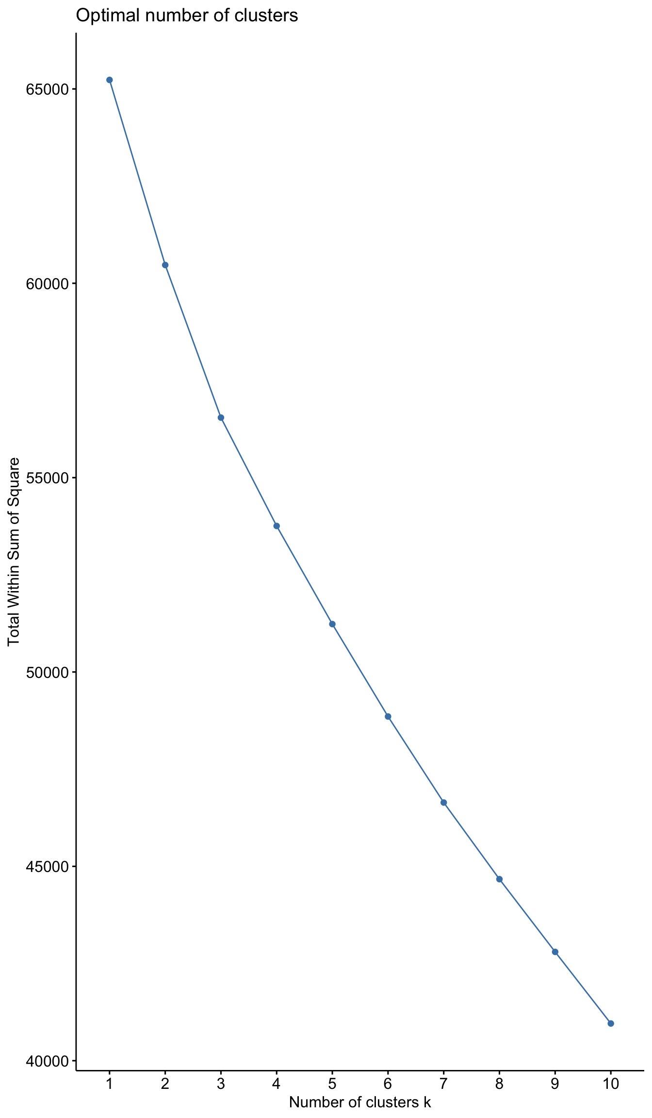
# Silhouette analysis
# method = avg
plot_hcl_silh_avg <- fviz_silhouette(res.hc_avg) +
  scale_colour_manual(values = c("darkred", "blue", "darkgreen"))+
  theme(aspect.ratio = 2/3)
## cluster size ave.sil.width
## 1 1 3623 0.69
## 2 2 1 0.00
## 3 3 1 0.00#method = ward.D
plot_hcl_silh_wd <- fviz_silhouette(res.hc_wd) +
scale_colour_manual(values = c("darkred", "blue", "darkgreen"))+
theme(aspect.ratio = 2/3)## cluster size ave.sil.width
## 1 1 2538 0.15
## 2 2 915 0.04
## 3 3 172 0.16grid.arrange(plot_hcl_silh_avg, plot_hcl_silh_wd, nrow = 1)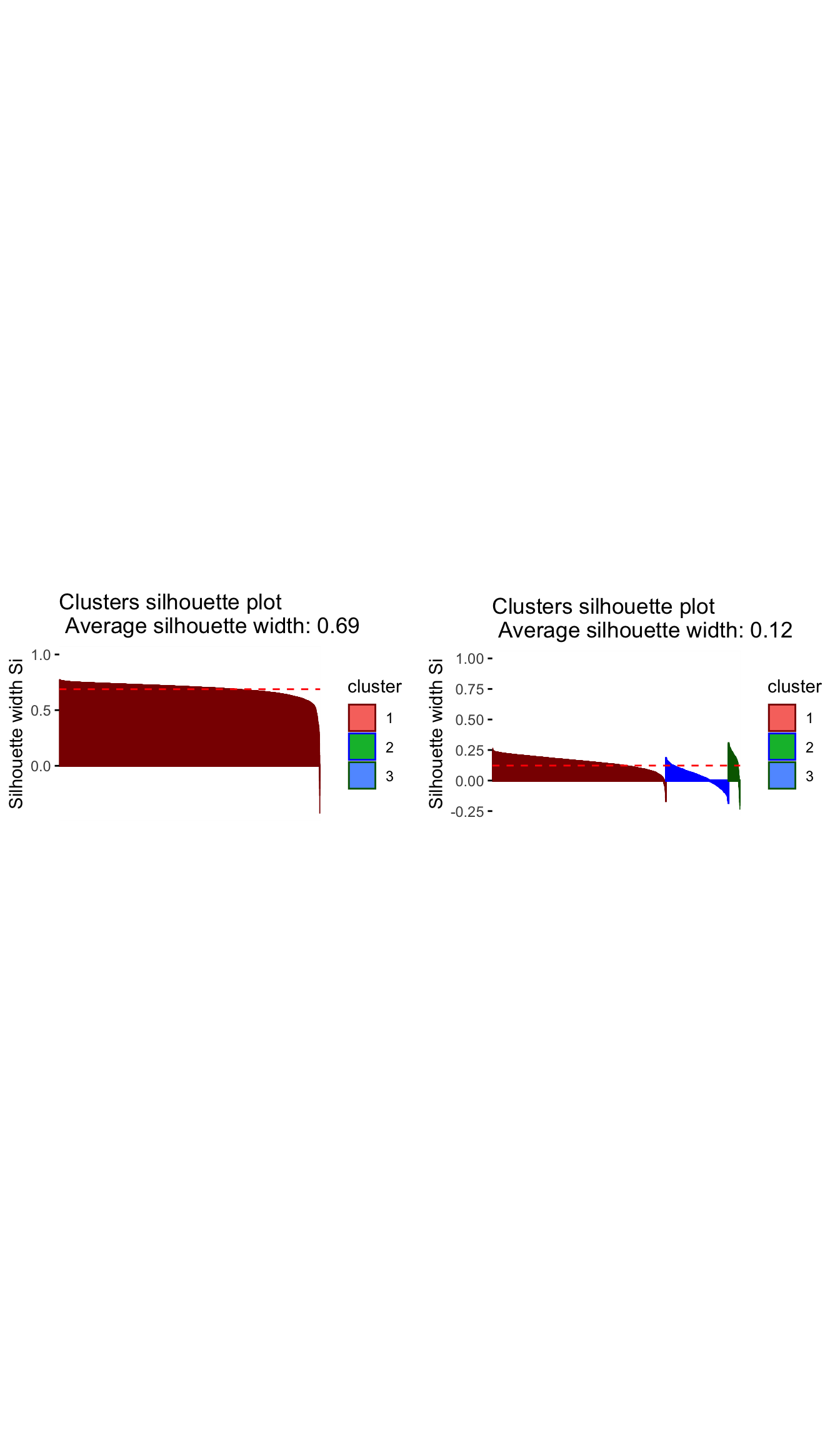
# to compare all three methods pca
grid.arrange(plot_kmeans_3cl_pca, plot_pam_pca, plot_hcl_pca_wd, nrow = 1)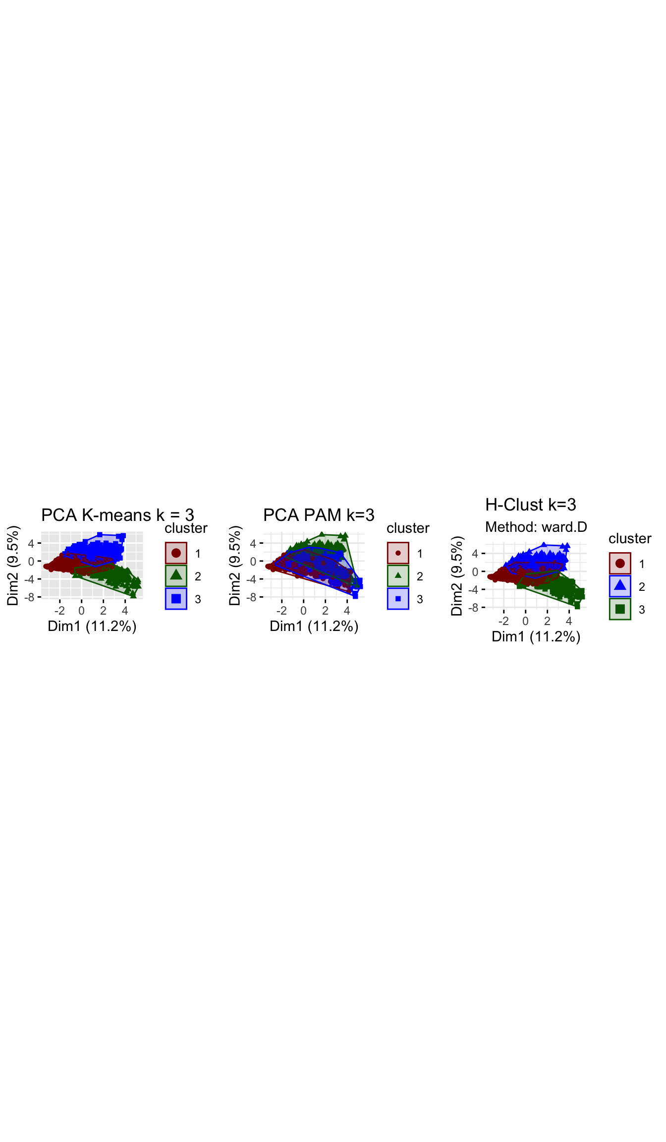
# to compare three methods silhouette analysis
grid.arrange(silh_k3, silh_pam, plot_hcl_silh_wd, nrow = 1)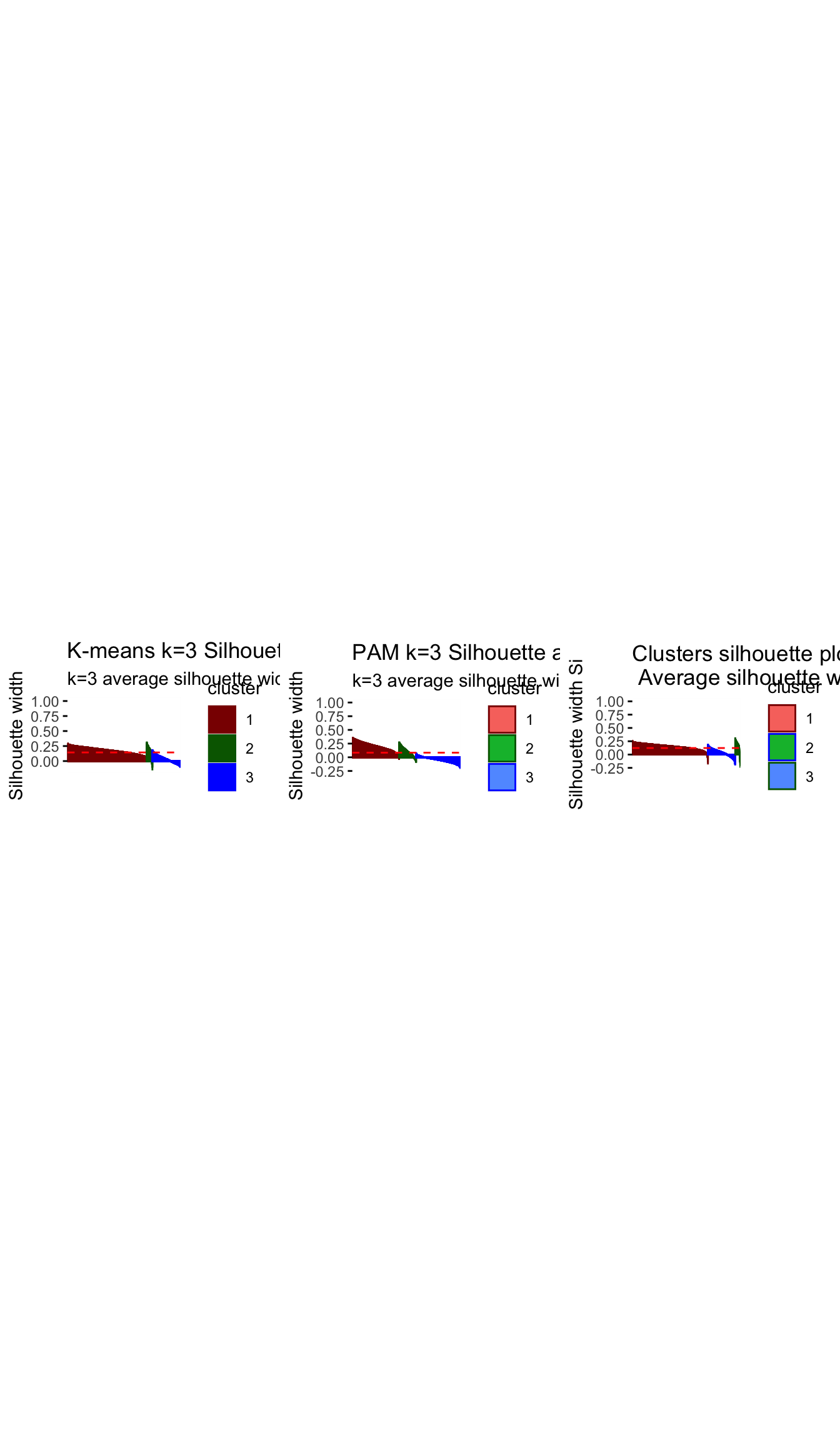
Question 7: Based on the results of these three methods, what can we conclude?
Answer!!!
Comparing across the 3 methods, we arrive at 3 fairly distinct groups. The ward.D h-clust method, seems to validate the clusters derived by k-means analysis as we arrive at fairly similar cluster in terms of size and attributes. However, The PAM method which does yield some similarities with the K–means method, differs significantly in terms of size and influence of variables. There are various possibilities for this, one may be that the data set is filled with outliers which are obscuring our results and the PAM method is more robust in handling outliers, or perhaps the PAM method sees the very niche group of children/learning individuals as outliers and is thus grouping them to the closest group of similar daytime viewers.
Having run the analysis across all 3 methods we are reassured characteristics of the clusters determined by k-means by the similarity of results in H-clustering. We have examined the differences between PAM and the alternative methods and while we are a bit more hesitant in our conclutions, the poor performance of PAM under the silhouette analysis means that we perhaps need to consider an alternative k when using PAM, or that our results may still be slightly influenced by outliers.
Subsample check
At this stage, we have chosen our number of clusters, namely k=3. We will try to reinforce our conclusions and verify that they are not due to chance by dividing the data into two equal parts. We use K-means clustering, fixing the number of clusters at 3, in these two data sets separately. If we get similar looking clusters, we can rest assured that our conclusions are robust. If not we might want to reconsider our decision.
#the following code chunk splits the data into two.
set.seed(1234)
train_test_split <- initial_split(userdata_for_model_scaled, prop = 0.5)
testing <- testing(train_test_split) #50% of the data is set aside for testing
training <- training(train_test_split) #50% of the data is set aside for training

#Fit k-means to each dataset and compare our results

# on training set
model_kmeans_3clusters_training <- eclust(training, "kmeans", k = 3, nstart = 50, graph = FALSE)

#Let's check the components of this object.
summary(model_kmeans_3clusters_training)

model_kmeans_3clusters_training$size
# cluster sizes 76,  690, 1047

model_kmeans_3clusters_training$center

# on testing set
model_kmeans_3clusters_testing <- eclust(testing, "kmeans", k = 3, nstart = 50, graph = FALSE)

#Let's check the components of this object.
summary(model_kmeans_3clusters_testing)

model_kmeans_3clusters_testing$size
# cluster sizes 102,  1260, 450

model_kmeans_3clusters_testing$center

# plot the centers for training

#First generate a new data frame with cluster centers and cluster numbers
cluster_centers_training <- data.frame(cluster = as.factor(c(1:3)),
                                       model_kmeans_3clusters_training$centers)

#transpose this data frame
cluster_centers_training_t <- cluster_centers_training %>%
                              gather(variable, value, -cluster, factor_key = TRUE)

#plot the centers
plot_kmeans_training <- ggplot(cluster_centers_training_t,
                          aes(x = variable, y = value)) +
                      geom_line(aes(color = cluster,
                                    group = cluster),
                                linetype = "dashed", size=1) +
                      geom_point(size = 1, shape = 4) +
                      geom_hline(yintercept = 0) +
                      theme(#aspect.ratio = 3/5,
                            text = element_text(size = 10),
                            axis.text.x = element_text(angle = 45, hjust = 1)) +
                      ggtitle("K-means Centers k=3 Training set")+
                      labs(colour = "Cluster",
                           x = "")+
                       scale_colour_manual(values = c("darkgreen", "blue", "darkred"))


# plot the centers for testing

#First generate a new data frame with cluster centers and cluster numbers
cluster_centers_testing<-data.frame(cluster = as.factor(c(1:3)),
                                    model_kmeans_3clusters_testing$centers)

#transpose this data frame
cluster_centers_testing_t <- cluster_centers_testing %>%
                              gather(variable, value, -cluster, factor_key = TRUE)

#plot the centers
plot_kmeans_testing <- ggplot(cluster_centers_testing_t,
                          aes(x = variable, y = value)) +
                      geom_line(aes(color = cluster,
                                    group = cluster),
                                linetype = "dashed", size=1) +
                      geom_point(size = 1, shape = 4) +
                      geom_hline(yintercept = 0) +
                      theme(#aspect.ratio = 3/5,
                            text = element_text(size = 10),
                            axis.text.x = element_text(angle = 45, hjust = 1)) +
                      ggtitle("K-means Centers k=3 Testing set")+
                      labs(colour = "Cluster",
                           x = "")+
                       scale_colour_manual(values = c("darkgreen", "darkred", "blue"))


plot_kmeans_training

plot_kmeans_testing
Question 8: Based on the results, what can we conclude? Are we more or less confident in our results?
Answer: The fact that this is a 50:50 split in training and testing and that both groups reflect almost identical center attributes makes us confident that our resulting clusters did not occur by chance but do exist in the underlying population. We find that the subsample check validates our previously identified three clusters with similar distinctive attributes. We are are more confident in our results as the clear distinction between clusters arising under the 50;50 split and under the full model assures us that these characteristics/dynamics of the clusters exists even in a subsample of the population. We are reassured the 3 clusters all retain their characteristics.
Conclusions
Question 9: In plain English, we explain which clusters we can confidently conclude that exist in the data, based on all our analyses in this exercise.
-Cluster 1: A large cluster (~70%) that mainly watches Drama shows, prefers to watch in the evening or night and finishes their shows; these users are adverse towards News and Weather shows
-Cluster 2: A small cluster (~5%) but still relevant cluster that watches Children and Learning shows in the afternoons; these users don’t watch for a long time or during the evening or night time and are not interested in any other genre
-Cluster 3: A medium-large cluster (~25%) that is mainly interested in News, Weather and Sports shows; these users often do not finish their shows and are adverse towards Drama and Comedy shows
Do we think we chose the right
k?
Yes, we believe we have selected the correct k for a number of reasons: -We have a relatively small sample size,so it does not make sense to decrease cluster sizes further and center dynamics may not be that meaningful -Under the k-means method best silhouette average for k=3 with the fewest amount of mis-allocated points(fewest negative widths). - When reviewing the PCA while there is some overlap we can still see 3 fairly distinct clusters. -And despite only a very small cluster emerging under k=3, we believe these dynamics represent a niche portion of the population(i.e children) that should not be grouped in the daytime News, Weather and Sport watchers as they would have very different preferences.
We do note the poor PCA visualizations and performance under PAM method and that we should perhaps explore this methods with a different cluster size.
What assumptions are our results sensitive to? How can we check the robustness of our conclusions?
- The results sensitive to outliers as shown by the differences between kmeans and PAM
- We only have sample of +/- 3.5k users, which may not representative of many thousand BBC iPlayer users results may differ for larger sets
- we assume that the data meets the underlying assumption of k-means,i.e k-means assume the variance of the distribution of each attribute (variable) is spherical and that all variables have the same variance;
- We also assume that this sample is truly random representative across demographics as data on age, gender, location, ethnicity ect are not mentioned and there could be biases in the representative sample.
The best way to validate these results would be to aquire a new set of sample data, run the same methods and see if similarities in results occur, if we witness similar trends we can assume that these dynamics are indeed representative of market segments or if they occurred due to specific sample chosen, simiarliy to what was done in the final step of this report. We also only considered 3 possible algorithms/methods(PAM,K-means and H-clustering). There are a multitude of different algorithms that aim to cluster using different distance minimizing formulas, We could explore these alternative methods and interpret similarities and differences across methods to assess the accuracy of our clusters.
Finally, we explain how the information about these clusters can be used to improve viewer experience for BBC or other online video streaming services.
Identifying these clusters allows BBC to target different viewer groups by their watching times and preferred genres, tailoring content and recommendations around them.This may improve customer retention if customer are able to find programs that meet their tastes more easily without having the noise of those that don’t. It also allows BBC to focus on what and when programs should be shown/released for example, there may be more views for a Drama program promoted in the evening. We also see that day time users are less likely to finish their shows, this mean that BBC could start tailoring their shows to be quicker for daytime viewers to improve their viewing experience.Overall, these three segments have very different interests and, therefore, the BBC iPlayer could offer customized offerings to better meet these. BBC could also tailor different subscription packages around these clusters for example a nighttime drama viewers or daytime sport viewers package. It also helps in content management for example music was not a influential characterict genre for any of the clusters, and to save money BBc could remove programs of such genres.