Brexit Voting Analysis

In this project, we will conduct an Exploratory Data Analysis of the data set concerning the results of the 2016 Brexit vote in the UK. We ill begin by investigating the raw data, then look at the summary statistics and finally create some informative visualizations. Let’s dive right in!
Exploratory Data Analysis
Raw Data
We will have a quick look at the results of the 2016 Brexit vote in the UK. First we read the data using vroom and have a quick glimpse at the data.
brexit_results <- vroom::vroom(here::here("data","brexit_results.csv"))


glimpse(brexit_results)
## Rows: 632
## Columns: 11
## $ Seat <chr> "Aldershot", "Aldridge-Brownhills", "Altrincham and Sale …
## $ con_2015 <dbl> 50.6, 52.0, 53.0, 44.0, 60.8, 22.4, 52.5, 22.1, 50.7, 53.…
## $ lab_2015 <dbl> 18.3, 22.4, 26.7, 34.8, 11.2, 41.0, 18.4, 49.8, 15.1, 21.…
## $ ld_2015 <dbl> 8.82, 3.37, 8.38, 2.98, 7.19, 14.83, 5.98, 2.42, 10.62, 5…
## $ ukip_2015 <dbl> 17.87, 19.62, 8.01, 15.89, 14.44, 21.41, 18.82, 21.76, 19…
## $ leave_share <dbl> 57.9, 67.8, 38.6, 65.3, 49.7, 70.5, 59.9, 61.8, 51.8, 50.…
## $ born_in_uk <dbl> 83.1, 96.1, 90.5, 97.3, 93.3, 97.0, 90.5, 90.7, 87.0, 88.…
## $ male <dbl> 49.9, 48.9, 48.9, 49.2, 48.0, 49.2, 48.5, 49.2, 49.5, 49.…
## $ unemployed <dbl> 3.64, 4.55, 3.04, 4.26, 2.47, 4.74, 3.69, 5.11, 3.39, 2.9…
## $ degree <dbl> 13.87, 9.97, 28.60, 9.34, 18.78, 6.09, 13.12, 7.90, 17.80…
## $ age_18to24 <dbl> 9.41, 7.33, 6.44, 7.75, 5.73, 8.21, 7.82, 8.94, 7.56, 7.6…We find that the data set has 632 observations (rows) and 11 variables (coloumns).
The variables are the following:
Seat: character; the respective name of the constituenciescon_2015: double; the share of the Conservative Party voters per constituency in 2015lab_2015: double; the share of the Labour Party voters per constituency in 2015ld_2015: double; the share of the Liberal Democrats party voters per constituency in 2015ukip_2015: double; the share of the UK Independence Party voters per constituency in 2015leave_share: double; the share of voters that voted for Brexitborn_in_uk: double; the share of people born in the UK in the respective constituencymale: double; the share of males in the respective constituencyunemployed: double; the share of people unemployed in the respective constituencydegree: unsure of meaningage_18to24: double; the share of people aged 18 to 24 in the respective constituency
Summary Statistics
Next, we will skim the data.
skim(brexit_results)| Name | brexit_results |
| Number of rows | 632 |
| Number of columns | 11 |
| _______________________ | |
| Column type frequency: | |
| character | 1 |
| numeric | 10 |
| ________________________ | |
| Group variables | None |
Variable type: character
| skim_variable | n_missing | complete_rate | min | max | empty | n_unique | whitespace |
|---|---|---|---|---|---|---|---|
| Seat | 0 | 1 | 4 | 43 | 0 | 632 | 0 |
Variable type: numeric
| skim_variable | n_missing | complete_rate | mean | sd | p0 | p25 | p50 | p75 | p100 | hist |
|---|---|---|---|---|---|---|---|---|---|---|
| con_2015 | 0 | 1.00 | 36.60 | 16.22 | 0.00 | 22.09 | 40.85 | 50.84 | 65.88 | ▂▅▃▇▅ |
| lab_2015 | 0 | 1.00 | 32.30 | 16.54 | 0.00 | 17.67 | 31.20 | 44.37 | 81.30 | ▆▇▇▅▁ |
| ld_2015 | 0 | 1.00 | 7.81 | 8.36 | 0.00 | 2.97 | 4.58 | 8.57 | 51.49 | ▇▁▁▁▁ |
| ukip_2015 | 0 | 1.00 | 13.10 | 6.47 | 0.00 | 9.19 | 13.73 | 17.11 | 44.43 | ▃▇▃▁▁ |
| leave_share | 0 | 1.00 | 52.06 | 11.44 | 20.48 | 45.33 | 53.69 | 60.15 | 75.65 | ▂▂▆▇▂ |
| born_in_uk | 0 | 1.00 | 88.15 | 11.29 | 40.73 | 86.42 | 92.48 | 95.42 | 98.02 | ▁▁▁▂▇ |
| male | 0 | 1.00 | 49.07 | 0.80 | 46.86 | 48.61 | 49.02 | 49.43 | 53.05 | ▁▇▃▁▁ |
| unemployed | 0 | 1.00 | 4.37 | 1.42 | 1.84 | 3.23 | 4.19 | 5.21 | 9.53 | ▆▇▅▂▁ |
| degree | 59 | 0.91 | 16.71 | 8.36 | 5.10 | 10.79 | 14.69 | 19.59 | 51.10 | ▇▆▂▁▁ |
| age_18to24 | 0 | 1.00 | 9.29 | 3.59 | 5.73 | 7.30 | 8.28 | 9.60 | 32.68 | ▇▁▁▁▁ |
We find that that none of the variables have missing values except for degree - this variable has 59 missing values. However, we will not go further into this, as this variable is not relevant to us.
We also find that our only character variable Seat has 632 unique values which lets us know that there are no duplicates in the list of constituencies.
We will have a more detailed look at the statistics of our numeric variables using favstats() next.
favstats(brexit_results$con_2015)## min Q1 median Q3 max mean sd n missing
## 0 22.1 40.8 50.8 65.9 36.6 16.2 632 0favstats(brexit_results$lab_2015)## min Q1 median Q3 max mean sd n missing
## 0 17.7 31.2 44.4 81.3 32.3 16.5 632 0favstats(brexit_results$ld_2015)## min Q1 median Q3 max mean sd n missing
## 0 2.97 4.58 8.57 51.5 7.81 8.36 632 0favstats(brexit_results$ukip_2015)## min Q1 median Q3 max mean sd n missing
## 0 9.19 13.7 17.1 44.4 13.1 6.47 632 0favstats(brexit_results$leave_share)## min Q1 median Q3 max mean sd n missing
## 20.5 45.3 53.7 60.2 75.6 52.1 11.4 632 0favstats(brexit_results$born_in_uk)## min Q1 median Q3 max mean sd n missing
## 40.7 86.4 92.5 95.4 98 88.2 11.3 632 0favstats(brexit_results$male)## min Q1 median Q3 max mean sd n missing
## 46.9 48.6 49 49.4 53 49.1 0.805 632 0favstats(brexit_results$unemployed)## min Q1 median Q3 max mean sd n missing
## 1.84 3.23 4.19 5.21 9.53 4.37 1.42 632 0favstats(brexit_results$age_18to24)## min Q1 median Q3 max mean sd n missing
## 5.73 7.3 8.28 9.6 32.7 9.29 3.59 632 0Again, we will not go into too much detail but anyone can feel free to have a look at the minimum and maximum values, the mean and median or the standard deviation for each variable.
Some conclusions we can, for example, draw is that those variables that have an equal (or similar) mean and median are roughly normally distributed. This is true for lab_2015, ukip_2015, leave_share, male and unemployed.
Visualizations
In order to add the ggthemr dust theme to all the following ggplots, we run this command:
ggthemr('dust')Correlations
To get a sense of the data and the relationships between the variables, we create a ggpairs plot which shows each respective correlation and scatterplot for all two variable pairs.
brexit_results %>%
  select(-Seat, -degree) %>%  #deselect irrelevant variables seat and degree
  GGally::ggpairs(alpha = 0.2) +
      theme_minimal() +
      labs(title = "Quick overview of what is happening in our data",
           subtitle = "Correlations and distributions for most relevant variables")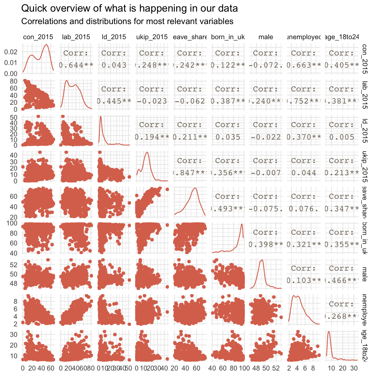
In the following, we describe a few findings based on these plots - no definitive results!
We find an extremely high positive correlation of 0.85 between leave_share and ukip_2015 as well as another significant positive correlation between born_in_uk and leave_share.
The first observation may show that the majority of UKIP voters was also pro-Brexit. The latter relationship will be further investigated later on.
We also find significant negative relationships, e.g. between lab_2015 and con_2015, clearly indicating that the more Labour Party voters there are in a constituency, the less Conservative Party voters there are and vice versa (quite obvious as those are the two biggest parties in the UK). Further negative relationships include those between unemployed and con_2015 as well as age_18to24 and con_2015, indicating that the Conservative Party does not necessarily have many unemployed voters or voters below 24 years of age.
Another interesting dynamic stems from the negative correlations between age_18to24 and leave_share as well as born_in_uk. This may indicate that the more younger voters are in a district, the fewer people are pro-Brexit. A common dynamic during the Brexit referendum was actually that older generations were generally pro Brexit while younger generations were against it. Further, the more voters are between the age of 18 to 24, the less voters were born in the UK. This may stem from many young immigrants settling in the UK.
There are further similar relationships that can be seen in the graph; we will, however not go into detail on all of them.
Distributions
To understand the data and the potential influencing factors on the share of pro-Brexit vothers further, we plot a histogram and a density plot of the leave share in all constituencies.
#creating histogram with binwidth of 2.5
ggplot(brexit_results,
       aes(x = leave_share)) +
        geom_histogram(binwidth = 2.5) +
        labs(title = "The majority of the majority want to leave the EU",
             subtitle = "Histogram showing the spread of the proportion of 'leave the EU-votes'\n over all constituencies",
             x = "Share of leave-votes (%)",
             y = "Count of constituencies") +
  NULL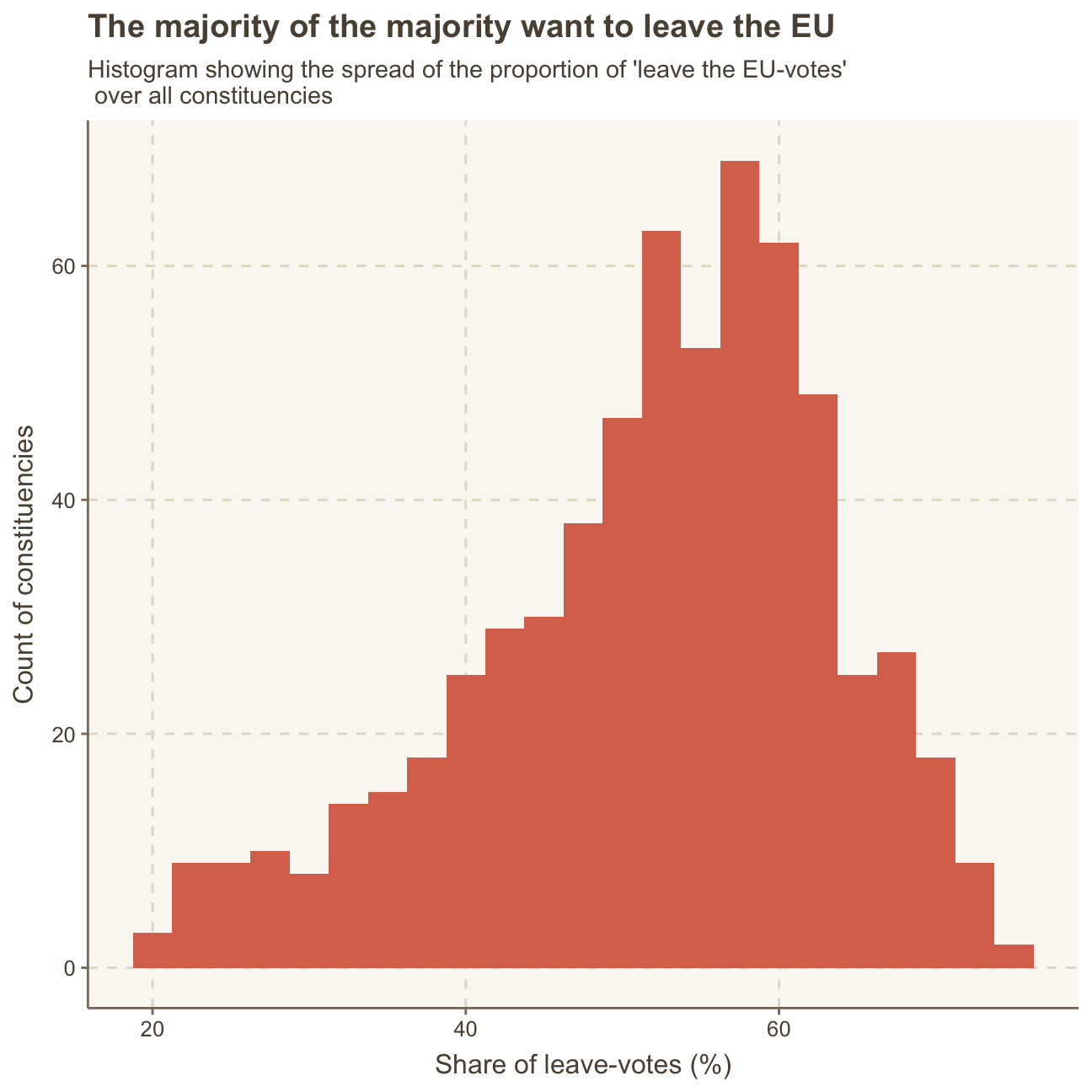
  #creating density plot
ggplot(brexit_results,
       aes(x = leave_share)) +
        geom_density() +
        labs(title = "The majority of the majority want to leave the EU",
             subtitle = "Density plot showing the spread/density of the proportion of 'leave the EU-votes'\n over all constituencies",
             x = "Share of leave-votes (%)",
             y = "Density over all constituencies") +
  NULL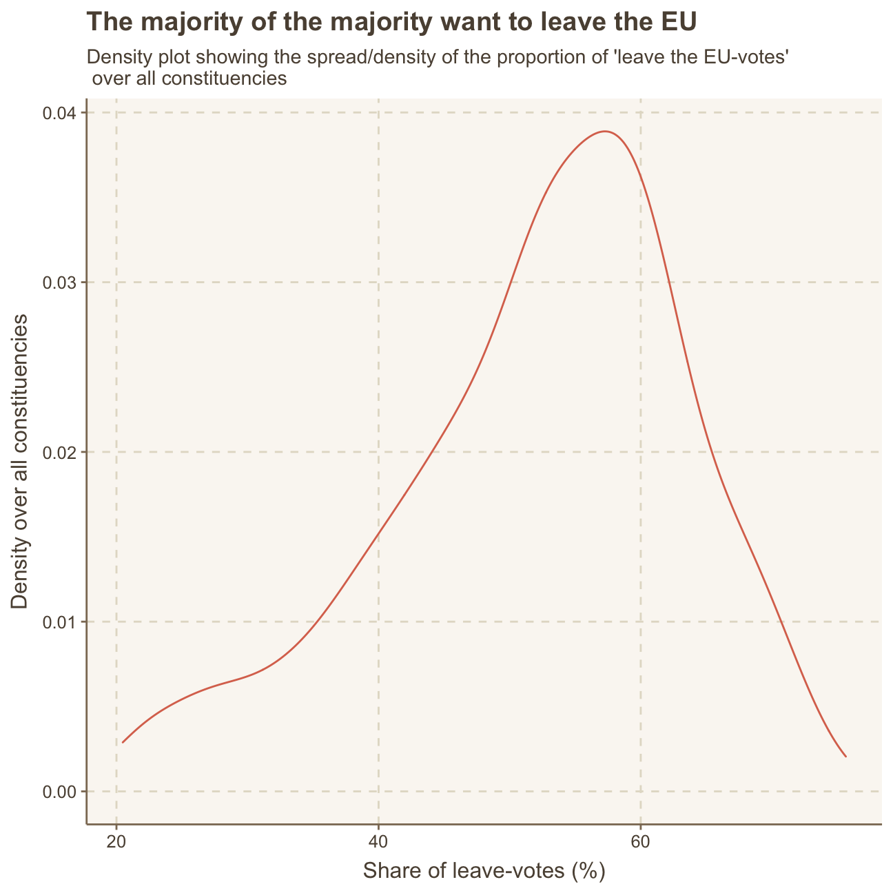
Born in the UK vs. Leave-share
One common explanation for the Brexit outcome was fear of immigration and opposition to the EU’s more open border policy. We can check the relationship between the proportion of native born residents (born_in_uk) in a constituency and its leave_share by calculating the correlation between the two variables.
brexit_results %>%

  #select relevant variables
  select(leave_share, born_in_uk) %>%

  #calculate correlation
  cor()
## leave_share born_in_uk
## leave_share 1.000 0.493
## born_in_uk 0.493 1.000The correlation is almost 0.5, which shows that the two variables are positively correlated.
We can also create a scatterplot between these two variables using geom_point. We add the best fit line, using geom_smooth(method = "lm").
ggplot(brexit_results,
       aes(x = born_in_uk, y = leave_share)) +

  #creating scatterplot
        geom_point(alpha=0.3) +

  #creating trend line
        geom_smooth(method = "lm") +

        labs(title = "Are all UK-born voters pro Brexit?",
             subtitle = "Relationship between the share of voters born in the UK \n and the share of voters that voted to leave the EU over all constituencies",
             x = "Share of UK-born voters (%)",
             y = "Share of leave-voters (%)") +
  NULL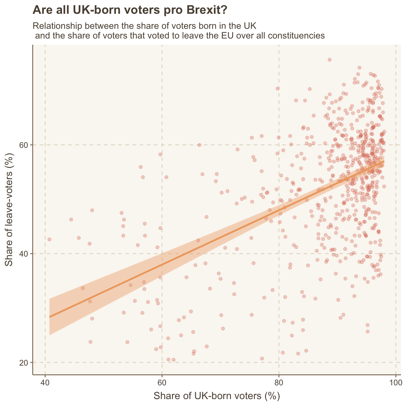
Analysis & Interpretation
Looking at the above graph and the derived correlation of 0.49, a positive relationship between the share of UK-born voters and voters that voted to leave the EU becomes visible. This means that the higher the share of UK-born voters a constituency in the UK has, the more likely the constituency is to also have a higher share of pro-Brexit voters. On the other hand, the higher the share of voters that were born outside of the UK belong to/vote in a constitucency, the lower the share of voters in favour of staying in the EU.
This result is not surprising when we look at the pro and con arguments for Brexit. Brexit means leaving the EU and, thereby, returning the UK to its traditional values, seperated from the EU’s values and regulations. It also means focusing on the UK first and the British being able to govern the country as they like - without major interferences or guidelines from the EU. This means a return to a more traditional and historic UK with less influence from the rest of the continent. Obviously, this is more ingrained into people that were born in the UK and are interested in keeping its culture and values alive. Voters that were not born in the UK may be more interested in well-established international relations as well as a country that is more adapted to the rest of the continent and supports globalized values.
Next to the topic of values and traditions, as mentioned above: “One common explanation for the Brexit outcome was fear of immigration and opposition to the EU’s more open border policy.” Here, it becomes clear that non-UK-born voters are immigrants themselves and, therefore, most probably support more open-minded policies regarding immigrants as well as open border policies. These non-UK-born voters may be interested in the UK being on good terms with their own home country. Further, they may be interested to be able to easily and freely travel to their home countries and back as well as work in the UK. These arguments support the observation that the higher the share of non-UK-born voters live in a constituency, the lower the share of leave-voters.
Lastly, the graph clearly shows that there are more constituencies in the UK with a higher share (approx. 80% and above) of UK-born voters. This is not a surprise since the majority of the population in the UK is also UK-born. Nevertheless, the plot shows some outliers to the overall trend as a few constituencies with a high share of UK-born voters (e.g. >90%) have a relatively low share of leave-voters (<30%). Most of the constituencies with <80% of UK-born voters are relatively widely-spread within a range of 20% to 60% share of leave-voters. There is a slight trend towards lower share of UK-born voters translating to lower share of leave-votes but overall, these observations are quite scattered and it’s difficult to determine a definitive, clear trend. Generally, the points in the plot clearly cluster in the upper right corner, showing that most of the consitutencies consist of mainly UK-born voters and have a relatively high share of leave-voters. In the end, this was logically followed by the UK voters deciding to leave the EU.
Age 18-24 vs. Leave-share
In a next step, it is interesting to also analyse the relationship between the leave-share variable and the age_18to24 variable. We create the same plot as above but replace born_in_ukwith age_18to24.
ggplot(brexit_results,
       aes(x = age_18to24, y = leave_share)) +

  #creating scatterplot
        geom_point(alpha=0.3) +

  #creating trend line
        geom_smooth(method = "lm") +

        labs(title = "Are all young voters against Brexit?",
             subtitle = "Relationship between the share of voters below the age of 24 \n and the share of voters that voted to leave the EU over all constituencies",
             x = "Share of voters aged below 24 (%)",
             y = "Share of leave-voters (%)") +
  NULL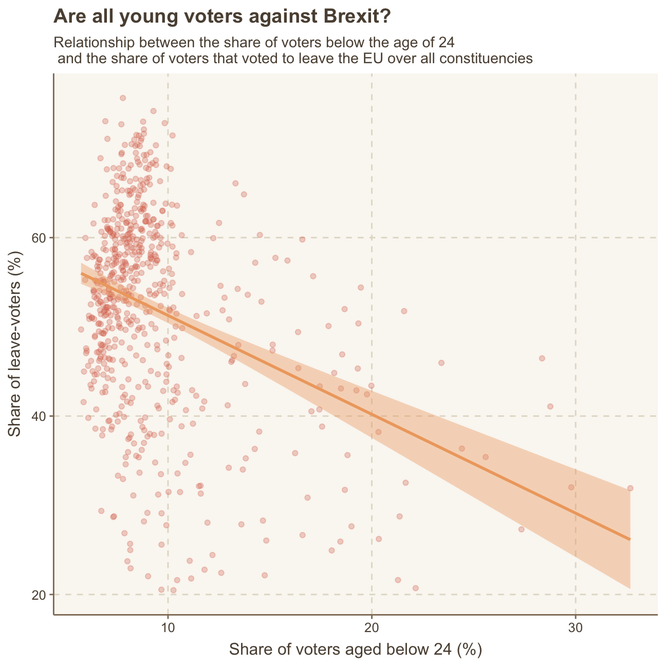
Analysis & Interpretation
As most often the younger generations in the UK are more likely to be in favour of keeping an alliance with the EU in order to stay globally connected, this analysis, as expected, shows that a higher share of 18 to 24 year-olds in a constituency means a relatively lower share of leave-voters.
The reason for this is most likely, again, the large difference between the generations in which older generations highly value the UK’s tradition and history and want to cut ties with the EU to return to their national values, while younger generations are interested in the international exchange the EU provides and, therefore, are not voting to leave the EU.
Political affiliation vs. Leave-share
As we have found earlier, the brexit_results.csv data set involves 632 observations with 11 variables, including each constituency in the UK (Seat), the share of the four parties Conservative Party, Labour Party, Liberal Democrats, UK Independence Party (UKIP) in 2015 as well as the share of pro-brexit voters per constituency. There are further variables which are not necessary for this analysis; we will, therefore, eliminate them.
As the four party share variables are all on the x-axis in the final plot, we will summarize them by using pivot_longer.
brexit <- brexit_results %>%

  #eliminate irrelevant variables, select relevant party variables
            select(Seat, con_2015, lab_2015, ld_2015, ukip_2015, leave_share) %>%

  #pivot longer to summarize party variables
            pivot_longer(2:5, names_to = "party", values_to = "percent" )
With the manipulated data set, we can now produce a plot that shows the relationship between a voter’s political affiliation and the leave-share. In order to colour each political party with its actual party colour, we find the official colour codes per party here.
#reset ggtjemr theme because we will add own aes to the next plot
ggthemr_reset()

#define vector with party-specific colours
colours <- c("#0087dc", "#d50000", "#FDBB30", "#EFE600")

brexit_plot <- brexit %>%
                ggplot(aes(x=percent, y=leave_share)) +

  #add scatter plot with slightly transparent dots (alpha) and slightly bigger size
                geom_point(shape = 21, stroke = 0, alpha = 0.5, size = 2,

                           #colour fill dots by party
                           aes(fill = party))+

  #fill dots with party colour
                scale_fill_manual(values = colours, #
                                  breaks = c("con_2015", "lab_2015", "ld_2015","ukip_2015"), #change labels
                                  labels = c("Conservative", "Labour", "Lib Dems", "UKIP"))+
  #outline dots with party colour
                scale_colour_manual(values = colours,
                                    breaks = c("con_2015", "lab_2015", "ld_2015","ukip_2015"), #change labels
                                    labels = c("Conservative", "Labour", "Lib Dems", "UKIP"))+

  #set limits of x and y scale
                scale_x_continuous(limits = c(0, 82))+
                scale_y_continuous(limits = c(20, 100))+

  #add regression lines
                geom_smooth(method= lm,

                            #decrease line weight
                            size = 0.5,

                            #group and colour lines by party
                            aes(group=party,
                                color = party)) +
  #ad black and white theme
                theme_bw() +

  #position legend at the bottom
                theme(legend.position = "bottom",

                      #delete legend title
                      legend.title = element_blank()) +

                labs(title = "How political affiliation translated to Brexit Voting", #add title
                     x = "Party % in the UK 2015 general election", #add axis labels
                     y = "Leave % in the 2016 Brexit referendum") +
                NULL

#save and scale differently if needed
#ggsave("brexit_plot.png", plot = brexit_plot, width = 11, height = 7, path = here::here("data", "images"))
#knitr::include_graphics(here::here("data", "images", "brexit_plot.png"))

#otherwise just print as it is
brexit_plot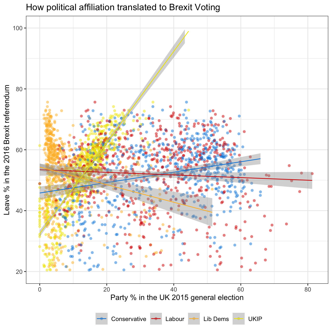
Analysis & Interpretation
In this final analysis we plot the respective share of voters for the Conservative Party, Labour Party, Liberal Democrats and UKIP per constituency in 2015 compared to the respective leave share in the Brexit referendum in 2016.
We find that two positive relationships and two negative relationships. More precisely, we find a steep regression line between the UKIP share and leave-share and a slightly upward facing slope for the regression line between the Conservative Party share and the leave share. This would indicate that the higher the share of UKIP voters in a constituency, the higher the share of pro-Brexit voters.
Despite the regression line being slightly positive, the scatterplot of the Conservative party does not allow for a clear interpretation. This is also true for the Labour Party, despite this regression line being slightly downward sloped.
The scatterplot and regression line of the Liberal Democrats Party is also negatively sloped and is a little more clear on this relationship. This means, we can interpret that the lower the share of Liberal Democrat voters in a constituency, the higher the share of pro-Brexit voters.
Only looking at this analysis, we would now conclude that there is no clear opinion on Brexit within voters of the Conservative- and Labour Party while there is a tendency that UKIP party voters support Brexit and Liberal Democrats do not support Brexit.
This is, however, a rather superficial analysis and in order to find meaningful and definitive interpreations, we would have to look at relationships between further variables.

Brexit