Content
The projects that you can currently find here are:
- Climate change and temperature anomalies
- General Social Survey (GSS)

In the following, you can have a quick look at some projects that I am currently working on. As these are not yet finished, you may find missing explanations, interpretations or planned but not yet executed analyses.
I know you’re excited to see more of my work but please bear with me! These are works in progress and once I was able to continue, refine, finish and polish these, they will appear as individual projects in my portfolio for you to inspect.
Consider this as a teaser… they will leave you wanting more!
The projects that you can currently find here are:

We want to study climate change and find data for that on the Combined Land-Surface Air and Sea-Surface Water Temperature Anomalies in the Northern Hemisphere at NASA’s Goddard Institute for Space Studies. The tabular data of temperature anomalies can be found here
To define temperature anomalies you need to have a reference, or base, period which NASA clearly states that it is the period between 1951-1980.
First, we load the file:
weather <- read_csv("https://data.giss.nasa.gov/gistemp/tabledata_v3/NH.Ts+dSST.csv",
           skip = 1,
           na = "***")
Here, we use two additional options: skip and na.
skip=1 option is there as the real data table only starts in Row 2, so we need to skip one row.na = "***" option informs R how missing observations in the spreadsheet are coded. When looking at the spreadsheet, you can see that missing data is coded as "***". It is best to specify this here, as otherwise some of the data is not recognized as numeric data.Once the data is loaded, we notice that there is a object titled weather in the Environment panel. We inspect the dataframe by clicking on the weather object and looking at the dataframe that pops up on a seperate tab.
For each month and year, the dataframe shows the deviation of temperature from the normal (expected). Further, the dataframe is in wide format.
Before we dive into the data, we want to transform it to a more helpful format.
The weather dataframe has a column for Year and then one column per month of the year (12 more in total). However, there are six further columns that we will not need. In the code below, we use the select() function to select the 13 columns (year and the 12 months) of interest to get rid of the others (J-D, D-N, DJF, etc.).
We also convert the dataframe from wide to ‘long’ format by using the pivot_longer() function. We name the new dataframe tidyweather, the variable containing the name of the month month, and the temperature deviation values delta.
tidyweather <- weather %>%
                  select(Year:Dec) %>%
                  pivot_longer(cols = 2:13, names_to = "Month", values_to = "delta")

glimpse(tidyweather)
## Rows: 1,680
## Columns: 3
## $ Year <dbl> 1880, 1880, 1880, 1880, 1880, 1880, 1880, 1880, 1880, 1880, 188…
## $ Month <chr> "Jan", "Feb", "Mar", "Apr", "May", "Jun", "Jul", "Aug", "Sep", …
## $ delta <dbl> -0.54, -0.38, -0.26, -0.37, -0.11, -0.22, -0.23, -0.24, -0.26, …When inspecting the dataframe with the glimpse() function or by opening the separate tidyweather dataframe tab, we find that our dataset has been reduced to the following three variables now:
Year,Month, anddelta, or temperature deviation.Let us plot the data using a time-series scatter plot, and add a trendline. To do that, we first create a new variable called date in order to ensure that the delta values are plotted chronologically.
We now have a Month variable that includes the months “Jan”, “Feb”, etc. as characters and a month variable that includes those months as ordered factors, i.e. “Jan”<“Feb”< etc.
#create new variable `date` to ensure chronological order
tidyweather <- tidyweather %>%
mutate(date = ymd(paste(as.character(Year), Month, "1")),
month = month(date, label=TRUE),
year = year(date))
#plot time-series scatter plot with time variable on x-axis and temp deviation on y-axis
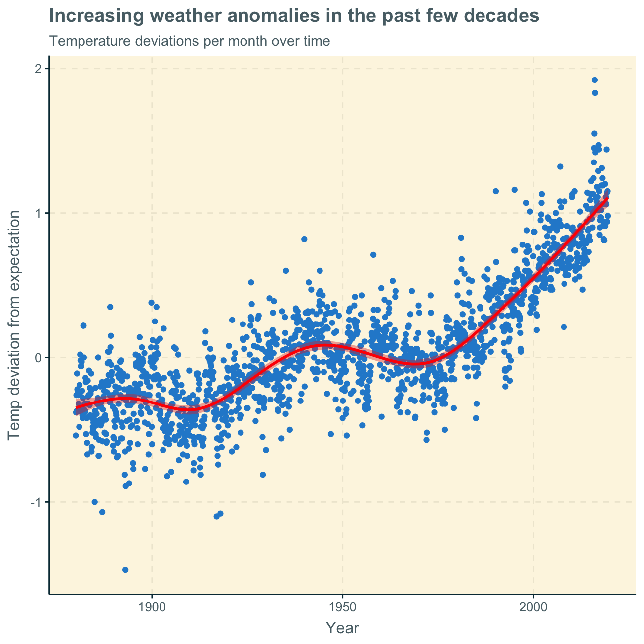
ggplot(tidyweather, aes(x=date, y = delta))+
geom_point()+
geom_smooth(color="red") + #add red trend line
labs (title = "Increasing weather anomalies in the past few decades",
subtitle = "Temperature deviations per month over time",
x = "Year",
y = "Temp deviation from expectation"
)
Next, we want to find out if the effect of increasing temperature deviations is more pronounced in some months. We use facet_wrap() to produce a separate scatter plot for each month, again with a smoothing line.
ggplot(tidyweather, aes(x=date, y = delta))+
  geom_point()+
  geom_smooth(color="red") +

  #facet by month
  facet_wrap(~month) +

  labs (title = "Temperature's rising!",
    subtitle = "Temperature deviations per month over the years",
    x = "Year",
    y = "Temp deviation from expectation"
  )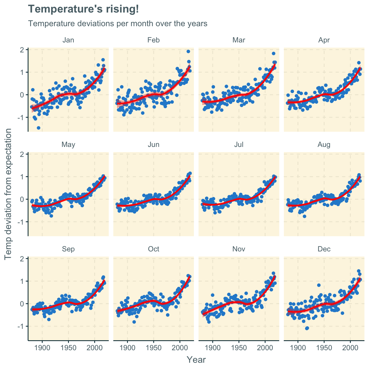
Looking at the produced plots, we find that the increase in temperature deviations from the normal (expected) temperature has increased over the years in every month of the year. Although the trend line has similar shapes in all months, the curve is flatter in some months and steeper in others. We find that the delta has increased more significantly in the winter months (e.g. Nov, Dec, Jan) than the summer months (e.g. Jun, Jul, Aug). This may mean that winters have become significantly hotter or colder but summers have only become slightly hotter or colder over the past decades.
To investigate the historical data further, it may be useful to group it into different time periods.
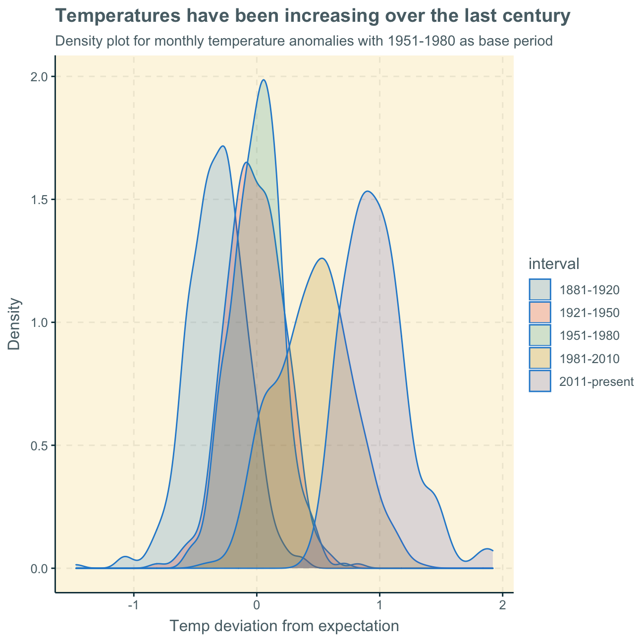
NASA calculates a temperature anomaly, as difference form the base period of 1951-1980. The code below creates a new data frame called comparison that groups data in five time periods: 1881-1920, 1921-1950, 1951-1980, 1981-2010 and 2011-present.
We remove data before 1800 and before using filter. Then, we use the mutate function to create a new variable interval which contains information on which period each observation belongs to. We assign the different periods using case_when().
comparison <- tidyweather %>%
  filter(Year>= 1881) %>%     #remove years prior to 1881
  #create new variable 'interval', and assign values based on criteria below:
  mutate(interval = case_when(
    Year %in% c(1881:1920) ~ "1881-1920",
    Year %in% c(1921:1950) ~ "1921-1950",
    Year %in% c(1951:1980) ~ "1951-1980",
    Year %in% c(1981:2010) ~ "1981-2010",
    TRUE ~ "2011-present"
  ))
Inspecting the comparison dataframe in the Environment pane, we find that the new column interval has been added and shows which period each observation belongs to.
Now that we have the interval variable, we can create a density plot to study the distribution of monthly deviations (delta), grouped by the different time periods we are interested in. We set fill to interval in order to group and colour the data by different time periods.
ggplot(comparison, aes(x=delta, fill=interval))+
  geom_density(alpha=0.2) +   #density plot with transparency set to 20%
                  #theme
  labs (
    title = "Temperatures have been increasing over the last century",
      subtitle = "Density plot for monthly temperature anomalies with 1951-1980 as base period",
    y     = "Density",         #changing y-axis label to sentence case
    x = "Temp deviation from expectation"
  )
So far, we have been working with monthly anomalies. However, we are also interested in average annual anomalies. We do this by using group_by() and summarise(), followed by a scatter plot to display the result.
#creating yearly average delta
average_annual_anomaly <- tidyweather %>%
  group_by(Year) %>%   #grouping data by Year

  # creating summaries for mean delta
  # use `na.rm=TRUE` to eliminate NA (not available) values
  summarise(annual_average_delta = mean(delta, na.rm=TRUE))

#plotting the data:
ggplot(average_annual_anomaly, aes(x=Year, y= annual_average_delta))+
  geom_point()+

  #Fit the best fit line, using LOESS method
  geom_smooth(method = "loess") +

  #change to theme_bw() to have white background + black frame around plot

  labs (
    title = "Significant temperature anomalies since 1970s",
      subtitle = "Average yearly temperature deviation from the normal",
    y     = "Average annual temp anomaly",
    x = "Year"
) 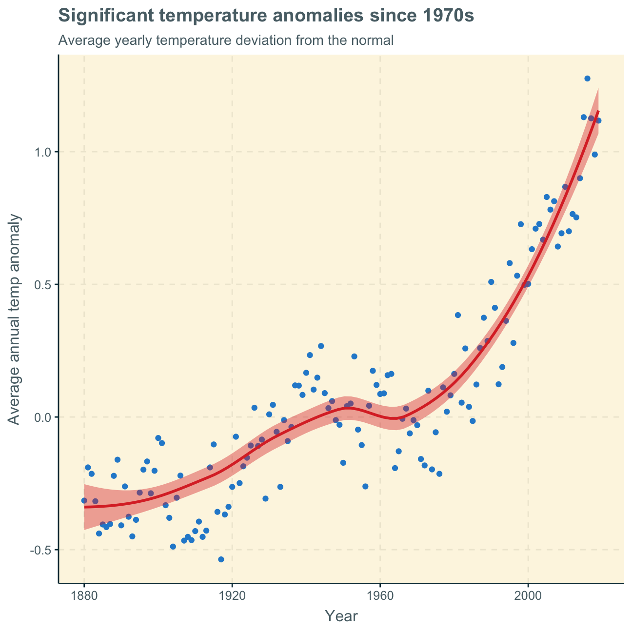
The analyses of monthly and annual temperature anomalies show very similar results. Over time, i.e. over both months and years, temperature overall increases. As the base period for the “normal” is 1951-1980, it is obvious that the deviations from the expected temperature in these years are relatively small (close to zero). This results in the small stagnating part of the curve around these years. The deviations before that time period are negative with the greatest negative deviation at the beginning of the observation years in 1880, decreasing the negative with every year after. After the base period, the deviations become positive and increasingly higher. The positive deviations are especially steep after around 1980.
This graph clearly shows an average temperature increase over the past century since 1880 with especially significant increases in the past few decades since 1980. This clearly depicts what is commonly known as climate change and how rising temperatures have been fueled by technologies and lifestyle of the 20th and 21st century.
In a next step, it would be interesting to split the data into geographical sections instead of periodical sections to investigate which specific regions of the world are more or less affected by climate change.
deltaNASA points out on their website that
A one-degree global change is significant because it takes a vast amount of heat to warm all the oceans, atmosphere, and land by that much. In the past, a one- to two-degree drop was all it took to plunge the Earth into the Little Ice Age.
Here, we will construct a confidence interval (CI) for the average annual delta since 2011. We use the dataframe comparison as it has already grouped temperature anomalies according to time intervals and we are only interested in what is happening between 2011-present.
First, we construct the CI by using a formula.
formula_ci <- comparison %>%
                filter(interval == "2011-present") %>%  #choose the interval 2011-present

  # calculate summary statistics for temperature deviation (delta)
  # calculate mean, SD, count, SE, lower/upper 95% CI
                summarise(mean = mean(delta, na.rm = TRUE), SD = sd(delta, na.rm = TRUE), count = n(), SE = SD/sqrt(count), ci_lower = mean - 1.96*SE, ci_upper = mean + 1.96*SE)

#print out formula_CI
formula_ci
## # A tibble: 1 x 6
## mean SD count SE ci_lower ci_upper
## <dbl> <dbl> <int> <dbl> <dbl> <dbl>
## 1 0.966 0.262 108 0.0252 0.916 1.02#CI = [0.916, 1.02]Second, we construct the CI by using a bootstrap simulation with the infer package.
library(infer)
#set seed number
set.seed(1234)

boot_temp <- comparison %>%
  # Select 2011-present
  filter(interval == "2011-present") %>%

  # Specify the variable of interest
  specify(response = delta) %>%

  # Generate a bunch of bootstrap samples
  generate(reps = 1000, type = "bootstrap") %>%

  # Find the mean of each sample
  calculate(stat = "mean")

#calculate 95% confidence interval
percentile_ci <- boot_temp %>%
  get_ci(level = 0.95, type = "percentile")

percentile_ci #print 95% CI
## # A tibble: 1 x 2
## lower_ci upper_ci
## <dbl> <dbl>
## 1 0.917 1.02Using formulas and individually calculating the mean, standard deviation, count and standard error gives us the results of the last but one code chunk above. We construct a 95% CI by both adding and subtracting the standard error times 1.96 (z score for 95% confidence) to/from the mean. We find the CI to be [0.916, 1.02].
Using the bootstrap simulation in the last code chunk, we generate multiple bootstrap samples and find the mean of each of these samples to then find that the 95% CI is [0.917, 1.02].
When using the summary statistics, we are 95% confident that the average yearly temperature anomaly is between [0.916, 1.02]. When using bootstrap, we found this interval to be [0.917, 1.02].
These results support our earlier analysis. The confidence intervals show us that a positive temperature deviation of around 1 degree Celcius is highly likely to occur, proving the overall hypothesis that our temperatures are increasing every year (by around 1 degree Celcius). As define by the NASA earlier, these seemingly small temperature increases can have significant implications for the Earth, our climate and our nature.

The General Social Survey (GSS) gathers data on American society in order to monitor and explain trends in attitudes, behaviours, and attributes. Many trends have been tracked for decades, so one can see the evolution of attitudes, etc in American Society.
In this assignment, we analyze data from the 2016 GSS sample data, using it to estimate values of population parameters of interest about US adults. The GSS sample data file has 2867 observations of 935 variables, but we are only interested in very few of these variables and, therefore, use a smaller file with 2867 observations of 7 variables.
We won’t take responses like “No Answer”, “Don’t Know”, “Not applicable”, “Refused to Answer” into consideration.
gss <- read_csv(here::here("data", "smallgss2016.csv"),
                na = c("", "Don't know",
                       "No answer", "Not applicable"))
We will be creating 95% confidence intervals for population parameters. The variables we have are the following:
emailhr and emailmin variables. For example, if the response is 2.50 hours, this would be recorded as emailhr = 2 and emailmin = 30.snapchat, instagrm, twitter: whether respondents used these social media in 2016sex: Female - Maledegree: highest education level attainedFirst, we estimate the population proportion of Snapchat or Instagram users in 2016.
We begin by creating a new variable, snap_insta that is Yes if the respondent reported using any of Snapchat (snapchat) or Instagram (instagrm), and No if not. If the recorded value was NA for both of these questions, the value in the new variable should also be NA.
gss_new <- gss %>%
             mutate(snap_insta = case_when(snapchat == "Yes"~"Yes",
                                           instagrm == "Yes"~"Yes",
                                           snapchat == "NA"~"NA",
                                           instagrm == "NA"~"NA",
                                            TRUE ~ "No"
                                          ))

gss_new
## # A tibble: 2,867 x 8
## emailmin emailhr snapchat instagrm twitter sex degree snap_insta
## <chr> <chr> <chr> <chr> <chr> <chr> <chr> <chr>
## 1 0 12 NA NA NA Male Bachelor NA
## 2 30 0 No No No Male High school No
## 3 NA NA No No No Male Bachelor No
## 4 10 0 NA NA NA Female High school NA
## 5 NA NA Yes Yes No Female Graduate Yes
## 6 0 2 No Yes No Female Junior college Yes
## 7 0 40 NA NA NA Male High school NA
## 8 NA NA Yes Yes No Female High school Yes
## 9 0 0 NA NA NA Male High school NA
## 10 NA NA No No No Male Junior college No
## # … with 2,857 more rowsNext, we calculate the proportion of Yes’s for snap_insta among those who answered the question, i.e. excluding NAs.
gss_new %>%
  filter(snap_insta != "NA") %>%  #eliminate NAs
  group_by(snap_insta) %>%
  summarise(count = n()) %>%
  mutate(frequency = count/sum(count)) #add frequency column
## # A tibble: 2 x 3
## snap_insta count frequency
## <chr> <int> <dbl>
## 1 No 858 0.625
## 2 Yes 514 0.375We find that 37.5% of respondents (excluding NAs) used either Snapchat or Instagram or both.
Using the CI formula for proportions, we construct 95% CIs for men and women who used either Snapchat or Instagram.
#define count of respondents who use snapchat and/or instagram
snap_insta_all <- gss_new %>%
                            filter(snap_insta == "Yes") %>%
                            summarise(count = n())

#define count of female respondents who use snapchat and/or instagram
snap_insta_f <- gss_new %>%
                            filter(snap_insta == "Yes", sex == "Female") %>%
                            summarise(count = n())

#define count of male respondents who use snapchat and/or instagram
snap_insta_m <- gss_new %>%
                            filter(snap_insta == "Yes", sex == "Male") %>%
                            summarise(count = n())

#Create CI for twitter "Female"
prop.test(sum(snap_insta_f), sum(snap_insta_all))
##
## 1-sample proportions test with continuity correction
##
## data: sum out of sumsnap_insta_f out of snap_insta_all
## X-squared = 32, df = 1, p-value = 1e-08
## alternative hypothesis: true p is not equal to 0.5
## 95 percent confidence interval:
## 0.583 0.668
## sample estimates:
## p
## 0.626#find CI = [0.583, 0.668]
#find sample estimate p = 0.626
#Create CI for twitter "Male"
prop.test(sum(snap_insta_m), sum(snap_insta_all))##
## 1-sample proportions test with continuity correction
##
## data: sum out of sumsnap_insta_m out of snap_insta_all
## X-squared = 32, df = 1, p-value = 1e-08
## alternative hypothesis: true p is not equal to 0.5
## 95 percent confidence interval:
## 0.332 0.417
## sample estimates:
## p
## 0.374#find CI = [0.332, 0.417]
#find sample estimate p = 0.374Following this calculation, we are 95% confident that the true population proportion of people that use either Snapchat or Instagram or both is female is between 58.3% and 66.8%. Similarly, we are 95% confident the proportion that use either Snapchat or Instagram or both is male is between 33.2% and 41.7%.
The prop.test command also shows us that the sample values for the regarded data is 62.6% female Snapchat/Instagram users and 37.4% male users.
Here, we estimate the population proportion of Twitter users by education level in 2016.
There are 5 education levels in variable degree which, in ascending order of years of education, are Lt high school, High School, Junior college, Bachelor, Graduate.
First, we turn degree from a character variable into a factor variable. We also make sure the order is the correct one and that levels are not sorted alphabetically which is what R by default does.
#find out which class `degree` is
class(gss_new$degree)
## [1] "character"#convert `degree` to factor
degree_f <- as.factor(gss_new$degree)
#check again
class(degree_f)## [1] "factor"#order education levels
degree_fo <- c("Lt high school", "High school", "Junior college", "Bachelor", "Graduate")Next, we create a new variable, bachelor_graduate that is Yes if the respondent has either a Bachelor or Graduate degree. As before, if the recorded value for either was NA, the value in the new variable should also be NA. For all other degree levels, the new variable is No.
gss_new2 <- gss %>%
             mutate(bachelor_graduate = case_when(degree == "Bachelor"~"Yes",
                                                  degree == "Graduate"~"Yes",
                                                  degree == "NA"~"NA",
                                                  TRUE ~ "No"
                                          ))

gss_new2
## # A tibble: 2,867 x 8
## emailmin emailhr snapchat instagrm twitter sex degree bachelor_gradua…
## <chr> <chr> <chr> <chr> <chr> <chr> <chr> <chr>
## 1 0 12 NA NA NA Male Bachelor Yes
## 2 30 0 No No No Male High scho… No
## 3 NA NA No No No Male Bachelor Yes
## 4 10 0 NA NA NA Female High scho… No
## 5 NA NA Yes Yes No Female Graduate Yes
## 6 0 2 No Yes No Female Junior co… No
## 7 0 40 NA NA NA Male High scho… No
## 8 NA NA Yes Yes No Female High scho… No
## 9 0 0 NA NA NA Male High scho… No
## 10 NA NA No No No Male Junior co… No
## # … with 2,857 more rowsHere, we calculate the proportion of bachelor_graduate who do (Yes) and who don’t (No) use twitter.
gss_new2 %>%
  filter(twitter != "NA", bachelor_graduate == "Yes") %>% #filter out NAs in twitter responses and only bachelor_graduate
  group_by(twitter) %>%   #only considering respondents with a Bachelor or Graduate degree
  summarise(count = n()) %>%
  mutate(frequency = count/sum(count))
## # A tibble: 2 x 3
## twitter count frequency
## <chr> <int> <dbl>
## 1 No 375 0.767
## 2 Yes 114 0.233We find that a majority of 76.7% of respondents with a Bachelor or Graduate degree do not use Twitter while the rest, 23.3% do use Twitter.
Using the CI formula for proportions, we construct two 95% CIs for the true bachelor_graduate population proportion - whether they use (Yes) and don’t (No) use twitter. We exclude NAs for Twitter again.
#define count of respondents with Bachelor or Graduate degree
bg_all <- gss_new2 %>%
                            filter(bachelor_graduate == "Yes", twitter != "NA") %>%
                            summarise(count = n())

#define count of respondents with Bachelor or Graduate degre that USE twitter
bg_all_t <- gss_new2 %>%
                            filter(bachelor_graduate == "Yes", twitter == "Yes") %>%
                            summarise(count = n())

#define count of respondents with Bachelor or Graduate degre that DO NOT USE twitter
bg_all_nt <- gss_new2 %>%
                            filter(bachelor_graduate == "Yes", twitter == "No") %>%
                            summarise(count = n())

#Create CI for twitter "Yes"
prop.test(sum(bg_all_t), sum(bg_all))
##
## 1-sample proportions test with continuity correction
##
## data: sum out of sumbg_all_t out of bg_all
## X-squared = 138, df = 1, p-value <2e-16
## alternative hypothesis: true p is not equal to 0.5
## 95 percent confidence interval:
## 0.197 0.274
## sample estimates:
## p
## 0.233#find CI = [0.197, 0.274]
#find sample estimate p = 0.233
#Create CI for twitter "No"
prop.test(sum(bg_all_nt), sum(bg_all))##
## 1-sample proportions test with continuity correction
##
## data: sum out of sumbg_all_nt out of bg_all
## X-squared = 138, df = 1, p-value <2e-16
## alternative hypothesis: true p is not equal to 0.5
## 95 percent confidence interval:
## 0.726 0.803
## sample estimates:
## p
## 0.767#find CI = [0.726, 0.803]
#find sample estimate p = 0.767Following this calculation, we are 95% confident that the population proportion with a Bachelor or Graduate degree that use Twitter is between 19.7% and 27.4%. Similarly, we are 95% confident that the population proportion with a Bachelor or Graduate degree that does not use Twitter is between 72.6% and 80.3%.
These two confidence intervals do not overlap. This is most likely the case as the two proportions are rather extreme. Considering the available data, were the two proportions more centred to the middle (e.g. both proportions around 50%), they would be more likely to overlap.
Lastly, we estimate the population parameter on time spent on email weekly.
We start by creating a new variable called email that combines emailhr and emailmin to reports the number of minutes the respondents spend on email weekly. We start by transforming the existing two variables to a numeric format as they are currently characters.
gss_new3 <- gss %>%
              filter(emailhr != "NA", emailmin != "NA") %>%  #eliminate NAs
                #change variable format from character to numeric for both email hr and min
                mutate(emailhr_n = as.numeric(emailhr)) %>%
                mutate(emailmin_n = as.numeric(emailmin)) %>%
                #create email variable that combines previous variables as total number of minutes
                mutate(email = emailhr_n*60+emailmin_n)
Next, we want to visualise the distribution of this new variable.
First, we find the mean and the median number of minutes respondents spend on email weekly.
#calculate and define email mean
mean_email <- gss_new3 %>%
                filter(email != "NA") %>%
                pull(email) %>%
                mean() %>%
                signif(5)
mean_email
## [1] 417#mean_email is 417
#calculate and define email median
median_email <- gss_new3 %>%
filter(email != "NA") %>%
pull(email) %>%
median()
median_email## [1] 120#median_email is 120We find that the average (mean) amount of time Americans spend on emails per week is 417 minutes (6 hrs 57 minutes). We find the median at 120 minutes (2 hours).
In order to find out if the mean or the median is a better measure of the typical time Americans spend on emails weekly, we look at the distribution by plotting the density function below.
Consequently, we plot the distribution of the email variable with a density function. We disregard the NAs of the emailhr and emailmin variables and, therefore, also the NAs of the new email variable. We also add a red line that indicates the mean (as calculted above) and a green line that indicates the median.
#create density plot
gss_new3 %>%
    filter(email != "NA") %>% #filter out NAs
    ggplot(aes(x = email)) +
    geom_density(fill = "dodgerblue", alpha = 0.2) +
    geom_vline(xintercept = mean_email, size = 0.5, colour = "red") +     #add mean line in red
    geom_vline(xintercept = median_email, size = 0.5, colour = "green")+  #add median line in green
    geom_text(aes(x=mean_email+270, label=paste0("Mean\n", mean_email), y=0.0025)) + #add label to mean
    geom_text(aes(x=median_email-270, label=paste0("Median\n", median_email), y=0.0005)) + #add label to median

    labs(title = "Most emails answered within 8 hours",
         subtitle = "Distribution of minutes spend on emails among Americans",
         x = "Minutes",
         y = "Density") +
    NULL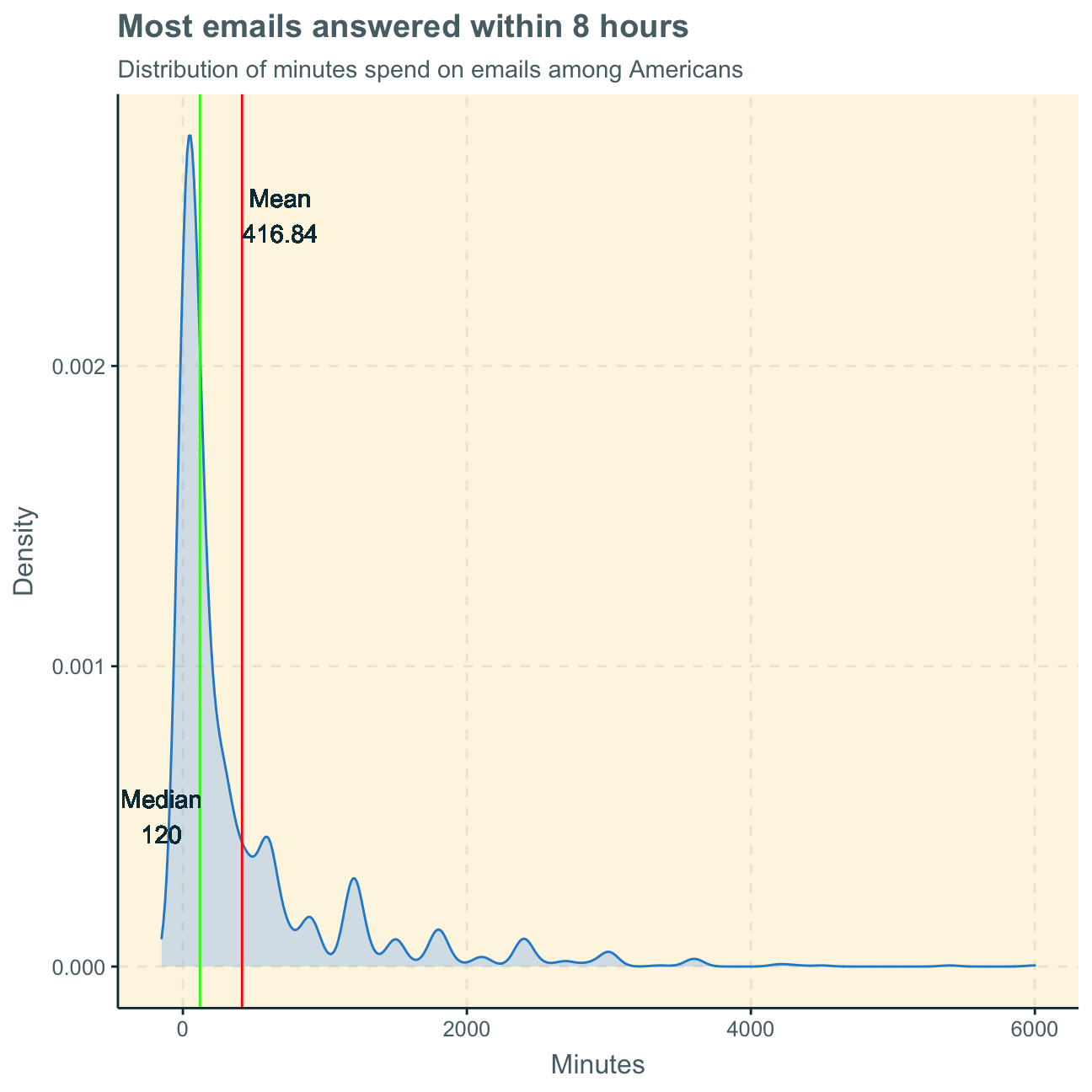
Interpreting the graph, we find the median at 120 minutes to be a better measure of the typical time Americans spend on emails per week. The time an American spends on emails per week generally highly depends on other variables such as age and job. Therefore, there will be a large spread of observation points within a population as some people spend their entire week on emails for their job, while others may not even own an email account. In the graph, we can see that the majority of observation points records a relatively low amount of time spend on emails at around 100 minutes. However, there are several outliers that record more than 1000 minutes (some even more than 4000 minutes) per week. This makes clear that the mean of 417 minutes is skewed by these outliers and, therefore, not a representative measure for the typical American. Thus, we consider the median to be more representative.
Lastly, we calculate a 95% bootstrap confidence interval for the mean amount of time Americans spend on email weekly.
library(infer)
set.seed(1234)  #set seed number

boot_email <- gss_new3 %>%
    filter(email != "NA") %>%         #eliminate NAs
    specify(response = email) %>%       #specify variable of interest
    generate(reps = 1000, type = "bootstrap") %>%   #generate bunch of bootstrap samples
    calculate(stat = "mean")          #find mean of each sample

email_ci <- boot_email %>%      #calculate 95% confidence interval
  get_ci(level = 0.95, type = "percentile")

email_ci #print 95% CI
## # A tibble: 1 x 2
## lower_ci upper_ci
## <dbl> <dbl>
## 1 385. 453.#find CI = [385, 453] minutesFollowing this, we are 95% confident that the true average amount of time Americans spend on email weekly is between 6 hrs and 25 minutes and 7 hrs and 33 minutes.
This shows the CI for the true population average. Again, the average may, however, not be very representative of the typical American. Considering this CI, a typical American would spend around 1 hr per day on emails. This may be true for people who work in an office job that requires a lot of email communication. However, there is a large chunk of the population that does not require emails for work and an hour a day on emails may seem a little odd to them. Again, this average is biased by some people spending an incredible amount of time on emails per week and, therefore, the median is a better representation of the typical American than the mean.
Alternatively, we could create a 99% confidence interval instead of a 95% one. As the confidence is higher, meaning we are even more confident that the population parameter is within this interval, the range of values becomes less specific. The larger the interval, the greater the Standard Error and the more certain one is that that confidence interval includes the true parameter.
Therefore, a 99% CI would be wider than a 95% interval as it shows a larger range of values.
When actually using the bootstrap simulation for a 99% CI, we find the following results:
email_ci99 <- boot_email %>%      #calculate 95% confidence interval
  get_ci(level = 0.99, type = "percentile")

email_ci99 #print 99% CI
## # A tibble: 1 x 2
## lower_ci upper_ci
## <dbl> <dbl>
## 1 375. 465.#find CI = [375, 465] minutesConsequently, we can be 99% confident that the true average amount of time Americans spend on email weekly is between 6 hrs and 15 minutes and 7 hrs and 45 minutes. While the range of the 95% CI between the lower and the upper limit was 1 hr and 8 minutes, the range of the 99% CI is 1 hr and 30 minutes and, thereby, 22 minutes larger. Including more possible true values (i.e. 22 more minutes in total) increases our confidence as there is a larger pool of values that may be true.