Gapminder data set
The gapminder dataset has data on life expectancy, population, and GDP per capita for 142 countries from 1952 to 2007. To get an understanding of the dataframe, namely to see the variable names, variable types, etc., we use the glimpse function. We also have a look at the first 10 rows of data.
#load gapminder data
library(gapminder)

#glimpse at data
glimpse(gapminder)
## Rows: 1,704
## Columns: 6
## $ country   <fct> Afghanistan, Afghanistan, Afghanistan, Afghanistan, Afghani…
## $ continent <fct> Asia, Asia, Asia, Asia, Asia, Asia, Asia, Asia, Asia, Asia,…
## $ year      <int> 1952, 1957, 1962, 1967, 1972, 1977, 1982, 1987, 1992, 1997,…
## $ lifeExp   <dbl> 28.8, 30.3, 32.0, 34.0, 36.1, 38.4, 39.9, 40.8, 41.7, 41.8,…
## $ pop       <int> 8425333, 9240934, 10267083, 11537966, 13079460, 14880372, 1…
## $ gdpPercap <dbl> 779, 821, 853, 836, 740, 786, 978, 852, 649, 635, 727, 975,…
#look at the first 10 rows of the data set
head(gapminder, 10)
## # A tibble: 10 x 6
##    country     continent  year lifeExp      pop gdpPercap
##    <fct>       <fct>     <int>   <dbl>    <int>     <dbl>
##  1 Afghanistan Asia       1952    28.8  8425333      779.
##  2 Afghanistan Asia       1957    30.3  9240934      821.
##  3 Afghanistan Asia       1962    32.0 10267083      853.
##  4 Afghanistan Asia       1967    34.0 11537966      836.
##  5 Afghanistan Asia       1972    36.1 13079460      740.
##  6 Afghanistan Asia       1977    38.4 14880372      786.
##  7 Afghanistan Asia       1982    39.9 12881816      978.
##  8 Afghanistan Asia       1987    40.8 13867957      852.
##  9 Afghanistan Asia       1992    41.7 16317921      649.
## 10 Afghanistan Asia       1997    41.8 22227415      635.
#skim data
skim(gapminder)
(#tab:raw_data_summary_statistics)Data summary
|
|
|
|
Name
|
gapminder
|
|
Number of rows
|
1704
|
|
Number of columns
|
6
|
|
_______________________
|
|
|
Column type frequency:
|
|
|
factor
|
2
|
|
numeric
|
4
|
|
________________________
|
|
|
Group variables
|
None
|
Variable type: factor
|
skim_variable
|
n_missing
|
complete_rate
|
ordered
|
n_unique
|
top_counts
|
|
country
|
0
|
1
|
FALSE
|
142
|
Afg: 12, Alb: 12, Alg: 12, Ang: 12
|
|
continent
|
0
|
1
|
FALSE
|
5
|
Afr: 624, Asi: 396, Eur: 360, Ame: 300
|
Variable type: numeric
|
skim_variable
|
n_missing
|
complete_rate
|
mean
|
sd
|
p0
|
p25
|
p50
|
p75
|
p100
|
hist
|
|
year
|
0
|
1
|
1.98e+03
|
1.73e+01
|
1952.0
|
1.97e+03
|
1.98e+03
|
1.99e+03
|
2.01e+03
|
▇▅▅▅▇
|
|
lifeExp
|
0
|
1
|
5.95e+01
|
1.29e+01
|
23.6
|
4.82e+01
|
6.07e+01
|
7.08e+01
|
8.26e+01
|
▁▆▇▇▇
|
|
pop
|
0
|
1
|
2.96e+07
|
1.06e+08
|
60011.0
|
2.79e+06
|
7.02e+06
|
1.96e+07
|
1.32e+09
|
▇▁▁▁▁
|
|
gdpPercap
|
0
|
1
|
7.22e+03
|
9.86e+03
|
241.2
|
1.20e+03
|
3.53e+03
|
9.33e+03
|
1.14e+05
|
▇▁▁▁▁
|
For a broad overview, we find that the data set has 1,704 observations within 6 variables.
The variables are:
countrycontinentyearlifeExp: The average life expectancy for the respective country within the respective yearpop: The population of the respective country within the respective yeargdpPercap: Gross Domestic Product (GDP) per capity (per person) in the respective country within the respective year
While the first two variables are characters, the others are numeric variables.
Using the skim() function, we find that all observations are complete and none of the variables misses any values. We further find that there are 142 unique values for country as well as 5 unique values for continent, meaning the 1,704 observations spread across 142 countries on 5 continents. Since the data includes observations from 1952 to 2007, every country and continent includes multiple observations of the other variables at several, different points in time.
Country Comparison
We start by creating two new data sets, country_data and continent_data, filtering the gapminder data for one country (here, my home country Germany) and for one continent (Europe).
country_data <- gapminder %>%
            filter(country == "Germany") #Choosing Germany because I am from Germany

continent_data <- gapminder %>%
            filter(continent == "Europe")
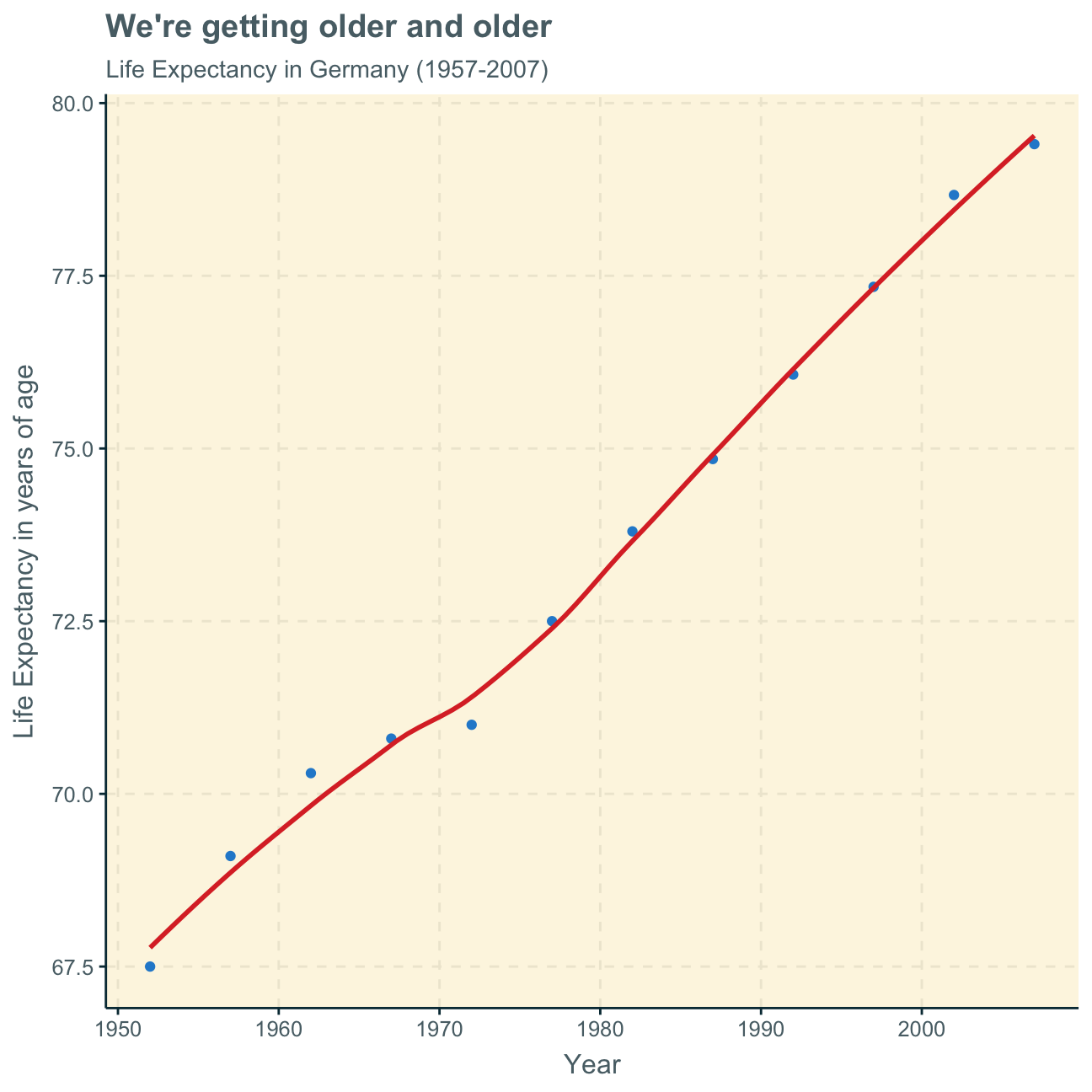
In the following, we create a plot of life expectancy over time for Germany from 1952 to 2007 to see how life expectancy has changed over the years in my home country.
ggplot(country_data,
       aes(x = year, y = lifeExp)) +
     geom_point() +
     geom_smooth(se = FALSE) +
     labs(title = "We're getting older and older",
          subtitle = "Life Expectancy in Germany (1957-2007)",
          x = "Year",
          y = "Life Expectancy in years of age") +
     NULL
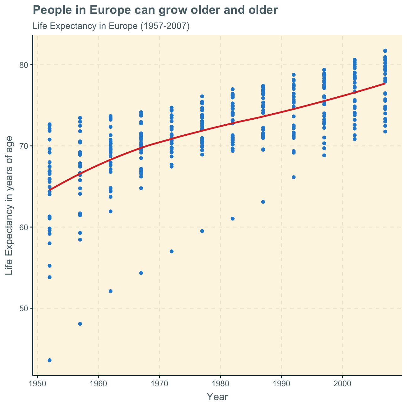
Next, we want to produce a graph to see how the life expectancy has changed over the years in Europe - the continent which Germany belongs to.
We creat a plot with the continent data to give an overview of the development of life expectancy in Europe.
ggplot(continent_data,
       aes(x = year, y = lifeExp)) +
   geom_point() +
   geom_smooth(se = FALSE) +
  labs(title = "People in Europe can grow older and older",
       subtitle = "Life Expectancy in Europe (1957-2007)",
       x = "Year",
       y = "Life Expectancy in years of age") +
   NULL
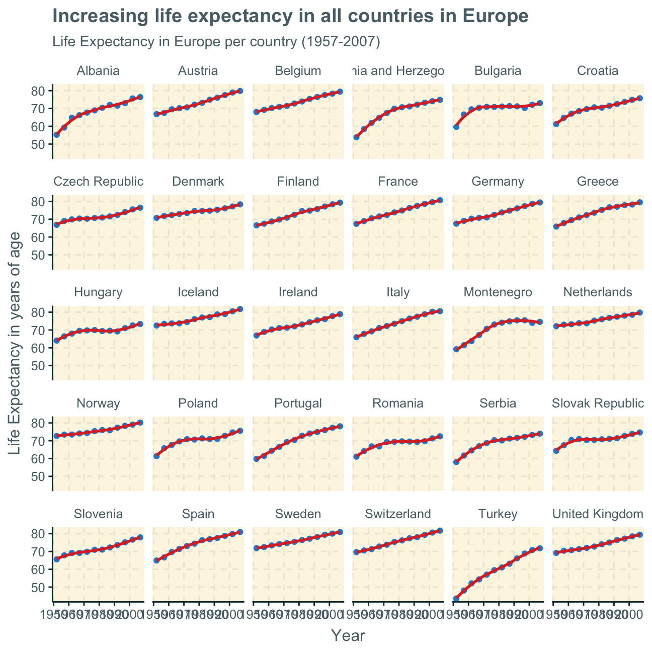
The plot above includes all countries in one graph. Alternatively, we can facet the plot per country to show the differences within the countries in Europe.
ggplot(continent_data,
       aes(x = year, y = lifeExp)) +
   geom_point() +
   geom_smooth(se = FALSE) +

  #facet by country
  facet_wrap(~country) +

  labs(title = "Increasing life expectancy in all countries in Europe",
       subtitle = "Life Expectancy in Europe per country (1957-2007)",
       x = "Year",
       y = "Life Expectancy in years of age") +
   NULL
Despite there being differences within a continent, we can also look at the differences between continents. Here, we create a plot from the original gapminder data (not the filtered datasets created before), showing the life expectancy over the years per continent.
ggplot(gapminder,
       aes(x = year , y = lifeExp)) +
   geom_point() +
   geom_smooth(se = FALSE) +

  #facet by continent
   facet_wrap(~continent) +

  #delete legend
   theme(legend.position="none") +

  labs(title = "People all over the world are getting older and older",
       subtitle = "Life Expectancy over all continents",
       x = "Year",
       y = "Life Expectancy in years of age") +
   NULL
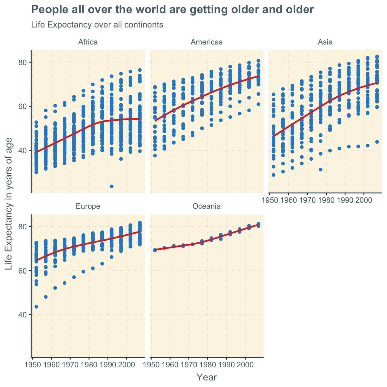
Analysis & Interpretation
The life expectancy of humans overall increases over the years 1952 to 2007 on all continents.
This may be due to improved and more widely available healthcare and medicine all around the world. Additionally, globalisation
allows us to share advice on health and wellbeing world-wide which makes the planet overall more knowledgable on how to extend our
lives.
Africa, the Americas and Asia all experienced a relatively steep increase in life expectancy over time which may result from an extreme improvement of healthcare in those continents in the regarded 55 years. Europe and Oceania seem to have already had a better health infrastracture during the mid-20th century as their life expectancies were already comparatively high at the beginning of the observations in 1952. Still, their healthcare also improved over the years - and so did these continents’ life expectancy - but as the initial level was already relatively higher, the overall increase in life expextancy in Europe and Oceania was not as rapid as in Afria, the Americas and Asia.
Lastly, the increase in life expectancy seems to slow down or even slightly stagnate on all continents but Oceania, possibly indicating that a certain limit to life expectancy will soon be reached. Furthermore, in Africa, average life expectancy seems to have already stagnated - if not will soon begin to decrease. This may indicate a deterioration of healthcare and wellbeing in some countries in Africa. This could also be explained by severe diseases or pandemics leading to earlier deaths in a few countries that decrease the overall continent life expectancy.
It is, however, difficult to make clear analyses per continent as most continents show wide differences in life expectancy developments between the countries within one continent. This is not true for Oceania as it only consists of two countries with similar life expectancies. The graphs, however, show that there are large ranges of the highest and lowest life expectancies and their developments over time per country on all other continents.
Gapminder 2.0
Data cleaning and tidying
Recalling the original gapminder data frame from the gapminder package, we find that that data frame we investigated until now contains just six columns from the larger data in Gapminder World.
In this part, we join a few data frames with more data than the ‘gapminder’ package. Specifically, we look at data on
We use the wbstats package to download data from the World Bank. The relevant World Bank indicators are SP.DYN.TFRT.IN, SE.PRM.NENR, NY.GDP.PCAP.KD, and SH.DYN.MORT
# load data
hiv <- vroom(here::here("data", "adults_with_hiv_percent_age_15_49.csv"))
life_expectancy <- vroom(here::here("data", "life_expectancy_years.csv"))

# get World bank data using wbstats
library(wbstats)
indicators <- c("SP.DYN.TFRT.IN","SE.PRM.NENR", "SH.DYN.MORT", "NY.GDP.PCAP.KD")


worldbank_data <- wb_data(country="countries_only", #countries only- no aggregates like Latin America, Europe, etc.
                          indicator = indicators,
                          start_date = 1960, #1952?
                          end_date = 2016) #2007?

# get a dataframe of information regarding countries, indicators, sources, regions, indicator topics, lending types, income levels,  from the World Bank API
countries <-  wbstats::wb_cachelist$countries
In the following, we join the 3 dataframes (life_expectancy, worldbank_data, and HIV) into one. We tidy the data first and then perform join operations.
We begin by tidying the hiv and the life_expectancy dataframes through pivot_longer so that we can summarize several coloumns which will help us with our analysis and, primarly, will help us to join the dataframes. We both use the merge and the left_join operations to try out what works and what doesn’t and see which one is preferable.
(Disclaimer: We prefer left_join as join operation over merge as it’s faster but we keep both operations in our code to show that both are possible to use)
#tidy hiv through pivot longer
hiv_tidy <- hiv %>%
  pivot_longer(cols = c("1979":"2011"),
               names_to = "date",
               values_to = "cases")

#tidy life_expectancy through pivot longer
life_expectancy_tidy <- life_expectancy %>%
  pivot_longer(cols = c("1800":"2100"),
               names_to = "date",
               values_to = "cases")

#join dataframes
hiv_life <-merge(hiv_tidy, life_expectancy_tidy,
                 by = c( "date","country"))

#select relevant variables
world_clean <- worldbank_data %>%
  select("date","country","SP.DYN.TFRT.IN","SE.PRM.NENR", "SH.DYN.MORT", "NY.GDP.PCAP.KD")

#join again
world_hiv_life <- merge(hiv_life,world_clean,
                        by = c("date","country"))
Data gaps
Next, we investigate which regions have the most observations with missing HIV data by plotting a bar chart. We used colours to indicate the regions as putting the regions on the x-axis only looks messy.
#load data
countries <- vroom(here::here("data", "countries.csv"))

#join data frames
regions_countries_HIV <- countries %>%
  left_join(hiv_tidy, by="country")

#create new data set with missing values for selected variables
missinghiv <- regions_countries_HIV %>%
  select(admin_region, cases) %>%

  #group by region
  group_by(admin_region) %>%

  #count missing values
  summarize(na_count = sum(is.na(cases))) %>%

  #order in most to least missing values
  arrange(desc(na_count)) %>%

  #remove countries that are not placed in administrative regions
  na.omit()


#plot newly created dataset
ggplot(missinghiv,
       aes(x= reorder(admin_region, -na_count),
           y=na_count,

           #colour by region so that we have a legend and no labels on the x axis
           fill = admin_region)) +

  geom_col()+

  #eliminate x axis labels
  scale_x_discrete(label="")+

  labs(title = "Most data gaps for Sub-Saharan Africa",
       subtitle = "Number of missing values for HIV Data per region",
       y="missing values for HIV Data",
       x="") +

  #delete axes text and legend title
  theme(axis.text.x=element_blank(),
        axis.ticks.x=element_blank(),
        legend.title = element_blank()) +
  NULL
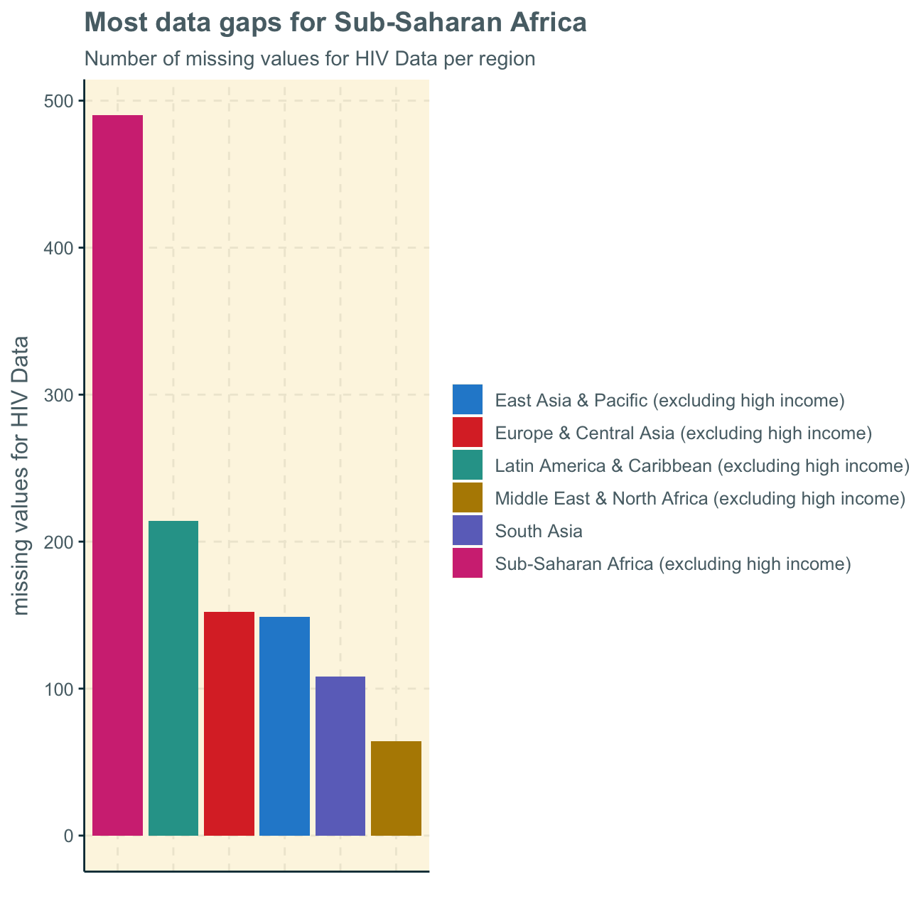
We find that, by far, the most values are missing within the Sub-Saharan Africa data observations. We will take these findings into consideration when regarding further analysis and their applicabilaty.
HIV vs. life expectancy
As a first analysis, we generate a scatterplot with a smoothing line to investigate the the relationship between HIV prevalence and life expectancy.
ggplot(data = world_hiv_life,
       aes(x= cases.x, y = cases.y)) +
        geom_point()+
        geom_smooth() +
        labs(title = "Does HIV decrease a country's life expectancy?" ,
             subtitle = "Relationship between HIV prevalence and life expectancy",
             x = "HIV Prevalence (%)",
             y = "Life Expectancy (years of age)") +
        NULL
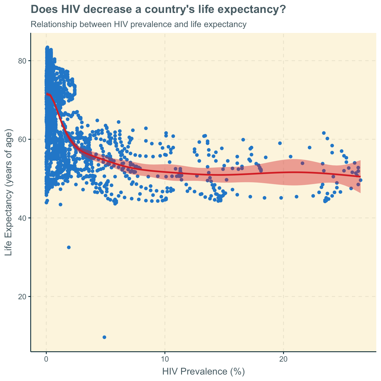
The graph shows a somewhat inverse relationships between HIV prevalence and life expectancy - however, this is only true for a lower percentage of HIV prevelance (below around 5%). We can further notice, that there are many more data points with a relatively low HIV prevalence. We can see that for an extremely low HIV prevelance (below around 3%), life expectancy is overall highest at up to more than 80. HIV prevalence of around 5%-30% corresponds to a somewhat lower life expectancy between 40 and 60.
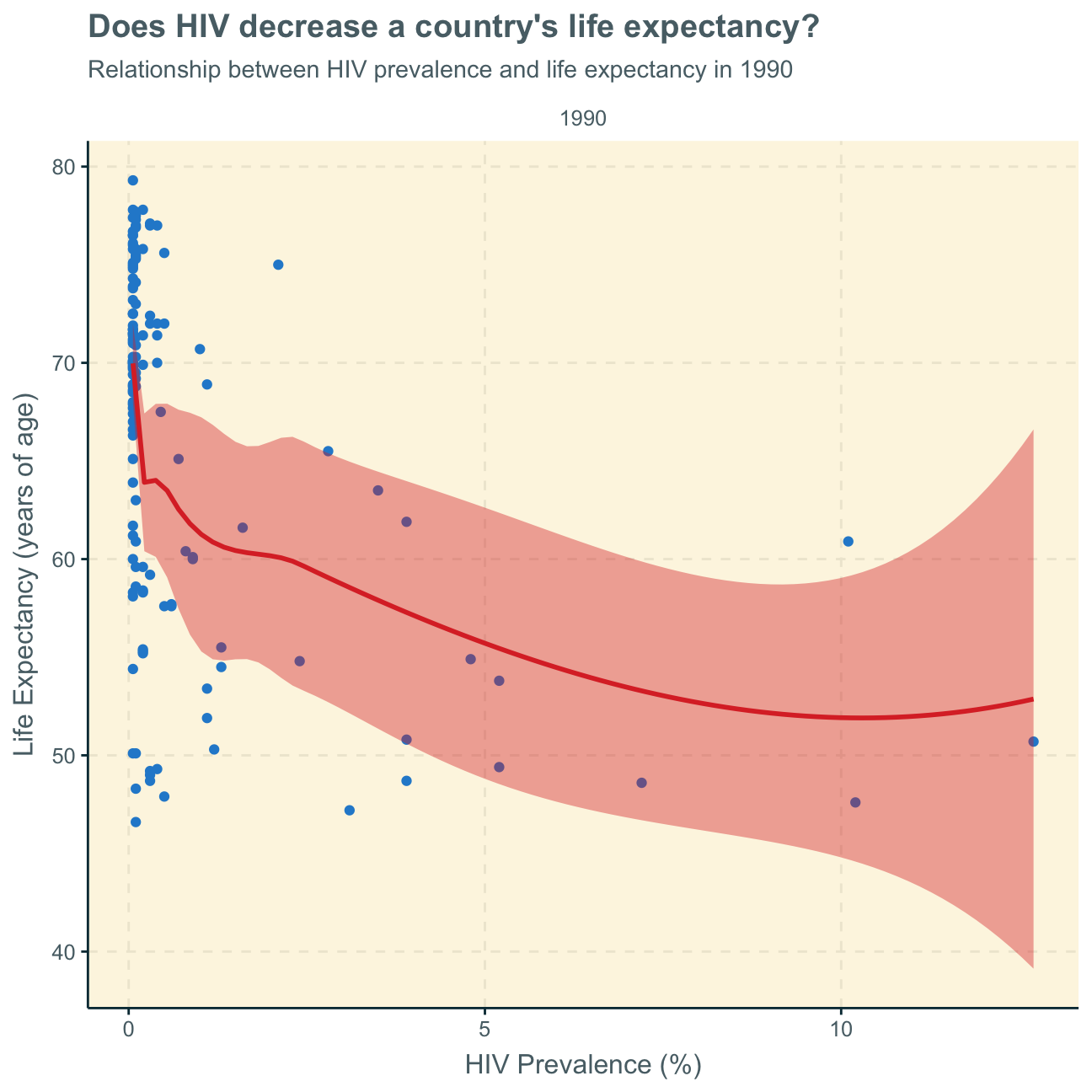
As the graph does not separate the time variable and plots several years for a country, we want to look at two graphs from 1990 (beginning of most data points) and 2011 (last data points) to understand if/how this relationship has developed over time.
world_hiv_life %>%

  #filter data for year 1990
  filter(date == "1990") %>%

    ggplot(aes(x= cases.x, y = cases.y)) +
        geom_point()+
        geom_smooth()+
        facet_wrap(~date)+
        labs(title = "Does HIV decrease a country's life expectancy?" ,
             subtitle = "Relationship between HIV prevalence and life expectancy in 1990",
             x = "HIV Prevalence (%)",
             y = "Life Expectancy (years of age)") +
        NULL
world_hiv_life %>%

  #filter data for year 2011
  filter(date == "2011") %>%

    ggplot(aes(x= cases.x, y = cases.y)) +
        geom_point()+
        geom_smooth()+
        facet_wrap(~date)+
        labs(title = "Does HIV decrease a country's life expectancy?" ,
             subtitle = "Relationship between HIV prevalence and life expectancy in 2011",
             x = "HIV Prevalence (%)",
             y = "Life Expectancy (years of age)") +
        NULL
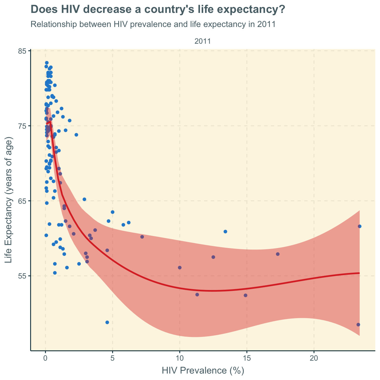
We find that the nature of the relationship (negative relationship) has stayed the same over time - it seems as if it even intensified over the years.
Finally, we cannot tell from this analysis if the higher life expectancy is because of fewer relative HIV cases or if countries with generally higher life expectancy due to higher economic wealth and better health infrastructures are, thus, also less likely to experience HIV cases or earlier deaths caused by HIV.
As the picture is not really clear, in a further analysis, we would use facet_wrap on this plot to investigate if there are any regional differences.
GDP vs. fertility rate
Next, we want to analyse the relationship between fertility rate and GDP per capita. As the general analysis gives us a rather odd picture, we facet by region to understand geographical trends better. In order to show the trends better, the scales are free and different per region.
#create new data set that includes regions
worldbank_data_regions <- wb_data(country = "regions_only" , #use aggregate regions
                                  indicator = indicators,
                                  start_date = 1960,
                                  end_date = 2016)

#create new data set and select relevant variables
world_clean_regions <- worldbank_data_regions %>%
  select("date","country","SP.DYN.TFRT.IN","SE.PRM.NENR", "SH.DYN.MORT", "NY.GDP.PCAP.KD")

#plot newly created data set
ggplot(data = world_clean_regions,
       aes(x= SP.DYN.TFRT.IN, y = NY.GDP.PCAP.KD)) +
          geom_point() +
          geom_smooth()+

  #facet by country and set scale of each plot free so that we can observe trend directions rather than absolute value comparisons
          facet_wrap( ~ country, scale = "free") +

          labs (title = "More babies, more money?",
                subtitle = "Relationship between fertility rate and GDP per capita per region",
                x = "Fertility Rate (Number of babies per woman)",
                y = "GDP per capita ($)") +
          NULL
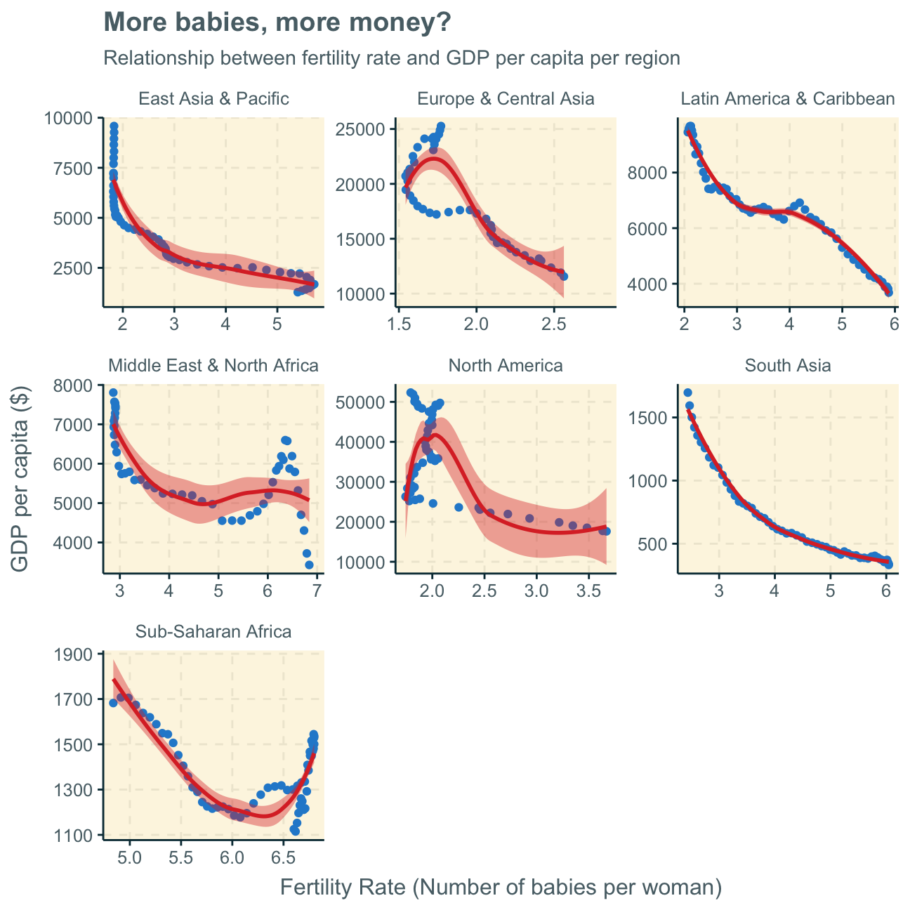
Again, the analyses are not 100% clear but there seem to be somewhat inverse relationships between fertility rate and a country’s GDP per capita in all regions - apart from some bumps inbetween. This effect is clearer in some areas (e.g. South Asia) than others (e.g. North America). However, we must not disregard the fact that some regions have a wide variety of countries and individual economic dynamics while other regions, such as North America, have fewer countries (here, only USA & Canada), which could lead to difficulties in comparing everything one on one.
Generally, one can observe a general trend of more a higher fertility rate translating to a lower GDP per capita and vice versa. This is a common difference between advanced and developing countries, where in developing countries, families often have multiple children while for families in advanced countries (with higher GDP per capita) it is more common to have around 2 children.
Again, it is difficult to observe time as an important variable here. For further investigation, we add the colour graphics in the graph below and delete the geom_smooth trend line.
ggplot(data = world_clean_regions,
       aes(x= SP.DYN.TFRT.IN, y = NY.GDP.PCAP.KD,
           colour = date)) +
          geom_point() +

  #facet by country and set scale of each plot free so that we can observe trend directions rather than absolute value comparisons
          facet_wrap( ~ country, scale = "free") +

          labs (title = "More babies, more money?",
                subtitle = "Relationship between fertility rate and GDP per capita per region",
                x = "Fertility Rate (Number of babies per woman)",
                y = "GDP per capita ($)") +
          NULL
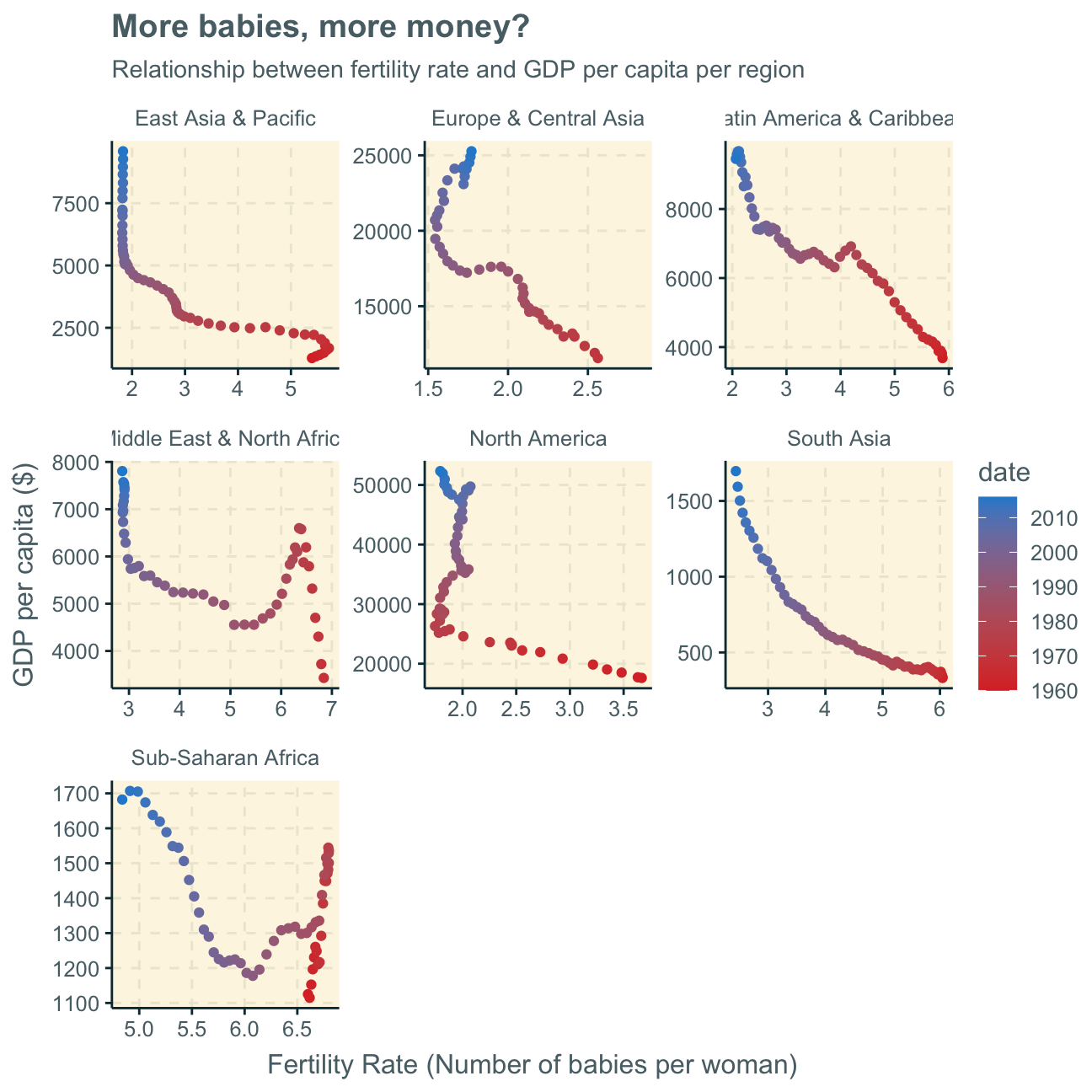
Consequently, we find that time is actually a highly influencing factor that we cannot disregard. Every graph (every region) clearly shows that there was a generally higher fertility rate and lower GDP per capita in the past which developed into a respectively higher (still on relative terms as there are still vast differences between countries’ GDP per capita) GDP per capita along with a lower fertility rate.
This trend may have many influencing factors, one being women starting to work in full-time jobs over the past decades, increasing a countries GDP through added work while at the same time, potentially, leaving less time to have (many) children.
Child mortality
Now, we investigate how the mortality rate for under 5 changed has changed by region. In each region, we find the top 5 countries that have seen the greatest improvement, as well as those 5 countries where mortality rates have had the least improvement or even deterioration. The ‘Aggregates’ panel serves the purpose of comparing regions to the general trend of all regions put together.
under5mortality <- vroom(here::here("data", "under5mortality.csv"))

#tidy data
tidyunder5mortality <- under5mortality %>%
  pivot_longer(cols = c("1960":"2019"),
               names_to = "year",
               values_to = "Mortality")

  names(tidyunder5mortality)[1]="country"

#join datasets
mortality_region <- tidyunder5mortality %>%
  left_join(regions_countries_HIV, by="country")

#select/calculate relevant data
trend_under5 <- mortality_region %>%
  select(year, region, Mortality) %>%
    group_by(year,region) %>%
      na.omit() %>%
        summarize(mean_mortality=mean(Mortality))

#plot data
ggplot(data = trend_under5,
       aes(x=year,
           y=mean_mortality,
           group = region)) +
    geom_point() +
    facet_wrap(~region, scale = "free")+ #facet by region, set scale free to make it better understandable & trends more visible
  labs(title = "Lower mortality rate for under 5 over the last decades globally",
       subtitle = "Change of mortality rate for under 5 over time per region",
        y="Deaths per 1000 children",
        x = "Year")+
        scale_x_discrete(name="",
                         breaks  = c("1960","1970","1980","1990","2000","2010","2020")
        )
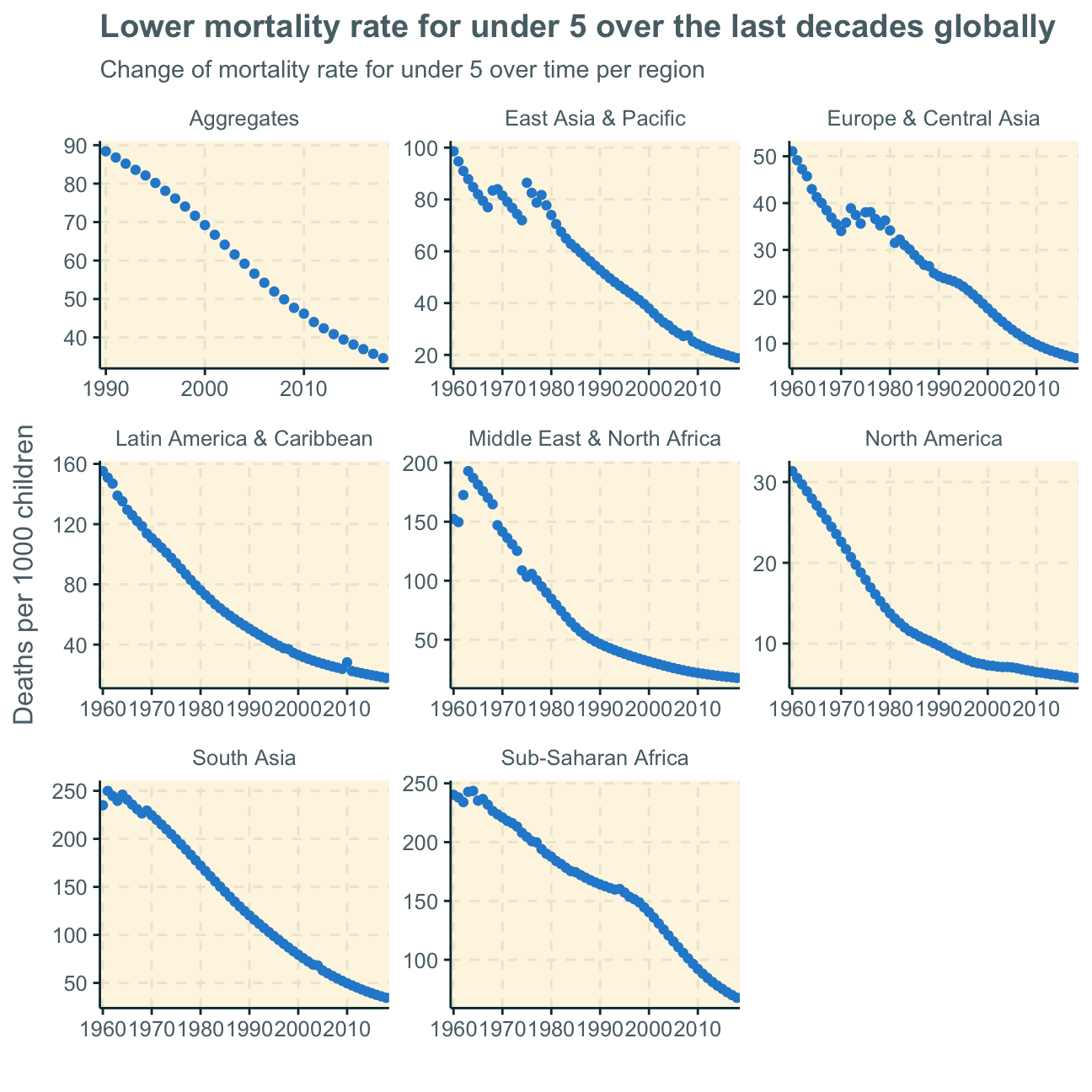
As we can see, mortality rates for children under 5 have decreased in all regions over the past decades. This trend is most probably because of better health infrastructures and wealthier economies all around the world. More peace and less war will be an influencing factor too.
Moving on, the following tables represent the percent changes in mortality rate for under 5 from 1970 to 2018. WHY 1970
We will look at a number of tables that show the top 5 countries with both the greatest and worst improvement in mortality rates under 5. You will find the specific title commented in the code and then a table with the name of the 5 countries and their respective percent change (pct_change in percentage points).
We will not discuss every single finding as several different regions and many different dynamics are in place here.
library(kableExtra)
mortality_improvements <- mortality_region %>%
                              select(year,region,country, Mortality) %>%
                                group_by(year,country,region) %>%
                                  filter(year == "1970" | year == "2018") %>% #selecting 1970 rather than 1960 as there were too many missing values in the latter
                                     unique() %>%
                                      na.omit()


mortality_improvements_new <- mortality_improvements %>%
                                  group_by(country) %>%
                                    arrange(country) %>%
                                      mutate(pct_change = (Mortality/lag(Mortality) - 1) * 100) %>%
                                        na.omit()
East Asia & Pacific
Here, we find the countries with the greatest improvement in child mortality (under 5) to be nations such as China, Singapore and Japan which have also economically boomed over the past decades, most probably leading to significant improvements in health infrastructures as well. All countries in this region with the least improvement are island nations, which potentially indicate less/more difficult accessibility to medical supplies.
#East Asia & Pacific greatest improvement S
east_asia_top <- mortality_improvements_new %>%
                    filter(region == "East Asia & Pacific") %>%
                    select(country,pct_change) %>%
                    arrange(pct_change) %>%
                    head(5)

kbl(east_asia_top,
    caption="Top 5 most improved in East Asia & Pacific") %>%
  kable_styling()
Table 1: Top 5 most improved in East Asia & Pacific
|
country
|
pct_change
|
|
Korea, Rep.
|
-94.8
|
|
China
|
-92.4
|
|
Thailand
|
-90.8
|
|
Singapore
|
-89.7
|
|
Japan
|
-85.6
|
#East Asia & Pacific smallest improvement INSELSTAATEN > MEDICAL ANBINDUNG

east_asia_bottom <- mortality_improvements_new %>%
                        filter(region == "East Asia & Pacific") %>%
                        select(country,pct_change) %>%
                        arrange(desc(pct_change)) %>%
                        head(5)

kbl(east_asia_bottom,
    caption="Top 5 least improved in East Asia & Pacific") %>%
  kable_styling()
Table 1: Top 5 least improved in East Asia & Pacific
|
country
|
pct_change
|
|
Fiji
|
-55.5
|
|
Marshall Islands
|
-58.4
|
|
Kiribati
|
-62.1
|
|
Philippines
|
-66.1
|
|
Papua New Guinea
|
-66.7
|
South Asia
As there are only 8 countries observable, we decrease the smallest improvement to a top 3. Apart from Pakistan and Afghanistan, all countries in this region experienced a relatively high improvement in child mortality, possibly because overall improvements in health infrastructures and medical progress. Considerably lower percent changes in Pakistan and Afghanistan may result from war zones.
#South Asia greatest improvement
sa_top <- mortality_improvements_new %>%
            filter(region == "South Asia") %>%
            select(country,pct_change) %>%
            arrange(pct_change) %>%
            head(5)

kbl(sa_top,
    caption="Top 5 most improved South Asia") %>%
  kable_styling()
Table 2: Top 5 most improved South Asia
|
country
|
pct_change
|
|
Maldives
|
-96.7
|
|
Sri Lanka
|
-89.7
|
|
Bhutan
|
-89.1
|
|
Nepal
|
-87.8
|
|
Bangladesh
|
-86.5
|
#South Asia smallest improvement

sa_bottom <- mortality_improvements_new %>%
              filter(region == "South Asia") %>%
              select(country,pct_change) %>%
              arrange(desc(pct_change)) %>%
              head(3)

kbl(sa_bottom,
    caption="Top 3 least improved in South Asia") %>%
  kable_styling()
Table 2: Top 3 least improved in South Asia
|
country
|
pct_change
|
|
Pakistan
|
-63.6
|
|
Afghanistan
|
-79.4
|
|
India
|
-82.9
|
Europe & Central Asia
Here, we find already very privileged countries to have experienced the smallest improvements in child mortality as they already had/have well developed (health) infrastructures (e.g. Denmark, Netherlands, Switzerland). Less developed (for European terms) countries such as Turkey and Portugal have experienced comparatively high progress and, thus, also highest percentage imrpovements in child mortality rates.
#Europe & Central Asia greatest improvement
europe_asia_top <- mortality_improvements_new %>%
                      filter(region == "Europe & Central Asia") %>%
                      select(country,pct_change) %>%
                      arrange(pct_change) %>%
                      head(5)

kbl(europe_asia_top,
    caption="Top 5 most improved in Europe & Central Asia") %>%
  kable_styling()
Table 3: Top 5 most improved in Europe & Central Asia
|
country
|
pct_change
|
|
Portugal
|
-94.6
|
|
Turkey
|
-94.4
|
|
Italy
|
-91.1
|
|
Finland
|
-89.4
|
|
Luxembourg
|
-89.2
|
#Europe & Central Asia smallest improvement
europe_asia_bottom <- mortality_improvements_new %>%
                        filter(region == "Europe & Central Asia") %>%
                        select(country,pct_change) %>%
                        arrange(desc(pct_change)) %>%
                        head(5)

kbl(europe_asia_bottom,
    caption="Top 5 least improved in Europe & Central Asia") %>%
  kable_styling()
Table 3: Top 5 least improved in Europe & Central Asia
|
country
|
pct_change
|
|
Denmark
|
-74.7
|
|
Netherlands
|
-75.3
|
|
Switzerland
|
-77.7
|
|
France
|
-78.0
|
|
Bulgaria
|
-78.2
|
Latin America
We can observe the variety of economical progress within Latin America by observing the large range of up to 91pp (Peru) improvement in child mortality rate over the time period as the best improvement and 40pp improvement as smallest change (Dominica). Again, we find island nations to have smaller improvements in child mortality rate, potentially indicating worse medical supply.
#Latin America greatest improvement
latam_top <- mortality_improvements_new %>%
                  filter(region == "Latin America & Caribbean") %>%
                  select(country,pct_change) %>%
                  arrange(pct_change) %>%
                  head(5)

kbl(latam_top,
    caption="Top 5 most improved in Latin America & Caribbean") %>%
  kable_styling()
Table 4: Top 5 most improved in Latin America & Caribbean
|
country
|
pct_change
|
|
Peru
|
-91.3
|
|
Chile
|
-91.0
|
|
El Salvador
|
-90.9
|
|
Ecuador
|
-89.7
|
|
Nicaragua
|
-89.4
|
#Latin America smallest improvement
latam_bottom <- mortality_improvements_new %>%
                  filter(region == "Latin America & Caribbean") %>%
                  select(country,pct_change) %>%
                  arrange(desc(pct_change)) %>%
                  head(5)

kbl(latam_bottom,
    caption="Top 5 least improved in Latin America & Caribbean") %>%
  kable_styling()
Table 4: Top 5 least improved in Latin America & Caribbean
|
country
|
pct_change
|
|
Dominica
|
-40.0
|
|
Guyana
|
-59.2
|
|
Venezuela, RB
|
-60.7
|
|
Trinidad and Tobago
|
-64.5
|
|
Bahamas, The
|
-66.4
|
Middle East & North Africa
Here, we find countries such as the UAE, Oman and Bahrain that have developed into more privileged countries over the past decades to also show the best improvement in child mortality rates. Again, the countries with the smallest improvement include war zones and countries with less developed infrastructures.
#Middle East & North Africa greatest improvement
mena_top <- mortality_improvements_new %>%
              filter(region == "Middle East & North Africa") %>%
              select(country,pct_change) %>%
              arrange(pct_change) %>%
              head(5)

kbl(mena_top,caption="Top 5 most improved in Middle East & North Africa") %>%
  kable_styling()
Table 5: Top 5 most improved in Middle East & North Africa
|
country
|
pct_change
|
|
Oman
|
-95.0
|
|
United Arab Emirates
|
-92.2
|
|
Egypt, Arab Rep.
|
-91.3
|
|
Libya
|
-91.2
|
|
Bahrain
|
-90.6
|
#Middle East & North Africa smallest improvement

mena_bottom <- mortality_improvements_new %>%
  filter(region == "Middle East & North Africa") %>%
  select(country,pct_change) %>%
  arrange(desc(pct_change)) %>%
  head(5)

kbl(mena_bottom,caption="Top 5 least improved in Middle East & North Africa") %>%
  kable_styling()
Table 5: Top 5 least improved in Middle East & North Africa
|
country
|
pct_change
|
|
Malta
|
-74.8
|
|
Iraq
|
-76.5
|
|
Jordan
|
-81.9
|
|
Yemen, Rep.
|
-83.2
|
|
Syrian Arab Republic
|
-83.8
|
North America
As we only have two countries with the USA and Canada, it’s difficult to draw conclusions and compare nations.
#North America greatest improvement
na_top <- mortality_improvements_new %>%
              filter(region == "North America") %>%
              select(country,pct_change) %>%
              arrange(pct_change) %>%
              head(5)

kbl(na_top,
    caption="USA & Canada") %>%
  kable_styling()
Table 6: USA & Canada
|
country
|
pct_change
|
|
Canada
|
-77.3
|
|
United States
|
-72.0
|
Sub-Saharan Africa
We again find a large difference between the best improvement in percentage points at -88.6pp and the smallest improvement at -47.9pp. This shows the different dynamics in the many African countries and no clear trend or development that concerns the entire continent.
We generally have to be careful with this interpretation as, as we found earlier, the data set includes many gaps for the Sub-Saharan Africa observations.
#Sub-Saharan Africa greatest improvement
ssa_top <- mortality_improvements_new %>%
              filter(region == "Sub-Saharan Africa") %>%
              select(country,pct_change) %>%
              arrange(pct_change) %>%
              head(5)

kbl(ssa_top,
    caption="Top 5 most improved in Sub-Saharan Africa") %>%
  kable_styling()
Table 7: Top 5 most improved in Sub-Saharan Africa
|
country
|
pct_change
|
|
Cabo Verde
|
-88.6
|
|
Malawi
|
-85.5
|
|
Senegal
|
-84.9
|
|
Rwanda
|
-84.1
|
|
Mauritius
|
-81.4
|
#Sub-Saharan Africa smallest improvement
ssa_bottom <- mortality_improvements_new %>%
                filter(region == "Sub-Saharan Africa") %>%
                select(country,pct_change) %>%
                arrange(desc(pct_change)) %>%
                head(5)

kbl(ssa_bottom,
    caption="Top 5 least improved in Sub-Saharan Africa") %>%
  kable_styling()
Table 7: Top 5 least improved in Sub-Saharan Africa
|
country
|
pct_change
|
|
Central African Republic
|
-47.9
|
|
Lesotho
|
-54.5
|
|
Nigeria
|
-57.9
|
|
Namibia
|
-59.6
|
|
Zimbabwe
|
-60.0
|
Overall, it is noticeable that there was (luckily) no observation of an increase in child mortality rate between 1970 and 2018 in the observed countries.
However, investigating a relative percent change will always only tell half the story. Knowing the actual beginning and ending rates of child mortality for each country would make this analysis more meaningful. More precisely, our percent change analysis does not show if, for example, a country already had a really low mortality rate and then only a small improvement or if it actually had a really high mortality rate but only a small improvement over time. This variable must not be disregarded when drawing meaningful conclusions.
Furthermore, there are vast differences between what is considered a small (the smallest) change in the mortality rate as for some regions the smallest change was at -70pp and for some at -40pp.
Primary school enrollment vs. fertility rate
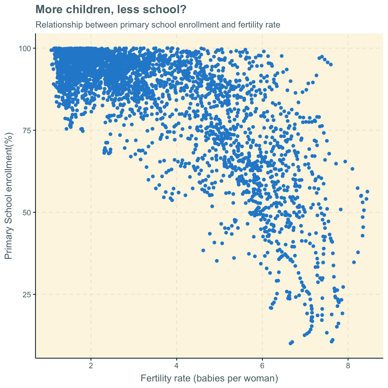
Lastly, we investigate if there is a relationship between primary school enrollment and fertility rate. Again, as we disregard the time variable in the first plot, we facet different time periods to get a better understanding of the data.
#create new data set witout NAs
no_na <- worldbank_data %>%
  na.omit()

#create overall plot
ggplot(data = no_na,
       aes(x = SP.DYN.TFRT.IN, y = SE.PRM.NENR))+
    geom_point()+
    labs(title = "More children, less school?",
         subtitle = "Relationship between primary school enrollment and fertility rate",
         x="Fertility rate (babies per woman)",
         y="Primary School enrollment(%)")
#create  new data set with time periods
ay_no_na <- no_na %>%
  filter(date == "1970"|
            date == "1980"|
            date == "1990"|
            date == "2000"|
            date == "2010"|
            date == "2016")

#create plot with new time-period-data set and facet by time period
ggplot(data = ay_no_na,
       aes(x = SP.DYN.TFRT.IN, y = SE.PRM.NENR))+
  geom_point() +
  labs(title = "More children, less school?",
       subtitle = "Relationship between primary school enrollment and fertility rate over time",
       x="Fertility rate (babies per woman)",
       y="Primary School enrollment(%)")+

  #facet by time period
  facet_wrap(~ date) +

  geom_smooth() +
  NULL
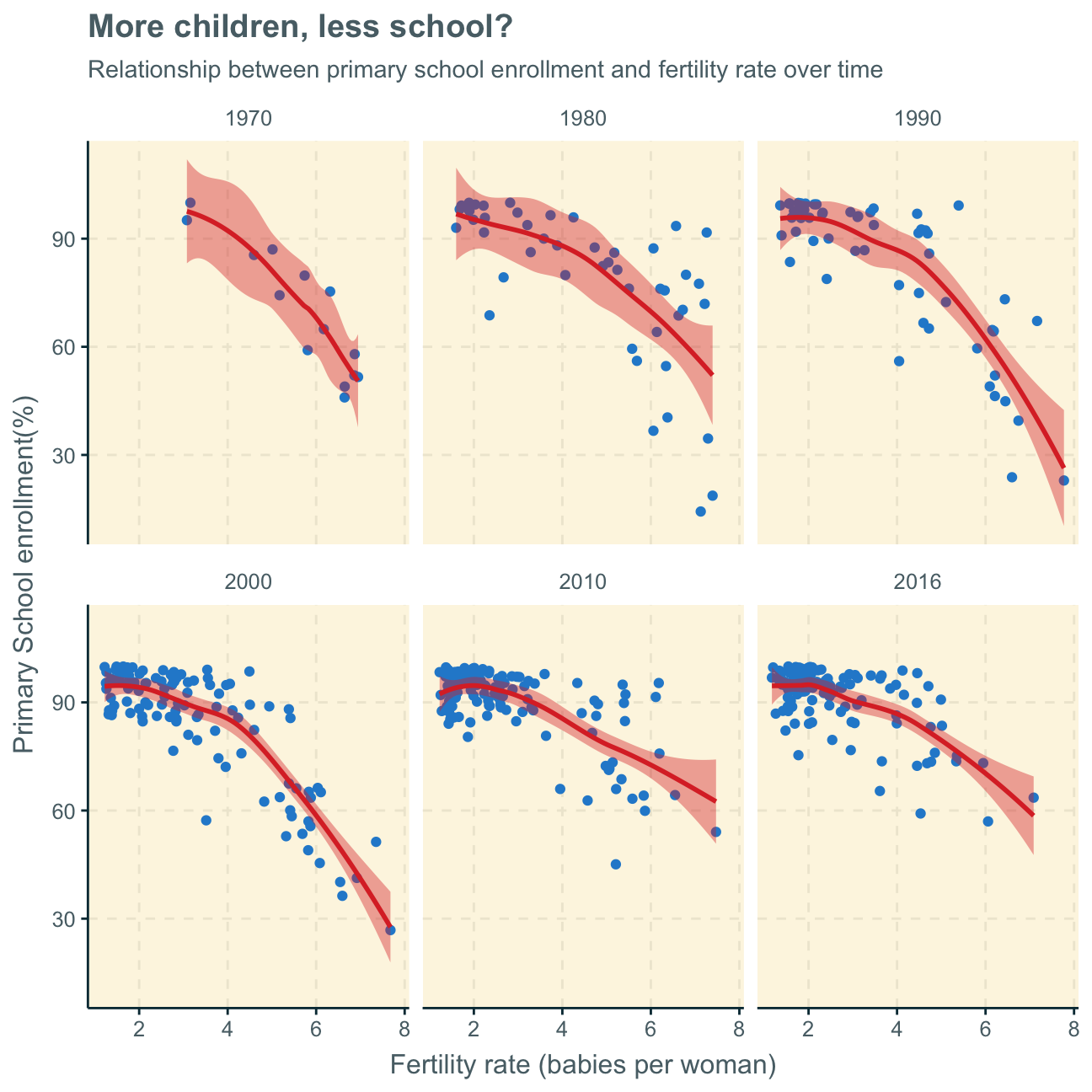
As fertility rate increases primary school enrollment seems to be decreasing, highlighting an inverse relationship. The same can be inferred both by looking at the first scatterplot with the aggregates of all observations over time and the latter scatterplots, separating the time variable and showing the relationship at different points in time.
This trend is most likely due to the fact that it is common for less developed countries to have large families with a great number of children - however, these poorer countries can often not send all of their children to school. On the other hand, in advanced countries, it is common to only have, on average, 2 children. The education system being more advanced and the families wealthier, these fewer children per family can, however, all attend primary school. This trend solidified over time. Nevertheless, with recent data from 2010 and 2016, it seems as also developing countries are more and more able to also provide primary education to their children as the data points do show a tendency to move to the upper part of the graph (higher primary school enrollment) over the years.
To support this analysis, we would, in a future analysis, look at the data per region.