IBM HR Analysis

In the following project, we will investigate a data set on Human Resoruce Analytics. The IBM HR Analytics Employee Attrition & Performance data set is a fictional data set created by IBM data scientists.
We start by loading and having a first look at the data, then cleaning the data, then visualizing some of the most relevant relationships between the variables of the data set and finish this analysis by drawing some conclusions about the interpretation of the data.
Data set
First, we load the data and have a first look at it.
#load data
hr_dataset <- vroom(here::here("data", "datasets_1067_1925_WA_Fn-UseC_-HR-Employee-Attrition.csv"))

#glimpse at data
glimpse(hr_dataset)
## Rows: 1,470
## Columns: 35
## $ Age <dbl> 41, 49, 37, 33, 27, 32, 59, 30, 38, 36, 35, …
## $ Attrition <chr> "Yes", "No", "Yes", "No", "No", "No", "No", …
## $ BusinessTravel <chr> "Travel_Rarely", "Travel_Frequently", "Trave…
## $ DailyRate <dbl> 1102, 279, 1373, 1392, 591, 1005, 1324, 1358…
## $ Department <chr> "Sales", "Research & Development", "Research…
## $ DistanceFromHome <dbl> 1, 8, 2, 3, 2, 2, 3, 24, 23, 27, 16, 15, 26,…
## $ Education <dbl> 2, 1, 2, 4, 1, 2, 3, 1, 3, 3, 3, 2, 1, 2, 3,…
## $ EducationField <chr> "Life Sciences", "Life Sciences", "Other", "…
## $ EmployeeCount <dbl> 1, 1, 1, 1, 1, 1, 1, 1, 1, 1, 1, 1, 1, 1, 1,…
## $ EmployeeNumber <dbl> 1, 2, 4, 5, 7, 8, 10, 11, 12, 13, 14, 15, 16…
## $ EnvironmentSatisfaction <dbl> 2, 3, 4, 4, 1, 4, 3, 4, 4, 3, 1, 4, 1, 2, 3,…
## $ Gender <chr> "Female", "Male", "Male", "Female", "Male", …
## $ HourlyRate <dbl> 94, 61, 92, 56, 40, 79, 81, 67, 44, 94, 84, …
## $ JobInvolvement <dbl> 3, 2, 2, 3, 3, 3, 4, 3, 2, 3, 4, 2, 3, 3, 2,…
## $ JobLevel <dbl> 2, 2, 1, 1, 1, 1, 1, 1, 3, 2, 1, 2, 1, 1, 1,…
## $ JobRole <chr> "Sales Executive", "Research Scientist", "La…
## $ JobSatisfaction <dbl> 4, 2, 3, 3, 2, 4, 1, 3, 3, 3, 2, 3, 3, 4, 3,…
## $ MaritalStatus <chr> "Single", "Married", "Single", "Married", "M…
## $ MonthlyIncome <dbl> 5993, 5130, 2090, 2909, 3468, 3068, 2670, 26…
## $ MonthlyRate <dbl> 19479, 24907, 2396, 23159, 16632, 11864, 996…
## $ NumCompaniesWorked <dbl> 8, 1, 6, 1, 9, 0, 4, 1, 0, 6, 0, 0, 1, 0, 5,…
## $ Over18 <chr> "Y", "Y", "Y", "Y", "Y", "Y", "Y", "Y", "Y",…
## $ OverTime <chr> "Yes", "No", "Yes", "Yes", "No", "No", "Yes"…
## $ PercentSalaryHike <dbl> 11, 23, 15, 11, 12, 13, 20, 22, 21, 13, 13, …
## $ PerformanceRating <dbl> 3, 4, 3, 3, 3, 3, 4, 4, 4, 3, 3, 3, 3, 3, 3,…
## $ RelationshipSatisfaction <dbl> 1, 4, 2, 3, 4, 3, 1, 2, 2, 2, 3, 4, 4, 3, 2,…
## $ StandardHours <dbl> 80, 80, 80, 80, 80, 80, 80, 80, 80, 80, 80, …
## $ StockOptionLevel <dbl> 0, 1, 0, 0, 1, 0, 3, 1, 0, 2, 1, 0, 1, 1, 0,…
## $ TotalWorkingYears <dbl> 8, 10, 7, 8, 6, 8, 12, 1, 10, 17, 6, 10, 5, …
## $ TrainingTimesLastYear <dbl> 0, 3, 3, 3, 3, 2, 3, 2, 2, 3, 5, 3, 1, 2, 4,…
## $ WorkLifeBalance <dbl> 1, 3, 3, 3, 3, 2, 2, 3, 3, 2, 3, 3, 2, 3, 3,…
## $ YearsAtCompany <dbl> 6, 10, 0, 8, 2, 7, 1, 1, 9, 7, 5, 9, 5, 2, 4…
## $ YearsInCurrentRole <dbl> 4, 7, 0, 7, 2, 7, 0, 0, 7, 7, 4, 5, 2, 2, 2,…
## $ YearsSinceLastPromotion <dbl> 0, 1, 0, 3, 2, 3, 0, 0, 1, 7, 0, 0, 4, 1, 0,…
## $ YearsWithCurrManager <dbl> 5, 7, 0, 0, 2, 6, 0, 0, 8, 7, 3, 8, 3, 2, 3,…We find that the data set has 1,470 observations on 35 variables including employees’ income, their distance from work, their position in the company, their level of education, etc. A full description of the variables can be found on the website.
We further investigate the data with the skim() function.
skim(hr_dataset)| Name | hr_dataset |
| Number of rows | 1470 |
| Number of columns | 35 |
| _______________________ | |
| Column type frequency: | |
| character | 9 |
| numeric | 26 |
| ________________________ | |
| Group variables | None |
Variable type: character
| skim_variable | n_missing | complete_rate | min | max | empty | n_unique | whitespace |
|---|---|---|---|---|---|---|---|
| Attrition | 0 | 1 | 2 | 3 | 0 | 2 | 0 |
| BusinessTravel | 0 | 1 | 10 | 17 | 0 | 3 | 0 |
| Department | 0 | 1 | 5 | 22 | 0 | 3 | 0 |
| EducationField | 0 | 1 | 5 | 16 | 0 | 6 | 0 |
| Gender | 0 | 1 | 4 | 6 | 0 | 2 | 0 |
| JobRole | 0 | 1 | 7 | 25 | 0 | 9 | 0 |
| MaritalStatus | 0 | 1 | 6 | 8 | 0 | 3 | 0 |
| Over18 | 0 | 1 | 1 | 1 | 0 | 1 | 0 |
| OverTime | 0 | 1 | 2 | 3 | 0 | 2 | 0 |
Variable type: numeric
| skim_variable | n_missing | complete_rate | mean | sd | p0 | p25 | p50 | p75 | p100 | hist |
|---|---|---|---|---|---|---|---|---|---|---|
| Age | 0 | 1 | 36.92 | 9.14 | 18 | 30 | 36 | 43.0 | 60 | ▂▇▇▃▂ |
| DailyRate | 0 | 1 | 802.49 | 403.51 | 102 | 465 | 802 | 1157.0 | 1499 | ▇▇▇▇▇ |
| DistanceFromHome | 0 | 1 | 9.19 | 8.11 | 1 | 2 | 7 | 14.0 | 29 | ▇▅▂▂▂ |
| Education | 0 | 1 | 2.91 | 1.02 | 1 | 2 | 3 | 4.0 | 5 | ▂▃▇▆▁ |
| EmployeeCount | 0 | 1 | 1.00 | 0.00 | 1 | 1 | 1 | 1.0 | 1 | ▁▁▇▁▁ |
| EmployeeNumber | 0 | 1 | 1024.87 | 602.02 | 1 | 491 | 1020 | 1555.8 | 2068 | ▇▇▇▇▇ |
| EnvironmentSatisfaction | 0 | 1 | 2.72 | 1.09 | 1 | 2 | 3 | 4.0 | 4 | ▅▅▁▇▇ |
| HourlyRate | 0 | 1 | 65.89 | 20.33 | 30 | 48 | 66 | 83.8 | 100 | ▇▇▇▇▇ |
| JobInvolvement | 0 | 1 | 2.73 | 0.71 | 1 | 2 | 3 | 3.0 | 4 | ▁▃▁▇▁ |
| JobLevel | 0 | 1 | 2.06 | 1.11 | 1 | 1 | 2 | 3.0 | 5 | ▇▇▃▂▁ |
| JobSatisfaction | 0 | 1 | 2.73 | 1.10 | 1 | 2 | 3 | 4.0 | 4 | ▅▅▁▇▇ |
| MonthlyIncome | 0 | 1 | 6502.93 | 4707.96 | 1009 | 2911 | 4919 | 8379.0 | 19999 | ▇▅▂▁▂ |
| MonthlyRate | 0 | 1 | 14313.10 | 7117.79 | 2094 | 8047 | 14236 | 20461.5 | 26999 | ▇▇▇▇▇ |
| NumCompaniesWorked | 0 | 1 | 2.69 | 2.50 | 0 | 1 | 2 | 4.0 | 9 | ▇▃▂▂▁ |
| PercentSalaryHike | 0 | 1 | 15.21 | 3.66 | 11 | 12 | 14 | 18.0 | 25 | ▇▅▃▂▁ |
| PerformanceRating | 0 | 1 | 3.15 | 0.36 | 3 | 3 | 3 | 3.0 | 4 | ▇▁▁▁▂ |
| RelationshipSatisfaction | 0 | 1 | 2.71 | 1.08 | 1 | 2 | 3 | 4.0 | 4 | ▅▅▁▇▇ |
| StandardHours | 0 | 1 | 80.00 | 0.00 | 80 | 80 | 80 | 80.0 | 80 | ▁▁▇▁▁ |
| StockOptionLevel | 0 | 1 | 0.79 | 0.85 | 0 | 0 | 1 | 1.0 | 3 | ▇▇▁▂▁ |
| TotalWorkingYears | 0 | 1 | 11.28 | 7.78 | 0 | 6 | 10 | 15.0 | 40 | ▇▇▂▁▁ |
| TrainingTimesLastYear | 0 | 1 | 2.80 | 1.29 | 0 | 2 | 3 | 3.0 | 6 | ▂▇▇▂▃ |
| WorkLifeBalance | 0 | 1 | 2.76 | 0.71 | 1 | 2 | 3 | 3.0 | 4 | ▁▃▁▇▂ |
| YearsAtCompany | 0 | 1 | 7.01 | 6.13 | 0 | 3 | 5 | 9.0 | 40 | ▇▂▁▁▁ |
| YearsInCurrentRole | 0 | 1 | 4.23 | 3.62 | 0 | 2 | 3 | 7.0 | 18 | ▇▃▂▁▁ |
| YearsSinceLastPromotion | 0 | 1 | 2.19 | 3.22 | 0 | 0 | 1 | 3.0 | 15 | ▇▁▁▁▁ |
| YearsWithCurrManager | 0 | 1 | 4.12 | 3.57 | 0 | 2 | 3 | 7.0 | 17 | ▇▂▅▁▁ |
We find that the data set is made up of 9 character and 26 numeric variables. Here, we can also see that there are no missing values in any of the variables and all observations are complete. We will not go into more detail but the data skimming also shows the mean, standard deviation, quartiles and a small histogram for each variable for anyone interested in having a closer look.
Data cleaning
We will clean the data set as some variables, e.g., education are given as a number rather than a more useful description, some variable names unclude capital letters and some variables are not necessary to our analysis. We will create a new data set called hr_cleaned which will include the cleaned data.
hr_cleaned <- hr_dataset %>%

# get rid of capital letters in variable names
  clean_names() %>%

# change numeric value for education to a descriptive word of level of education
  mutate(
    education = case_when(
      education == 1 ~ "Below College",
      education == 2 ~ "College",
      education == 3 ~ "Bachelor",
      education == 4 ~ "Master",
      education == 5 ~ "Doctor"
    ),

# change numeric value for environment satisfaction to a descriptive word of degree of satisfaction
    environment_satisfaction = case_when(
      environment_satisfaction == 1 ~ "Low",
      environment_satisfaction == 2 ~ "Medium",
      environment_satisfaction == 3 ~ "High",
      environment_satisfaction == 4 ~ "Very High"
    ),

# change numeric value for job satisfaction to a descriptive word of degree of satisfaction
    job_satisfaction = case_when(
      job_satisfaction == 1 ~ "Low",
      job_satisfaction == 2 ~ "Medium",
      job_satisfaction == 3 ~ "High",
      job_satisfaction == 4 ~ "Very High"
    ),

# change numeric value for performance rating to a descriptive word of rating
    performance_rating = case_when(
      performance_rating == 1 ~ "Low",
      performance_rating == 2 ~ "Good",
      performance_rating == 3 ~ "Excellent",
      performance_rating == 4 ~ "Outstanding"
    ),

# change numeric value for work life balance to a descriptive word of opinion on work life balance
    work_life_balance = case_when(
      work_life_balance == 1 ~ "Bad",
      work_life_balance == 2 ~ "Good",
      work_life_balance == 3 ~ "Better",
      work_life_balance == 4 ~ "Best"
    )
  ) %>%

# select only relevant variables
  select(age, attrition, daily_rate, department,
         distance_from_home, education,
         gender, job_role,environment_satisfaction,
         job_satisfaction, marital_status,
         monthly_income, num_companies_worked, percent_salary_hike,
         performance_rating, total_working_years,
         work_life_balance, years_at_company,
         years_since_last_promotion)
Now, let’s have a look at the cleaned data set.
# glimpse at cleaned data set
glimpse(hr_cleaned)
## Rows: 1,470
## Columns: 19
## $ age <dbl> 41, 49, 37, 33, 27, 32, 59, 30, 38, 36, 35…
## $ attrition <chr> "Yes", "No", "Yes", "No", "No", "No", "No"…
## $ daily_rate <dbl> 1102, 279, 1373, 1392, 591, 1005, 1324, 13…
## $ department <chr> "Sales", "Research & Development", "Resear…
## $ distance_from_home <dbl> 1, 8, 2, 3, 2, 2, 3, 24, 23, 27, 16, 15, 2…
## $ education <chr> "College", "Below College", "College", "Ma…
## $ gender <chr> "Female", "Male", "Male", "Female", "Male"…
## $ job_role <chr> "Sales Executive", "Research Scientist", "…
## $ environment_satisfaction <chr> "Medium", "High", "Very High", "Very High"…
## $ job_satisfaction <chr> "Very High", "Medium", "High", "High", "Me…
## $ marital_status <chr> "Single", "Married", "Single", "Married", …
## $ monthly_income <dbl> 5993, 5130, 2090, 2909, 3468, 3068, 2670, …
## $ num_companies_worked <dbl> 8, 1, 6, 1, 9, 0, 4, 1, 0, 6, 0, 0, 1, 0, …
## $ percent_salary_hike <dbl> 11, 23, 15, 11, 12, 13, 20, 22, 21, 13, 13…
## $ performance_rating <chr> "Excellent", "Outstanding", "Excellent", "…
## $ total_working_years <dbl> 8, 10, 7, 8, 6, 8, 12, 1, 10, 17, 6, 10, 5…
## $ work_life_balance <chr> "Bad", "Better", "Better", "Better", "Bett…
## $ years_at_company <dbl> 6, 10, 0, 8, 2, 7, 1, 1, 9, 7, 5, 9, 5, 2,…
## $ years_since_last_promotion <dbl> 0, 1, 0, 3, 2, 3, 0, 0, 1, 7, 0, 0, 4, 1, …# look at first 5 rows of data set
head(hr_cleaned, 5)## # A tibble: 5 x 19
## age attrition daily_rate department distance_from_h… education gender
## <dbl> <chr> <dbl> <chr> <dbl> <chr> <chr>
## 1 41 Yes 1102 Sales 1 College Female
## 2 49 No 279 Research … 8 Below Co… Male
## 3 37 Yes 1373 Research … 2 College Male
## 4 33 No 1392 Research … 3 Master Female
## 5 27 No 591 Research … 2 Below Co… Male
## # … with 12 more variables: job_role <chr>, environment_satisfaction <chr>,
## # job_satisfaction <chr>, marital_status <chr>, monthly_income <dbl>,
## # num_companies_worked <dbl>, percent_salary_hike <dbl>,
## # performance_rating <chr>, total_working_years <dbl>,
## # work_life_balance <chr>, years_at_company <dbl>,
## # years_since_last_promotion <dbl>After cleaning the data, the columns have been reduced to 19 (from 35) for a better overview. In the following, we will explore this cleaned data set trough several analyses.
Analysis
Correlations overview
In order to better understand the variables, we will, first, have a look at the relationships between some of the most relevant variables by considering their correlations and scatterplots. We will use the ggpairs() function which, in addition, will show us each individual variable’s density plot.
hr_cleaned %>%

  #select relevant variables
  select(age, monthly_income, num_companies_worked, total_working_years, years_at_company, years_since_last_promotion, gender) %>%

  #create ggpairs plots and colour data by gender
  GGally::ggpairs(aes(colour = gender), alpha = 0.4) +
            labs(title = "Quick overview of what is happening in our data",
                 subtitle = "Correlations and distributions for most relevant variables coloured by gender")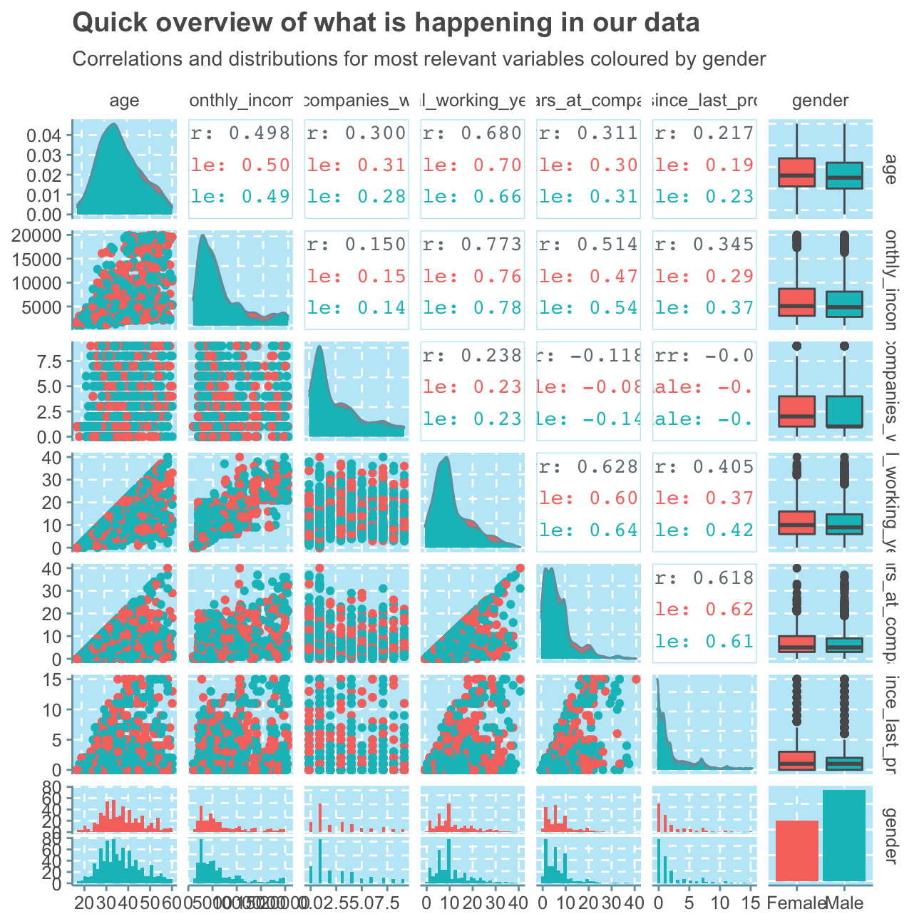
Although this plot is full of a vast amount of information, we can still see some relevant trends that we will investigate further in the next sections. For example, we see that there are relatively high correlations between age and all of the other selected variables. This shows a very common dynamic that the older you are, the longer you have worked and the more money you make. This trend can also be seen between the positive (and in this selection highest) correlation between monthly income and total working years of 0.773. Most people that have worked for several years are in senior positions where they also work more.
Another interesting find is the high, positive correlation of 0.628 between total working years and years at the company. This indicates that most people that have worked many years in their lives have worked at this regarded company (IBM) for a long time as well. As we also find a similar high correlation between years at the company and years since the last promotion, we can assume that the longer an employee works at IBM, the less frequently he/she will be promoted - a typical trend for more senior roles.
We don’t find any sigfinicant differences between women and men, apart from the fact that men have, on average, worked in less companies so far than women.
Now that we have a broad overview of the variables and their interactions, we will look at some of them in more detail.
Attrition & Employee Happiness
Attrition
We begin by looking at the attrition variable and want to find out how many employees, of the 1,470 recorded observations, have left the company (i.e. where attrition equals “Yes”).
# sum number of "Yes" for attrition
sum(hr_cleaned$attrition == "Yes")
## [1] 237#create bar plot for attrition
ggplot(hr_cleaned,
aes(attrition)) +
geom_bar() +
labs(title = "Only few employees leave",
subtitle = "Count of employees that have left and have not left the company",
x = "Attrition?",
y = "Number of employees") +
NULL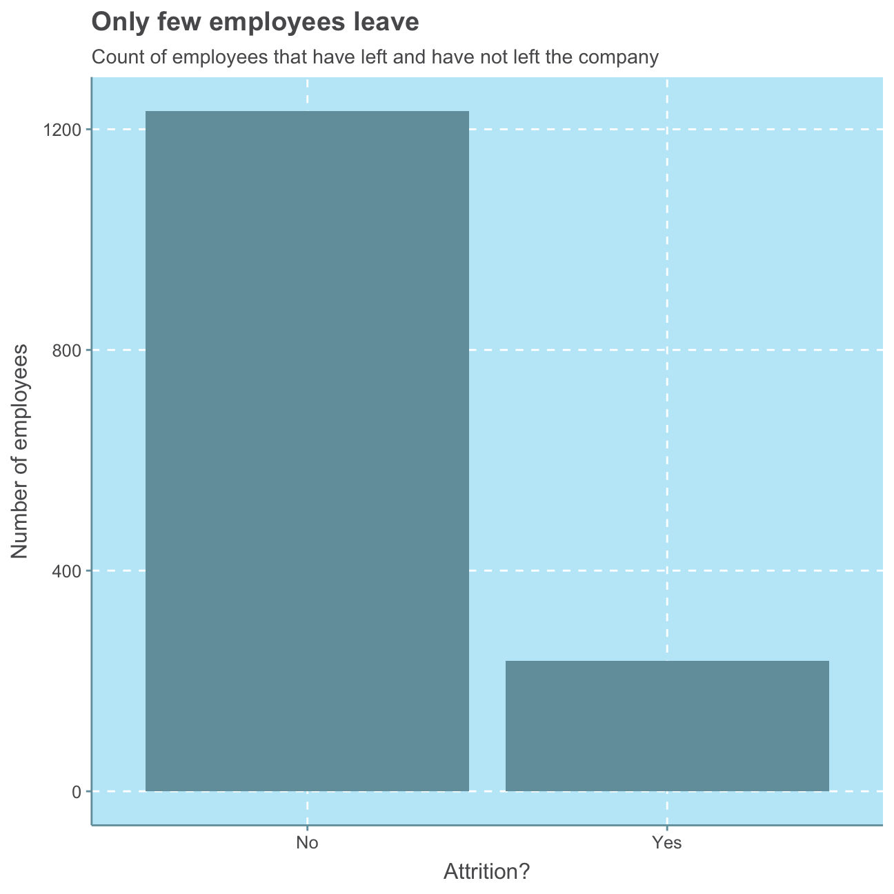
Summing all the observations that were “Yes” for attrition and looking at the bar plot below, we find that 237 employees left the company, whereas X of the observed employees still work for IBM.
This means that on average …
# divide the people that have left the company by all
sum(hr_cleaned$attrition == "Yes") / count(hr_cleaned$attrition)
## n_No
## 0.192… around 19 out of 100 people leave the company.
It is relatively difficult to judge an attrition rate of 19% with no further information about the industry of the company and what would be a normal attrition in that industry.
Oftentimes, employees leave a company because they are not satisfied with their job or their work-life balance. In order to make further conclusions about the attrition rate, we will evaluate employees’ happiness.
Employee Happiness
In the following, we will look at the distributions of job_satisfaction and work_life_balance.
#put job satisfaction levels in order
hr_cleaned$job_satisfaction <- factor(hr_cleaned$job_satisfaction, levels = c("Low", "Medium", "High", "Very High"))

#create job satisfaction plot
ggplot(hr_cleaned,
       aes(job_satisfaction,

#calculate percentage values per bar
           label = scales::percent(prop.table(stat(count))))) +

#create bar plot
            geom_bar() +

#add percentage values
            geom_text(stat = 'count',
            vjust = -0.5, # put labels above bars
            size = 5) + # size of label font

#add plot labels
            labs(title = "Most employees are happy with their jobs",
                 subtitle = "Distribution of employees' satisfaction with their jobs",
                 x = "Job satisfaction",
                 y = "Number of employees") +
                    NULL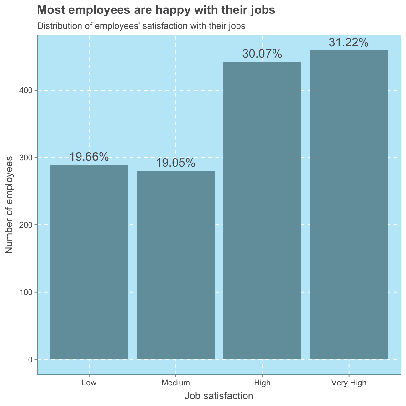
As can be seen, a majority of 61.29% of employees are highly or very highly satisfied with their job.
#put work-life balance levels in order
hr_cleaned$work_life_balance <- factor(hr_cleaned$work_life_balance, levels = c("Bad", "Good", "Better", "Best"))

#create work life balance satisfaction plot
ggplot(hr_cleaned,
       aes(work_life_balance,

#calculate percentage values per bar
           label = scales::percent(prop.table(stat(count))))) +

#create bar plot
            geom_bar() +

#add percentage values
            geom_text(stat = 'count',
            vjust = -0.5, #put labels above bars
            size = 5) + #size of label font

#add plot labels
            labs(title = "Most employees think their work-life-balance is great\n- but not perfect",
                 subtitle = "Distribution of employees' satisfaction with their work-life-balance",
                 x = "Work-life-balance",
                 y = "Number of employees") +
                    NULL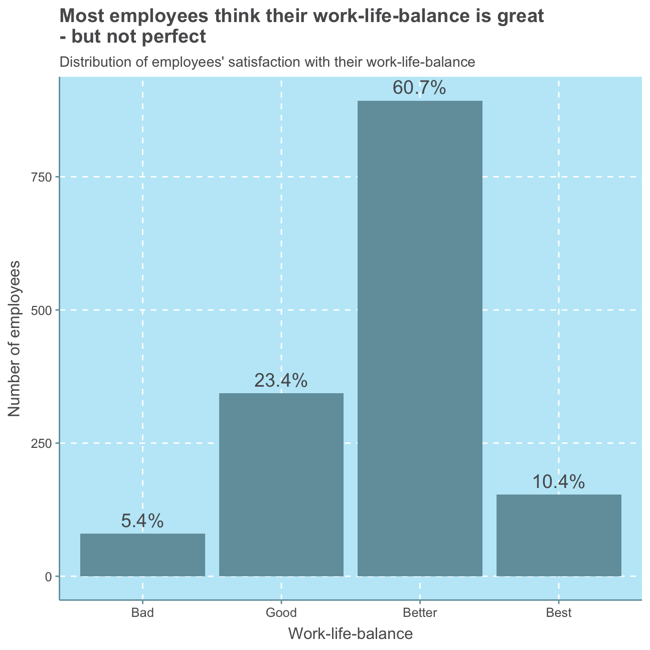
As can be seen in this plot, a small minority of 5.4% of employees is not satisfied with their work-life balance. A majority of 60.7% of employees rates their work-life balance 3 out of 4, namely “better”. Nevertheless, the scale could be improved by introducing a “medium” option or balancing the positive and negative attributes as of now, there is one bad and three good options to describe one’s work-life balance.
Altogether, most employees seem to be satisfied with their job and work-life balance, indicating that the 19% attrition rate is either rather low compared to industry standards or there are other reasons than employees’ happiness causing attrition.
Distributions
As a next step, we will explore the distributions of age, years_at_company, monthly_income and years_since_last_promotion in more detail.
First, we will have a rough look at the summary statistics for the four variables:
#select relevant variables
hr_cleaned_selected <- hr_cleaned %>%
                          select(age, years_at_company, monthly_income, years_since_last_promotion)

#summarize
summary(hr_cleaned_selected)
## age years_at_company monthly_income years_since_last_promotion
## Min. :18.0 Min. : 0 Min. : 1009 Min. : 0.00
## 1st Qu.:30.0 1st Qu.: 3 1st Qu.: 2911 1st Qu.: 0.00
## Median :36.0 Median : 5 Median : 4919 Median : 1.00
## Mean :36.9 Mean : 7 Mean : 6503 Mean : 2.19
## 3rd Qu.:43.0 3rd Qu.: 9 3rd Qu.: 8379 3rd Qu.: 3.00
## Max. :60.0 Max. :40 Max. :19999 Max. :15.00For a Normal distribution, the mean equals the median. Looking at the summary statistics, in no instance the mean is precisely equal to the respective median. However, the age variable’s mean of 36.9 is relatively close to its median of 36.0 compared to larger differences for the other three variables. Therefore, it is likely that the age distribution is roughly normal.
Let’s have a closer look.
#plot age distribution
ggplot(hr_cleaned_selected, aes(age)) +
          geom_density()+
          labs(title = "Age is Normal",
                subtitle = "Density function for employees' age",
                x = "Age",
                y = "Density") +
          NULL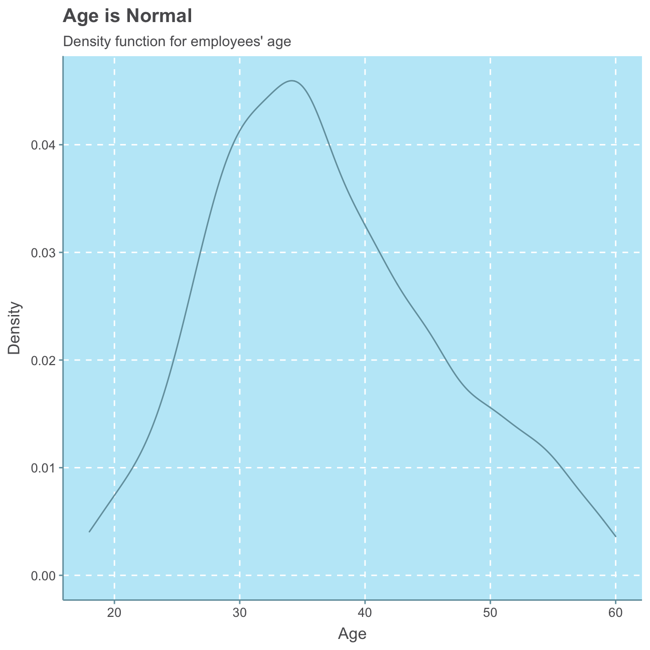
#plot years_at_company distribution
ggplot(hr_cleaned_selected, aes(years_at_company)) +
          geom_density()+
          labs(title = "Mostly newbies",
                subtitle = "Density function for how many years employees are working at the company",
                x = "Years",
                y = "Density") +
          NULL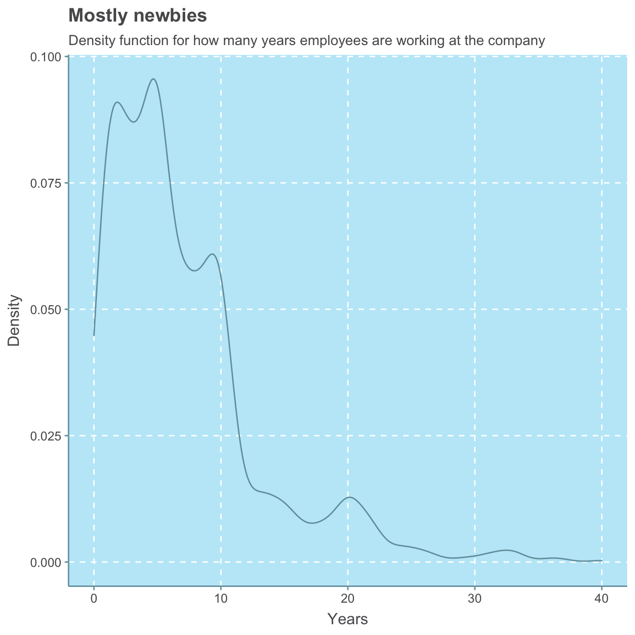
#plot years_since_last_promotion distribution
ggplot(hr_cleaned_selected, aes(years_since_last_promotion)) +
          geom_density()+
          labs(title = "Please promote me again",
                subtitle = "Density function for how many years have passed since an employee was last promoted",
                x = "Years",
                y = "Density") +
          NULL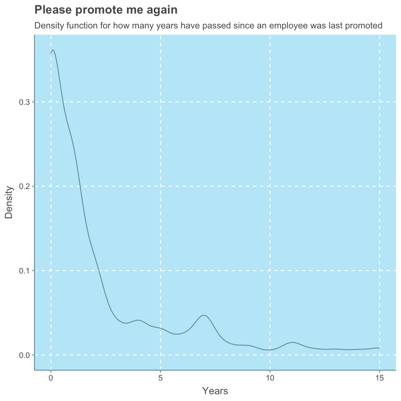
#plot monthly_income distribution
ggplot(hr_cleaned_selected, aes(monthly_income)) +
          geom_density()+
          labs(title = "Little for many, much for few",
                subtitle = "Density function for employees' monthly income",
                x = "Monthly income ($)",
                y = "Density") +
          NULL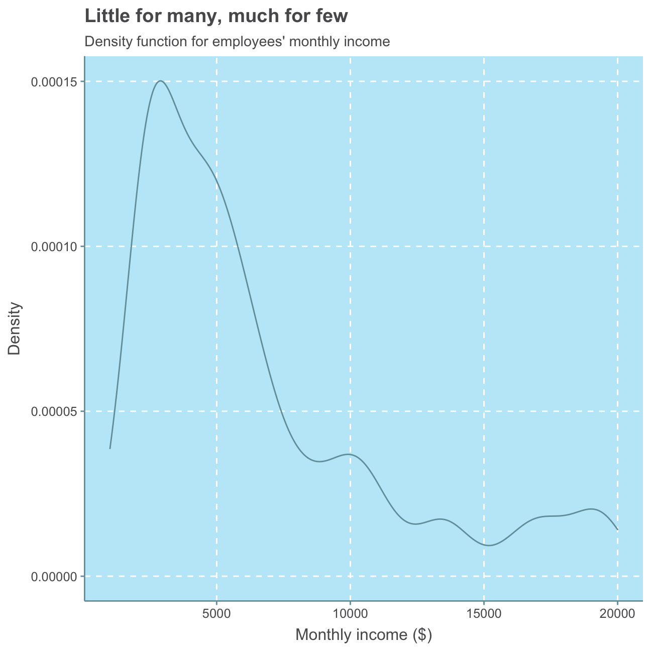
As expected, we can observe a roughly Normal distribution for the employees’ age. We find that the majority of employees has been at the company less then 10 years. There are, however, a few people that have worked at the company for 20 or even over 30 years. We, further find that for most employees, the last promotion is fewer than approx. 3 years ago while for only a small minority of employees the last promotion is over 10 years ago.
As there are a few people earning more than 10,000USD per month, the majority of employees earn a lower monthly income, indicating a common company structure with many low-salary jobs and only few high-salary jobs. In the next section, we will investigate monthly income further.
Monthly Income
In the following, we analyse potential influencing factors on the employees’ monthly income.
Education
Firstly, we will have a look at the relationship between employees’ monthly income and their respective highest level of education.
#put education levels in order
hr_cleaned$education <- factor(hr_cleaned$education, levels = c("Below College", "College", "Bachelor", "Master", "Doctor"))

#plot education vs monthly income boxplot
ggplot(hr_cleaned,
       aes(x = education, y = monthly_income)) +
          geom_boxplot() +
          labs(title = "The higher the education, the higher the pay?",
               subtitle = "Relationship between monthly income and education",
               x = "Education level",
               y = "Monthly income ($)") +
     NULL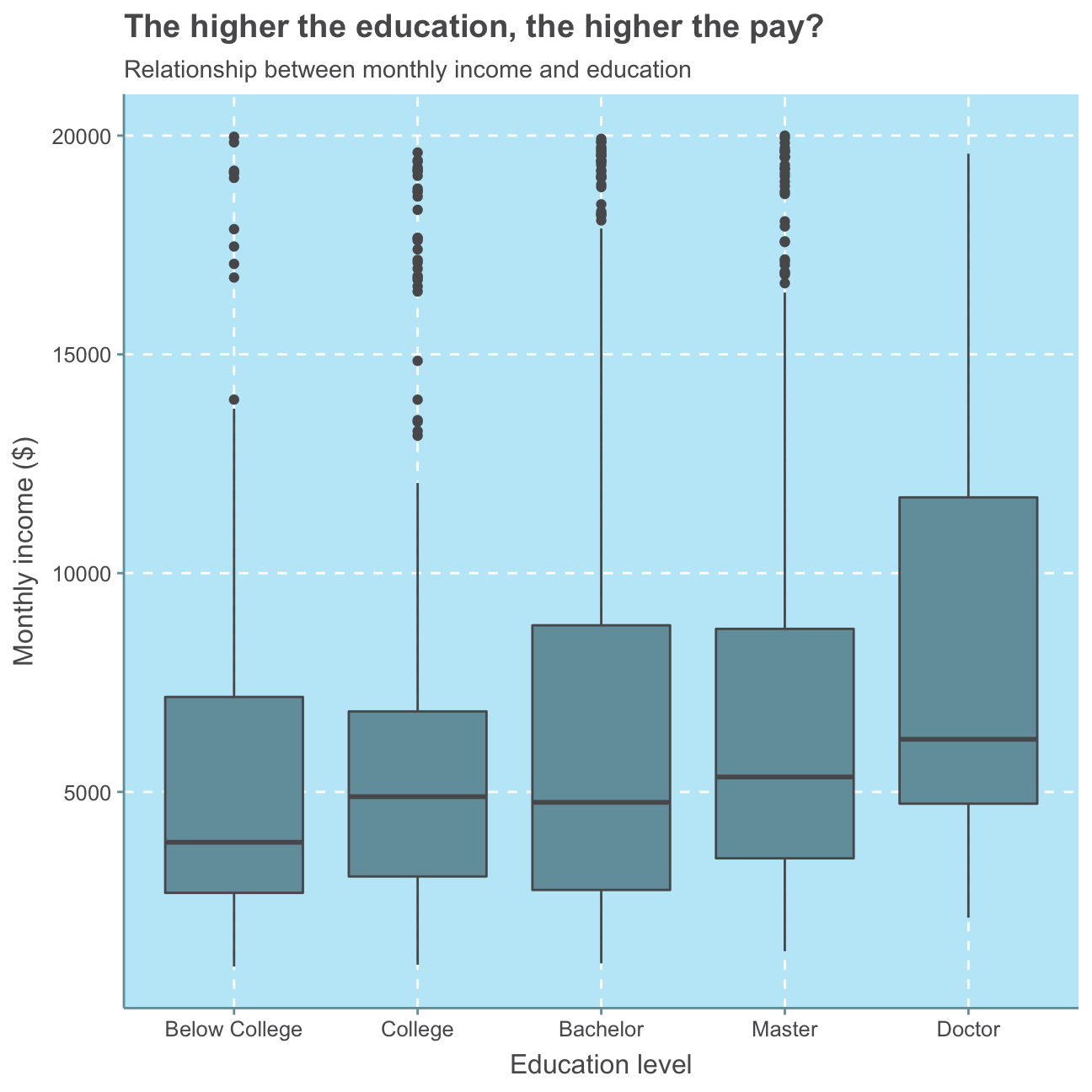
Generally, we can see that a higher level of education means a higher median monthly income. However, all education levels apart from Doctor show several outliers that earn between 15,000-20,000USD in contrast to relatively low medians around/below 5,000USD and 3rd quartile values of significantly lower than 10,000USD. No significant relationship can be observed.
For further investigation, we calculate and plot a bar chart of the mean (also called average) and median income by education level.
#defining the mean per education level
mean_ed <- hr_cleaned %>%

  #group observations by their level of education
            group_by(education) %>%

  #create mean variable
            summarize(mean_inc = mean(monthly_income)) %>%

  #arrange mean variable from highest to lowest
            arrange(desc(mean_inc))

#check mean per education level
mean_ed
## # A tibble: 5 x 2
## education mean_inc
## <fct> <dbl>
## 1 Doctor 8278.
## 2 Master 6832.
## 3 Bachelor 6517.
## 4 College 6227.
## 5 Below College 5641.#create plot for mean income by education level
ggplot(mean_ed,
aes(x=education,
y=mean_inc)) +
geom_col() +
theme(axis.text.x = element_text(angle = 90)) + #turn x axis label text 90 degrees
labs(title = "The higher the education, the higher the (average!) pay",
subtitle = "Average income by education Level",
x="Education level",
y="Average monthly income ($)")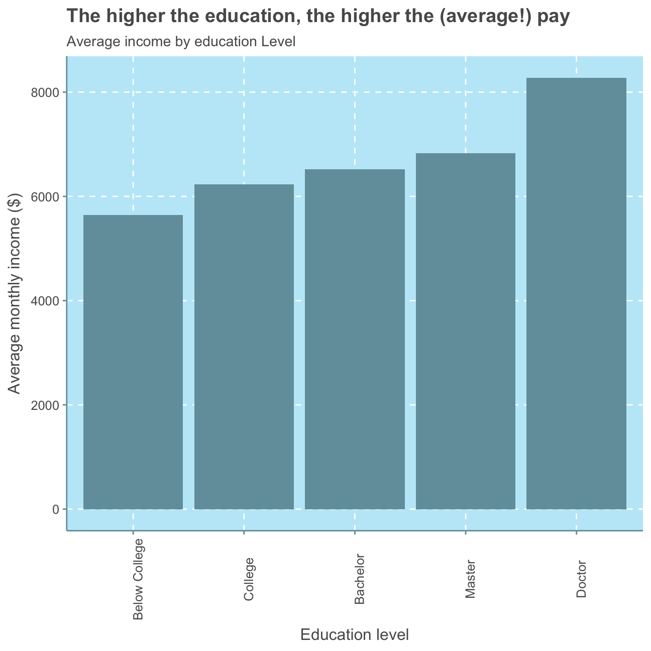
#defining the median per education level
median_ed <- hr_cleaned %>%

  #group observations by their level of education
            group_by(education) %>%

  #create median variable
            summarize(median_inc = median(monthly_income)) %>%

  #arrange median variable from highest to lowest
            arrange(desc(median_inc))

#check median per education level
median_ed
## # A tibble: 5 x 2
## education median_inc
## <fct> <dbl>
## 1 Doctor 6203
## 2 Master 5342.
## 3 College 4892.
## 4 Bachelor 4762
## 5 Below College 3849#create plot for median income by education level
ggplot(median_ed,
aes(x=education,
y=median_inc)) +
geom_col() +
theme(axis.text.x = element_text(angle = 90)) + #turn x axis label text 90 degrees
labs(title = "The higher the education, the higher the median pay? - Not necessarily!",
subtitle= "Median income by education level",
x="Education level",
y="Median monthly income ($)")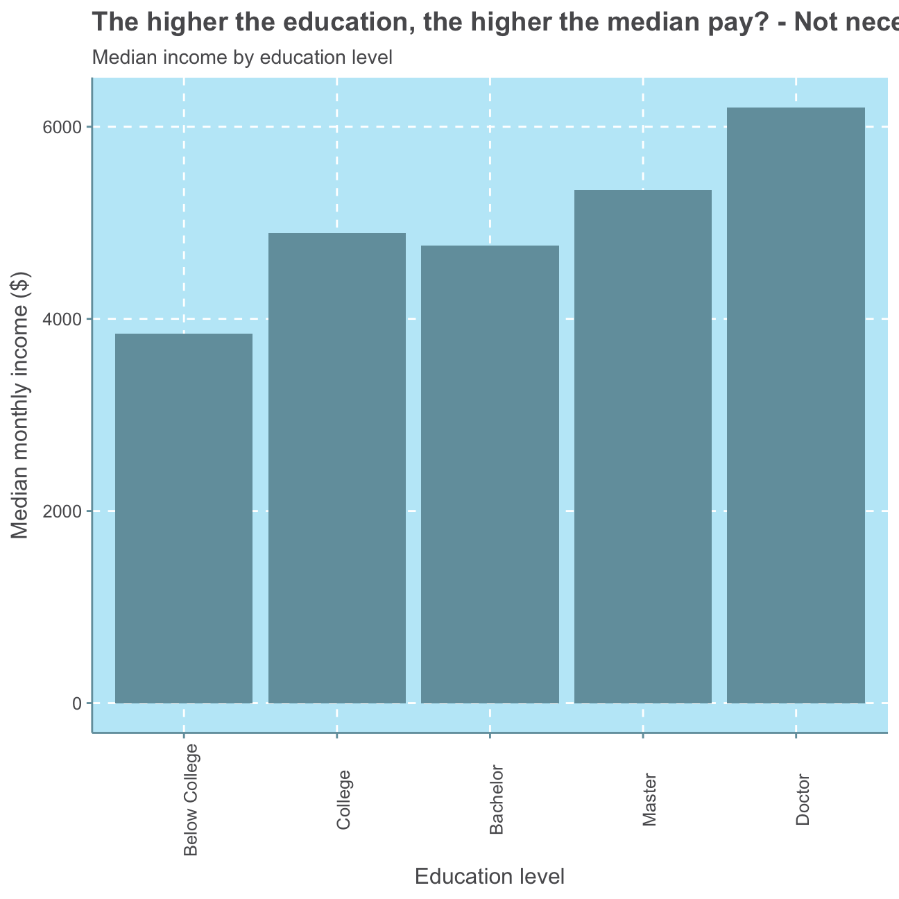
The median monthly income shows no direct positive relationship with the level of education as the median monthly income of employees with a bachelor is lower than that of people with a college degree. Nevertheless, the average (mean) monthly income shows a positive relationship with the education level as people with the lowest education level (Below College) earn the lowest monthly income on average, employees with the second lowest education level (College) earn the second lowest monthly income and so on.
Finally, we plot the distribution of monthly income by education level. The colouring also indicates the gender of the respective monthly income.
#plot distribution of monthly income
ggplot(hr_cleaned,
       aes(x = monthly_income )) +
            geom_histogram(bins = 50) + #set size of histogram bins

  #facet by education level
            facet_wrap(~education) +

            labs(title = "Little for many, much for few - regardless of education",
                 subtitle = "Distribution of monthly income by education level",
                 x = "Monthly income ($)",
                 y = "Number of employees") +
     NULL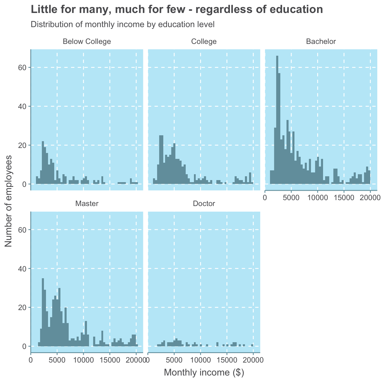
Here, again, we can only observe that there are a generally more low-salary jobs than high-salary jobs. The majority of all education levels except Doctor earn below 10,000USD but there is no clear indication as to which level of education earns the least. While there are only a few employees with a Doctor, their level of monthly income varies and shows no directly connected level of income.
Altogether, these plots may show that while it is generally possible for some people to earn a comparatively higher salary with a higher level of education, there is no strict rule and, thus, also no significant positive relationship between employees’ monthly income and highest level of education. We may find other factors such as gender or job role to be a more significant influence.
Gender
Next, we will investigate if there is a relationship between monthly income and gender.
#create boxplot of monthly income vs gender
ggplot(hr_cleaned,
       aes(x = gender, y = monthly_income)) +
        geom_boxplot(alpha=.2) +
        labs(title = "No gender pay gap",
             subtitle = "Relationship between monthly income and gender",
             x = "Gender",
             y = "Monthly income ($)") +
     NULL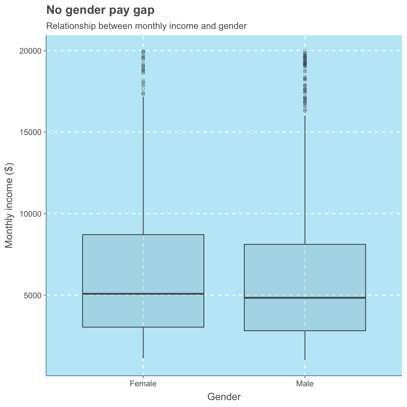
We see, again, that most employees generally are in the lower monthly income range (i.e., < 10,000USD) and the median employee salary is around 5,000USD - this is true for both men and women. We don’t see significant differences between male and female employees. In fact, the median salary of women is actually slightly higher than men’s within this group of employees.
While most women are in this lower range, there are a few women earning up to 20,000USD. Even though there are also fewer men earning within the higher income range than within the lower, there are overall more men earning such relatively high monthly incomes (more outliers visible).
Nonetheless, this graph does not take into consideration the number of female/male employees. Let’s have a look at that.
#Number of female employees
sum(hr_cleaned$gender == "Female")
## [1] 588#Number of male employees
sum(hr_cleaned$gender == "Male")## [1] 882#Female in % of total
sum(hr_cleaned$gender == "Female")/(sum(hr_cleaned$gender == "Female") + sum(hr_cleaned$gender == "Male"))## [1] 0.4We find that there are fewer women in the company, namely 40% of the employees are female.
Let’s take a closer look at the average income per gender.
#Separate female and male datasets
hr_cleaned_f <- hr_cleaned %>%
                  filter(hr_cleaned$gender == "Female")

hr_cleaned_m <- hr_cleaned %>%
                  filter(hr_cleaned$gender == "Male")

#total monthly income over all female / male employees
#sum(hr_cleaned_f$monthly_income)
#sum(hr_cleaned_m$monthly_income)

#average incomes for females
sum(hr_cleaned_f$monthly_income)/sum(hr_cleaned$gender == "Female")
## [1] 6687#average income for males
sum(hr_cleaned_m$monthly_income)/sum(hr_cleaned$gender == "Male")## [1] 6381As we can see from the plot and the calculations, the average monthly income over all females in the company is 6,686USD whereas men earn 301USD less on average, namely 6,381USD. Even though there is a greater number of men that earn a relative high monthly income (than women), there is also a significantly higher amount of men that earn a lower-range monthly income than women. Since monthly income of men and women varies largely between all income classes and there are more men employed in the company, their amounts of monthly income are also wider spread than those of the fewer female employees. As there are more male employees and generally more low-salary employees, men’s average income is lower than that of the female employees.
While the mean follows the same trend as the median in terms here, the median salary is lower for both men and women, indicating that the mean is subject to outliers (employees with very, very high income).
Again, we find no significant relationship between an employee’s gender and their monthly income.
Job Role
Since we found that neither education nor gender is a definitive indicator for monthly income, we will look at the relationship between an employee’s job role and their monthly income next.
#put job role levels in order according to highest median monthly income
hr_cleaned$job_role <- factor(hr_cleaned$job_role, levels = c("Sales Representative", "Laboratory Technician", "Research Scientist","Human Resources", "Sales Executive", "Manufacturing Director", "Healthcare Representative",  "Research Director", "Manager"))

#create boxplot of monthly income vs job role
ggplot(hr_cleaned,
       aes(x = monthly_income, y = job_role)) +
        geom_boxplot() +
        labs(title = "Little for many, much for managers and directors",
             subtitle = "Relationship between monthly income and job role",
             x = "Job role",
             y = "Monthly income ($)") +
      NULL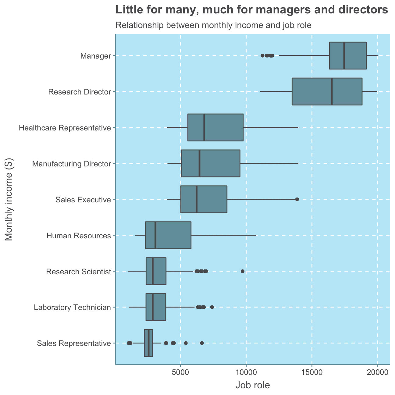
With this plot, we can clearly see that job roles can be a meaningful indicator of monthly income. When sorting the job roles by highest to lowest average monthly income, it becomes clear that high-seniority positions such as managers, directors and executives earn a higher level income than low-seniority jobs as a laboratory technician or sales representative.
This result is is not surprising as a commonly approved approach to determining an employee’s salary is to take their job role rather than their level of education or gender into consideration. These influencing factors, of course, also play a role but are nowhere near as decisive as what kind of role an employee takes on and how much responsibility he/she carries.
Age
As we have already seen some indications for a relationship between age and job_role in the beginning, we will, lastly, investigate the relationship between age and monthly income.
#create scatterplot of monthly income vs age
ggplot(hr_cleaned,
       aes(x = age, y = monthly_income)) +
        geom_point() +

  #add trend/regression line
        geom_smooth(method = lm) +

        labs(title = "Little for young, much for elder",
             subtitle = "Relationship between monthly income and age",
             x = "Age",
             y = "Monthly income ($)") +
     NULL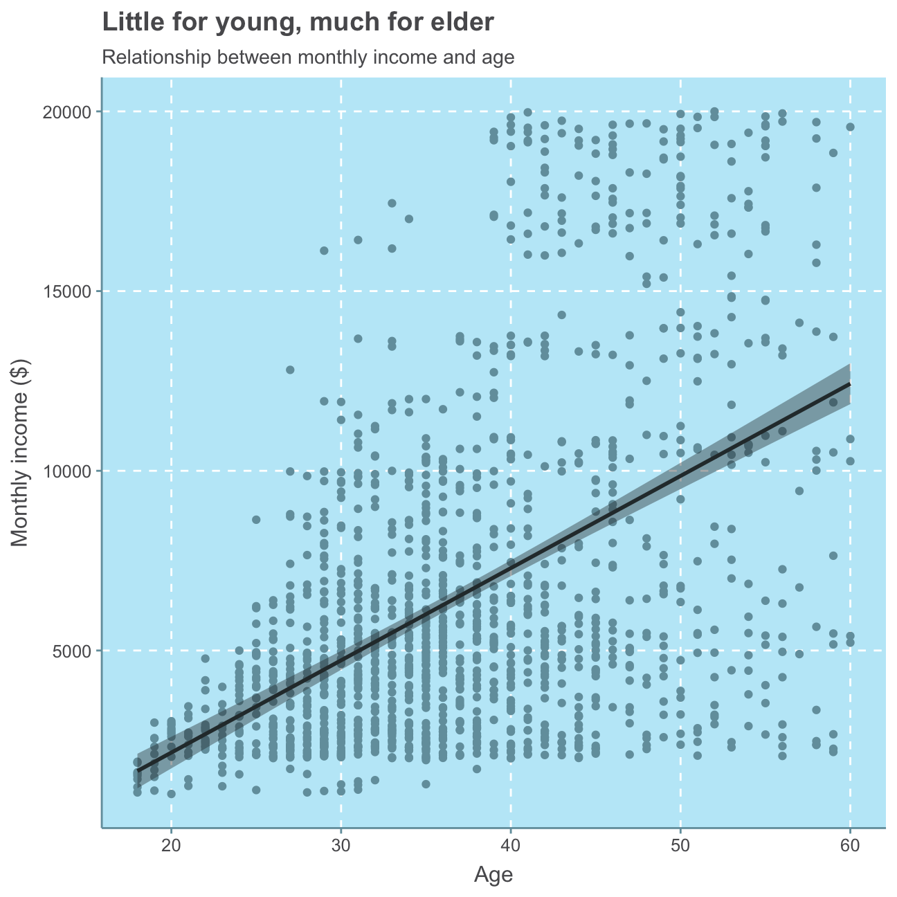
Although we can see that there are people of all ages earning a monthly income of below 5,000USD, it is clear that there are almost no people (just one person) younger than 30 that earn more than 10,000USD and only few (namely five) people between 30 and 40 that earn more than 15,000USD. Only employees above 40 years of age earn within the higher monthly income range of 15,000-20,000USD. This analysis clearly shows a positive relationship between age and monthly income, meaning the older an employee, the more likely he/she earns relatively more money.
As a higher age is commonly associated with a higher (more senior) job role and consequently also a higher salary, we facet the prior plot per job role for further analysis.
#put job role levels in order according to highest median monthly income
hr_cleaned$job_role <- factor(hr_cleaned$job_role, levels = c("Manager", "Research Director", "Healthcare Representative", "Manufacturing Director", "Sales Executive", "Human Resources","Research Scientist", "Laboratory Technician", "Sales Representative"))

#create scatterplot of monthly income vs age
ggplot(hr_cleaned,
       aes(x = age, y = monthly_income)) +
        geom_point() +

  #add trend/regression line
        geom_smooth(method = lm) +

  #facet by job role
        facet_wrap(~job_role) +

        labs(title = "Little for the young many, much for the elder managers and directors",
             subtitle = "Relationship between monthly income and age by job role",
             x = "Age",
             y = "Monthly income ($)") +
     NULL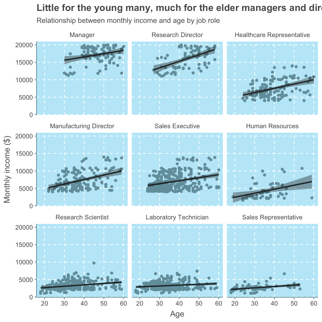
This analysis prints a cohesive picture with our previous analysis. There are no to only a few employees below 30 in high-seniority positions such as Manager and Reseach Director which both record the highest levels of monthly income. There are people of almost all ages in the other job roles. While people in HR are relatively middle-aged with a few employees at the lower and upper age range, most people working as Sales Representatives are relatively young with a few older people and only two employees above 50.
Conclusion
To conclude, the IBM HR Analytics Employee Attrition & Performance data set gives a broad overview of the dynamics of a group of employees in a fictional company. While we can observe an attrition rate of 19%, we cannot judge whether this is high or low as we have no indication of the industry in which this company works in and what is considered a high/low attrition rate there. We do, however, find that both job satisfaction and opinion on work-life balance are high/good. This indicates that most employees are satisfied and there is no high attrition due to an unpleasant work environment or stressful jobs.
While we can observe an almost Normal distribution for the employees’ age, we find that the majority of employees has been at the company less then approx. 10 years. There are, however, a few people that have worked at the company for 20 or even over 30 years. We, further find that employees are relatively quickly promoted as for most employees, the last promotion is fewer than approx. 3 years ago while for almost no employee the last promotion is over 10 years ago. While there are a few people earning more than 10,000USD per month, the majority of employees earn below, indicating a common company structure with many low-salary jobs and only few high-salary jobs.
When investigating the monthly income in detail, we neither find a distinct relationship between monthly income and education level nor between monthly income and gender. We do however find positive relationships between monthly income and age as well as monthly income and job role, indicating that an older employee is more likely to be in a senior job position and the more senior a job position is, the higher the salary.
![]()