Stop & Search - Data Visualisation Pt 1
Stop and Search in London
Stop and search powers help the police to tackle crime. Without the power of being able to stop and search individuals we suspect of having participated in or are about to commit a crime, the Met would be faced with a much tougher challenge on the streets of London. It’s targeted and intelligence-led and practised on people who are suspected of being involved in crime. Find out how it helps to keep our streets safe and what to expect if you are stopped here.
We investigate the claims of The Guardian in January 2019, calling out Stop and Search on racial bias as the “Met police ‘disproportionately’ use[s] stop and search powers on black people.”
This analysis focuses on Stop and Search data of the Metropolitan Police in London from September 2020. This data can be extracted here.
Loading data
# load data from csv
data <- read_csv(here::here("data", "stopandsearchlondon.csv"))
Inspecting data
head(data, 10)
glimpse(data)
skim(data)
Cleaning data
sasldn <- data %>%
            clean_names() %>%
            # delete empty columns
            dplyr::select(-policing_operation,
                          -part_of_a_policing_operation,
                          -outcome_linked_to_object_of_search,
                          -removal_of_more_than_just_outer_clothing) %>%
            # delete empty rows
            na.omit() %>%
            # remove one outlier value
            filter(latitude < 52)
Plotting data
Let’s visualize!
Analysis on the map
Let’s get a better understanding of where people are stopped and searched. We’ll look at the data on the map.
# coordinates for London
londonOSM <- c(left = -0.5, bottom = 51.28, right = 0.31, top = 51.7)

# map for London
ldn <- get_stamenmap(londonOSM,  maptype = "toner-lite")

# plot data on London map
mapldn <- ggmap(ldn, extent = "device") +
            # add scatterplot to the map with coordinates
            geom_point(data = sasldn,
                       aes(x = longitude,
                           y = latitude,
                           # colour points red
                           colour = "#cc0000"),
                       # adjust size and transparency of the points
                        size = 0.5,
                        alpha = 0.5)+

              theme(
                # edit text size and font
                text = element_text(size=10, family="Helvetica Neue Light"),
                # edit plot caption size and font
                plot.caption = element_text(size=6, family = "Helvetica Neue Light"),
                # edit plot title size and font
                plot.title = element_text(size=13, family = "Helvetica Neue Bold"),
                # remove legend
                legend.position = "none",
                # add margins around the plot
                plot.margin = unit(c(0.4,0.4,0.4,0.4), "lines")
                ) +

              # overwrite London as it is not visible otherwise
              geom_text(
                data = data.frame(
                  x = -0.123, y = 51.507,
                  label = "London"),
                aes(x = x, y = y,
                 label = label),
                colour="black",
                family="Helvetica Neue Bold",
                hjust = 0.5,
                lineheight = .8,
                inherit.aes = FALSE
              )+

              # add labels
              labs(title = "Stop&Search London September 2020",
                   subtitle = "More than 15,000 people stopped and searched by London Police",
                   caption = "Source: https://data.police.uk/data/")+
  NULL

# I wanted to use the title below but the styles didn't work in my plots

#title = "**Stop&Search London September 2020**",
 #                  subtitle = "More than <span style='color:#cc0000;'>15,000</span> people stopped and searched by London Police </span>")
mapldn +
ggsave('mapldn.png', height=15, width = 25, units = 'cm')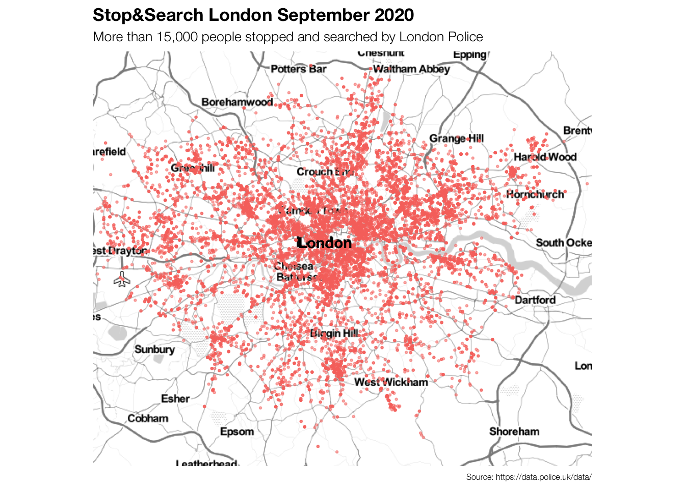
Now we know where the potential criminals were stopped and searched in London in September 2020. It is visible that there were more stops (maybe also more crimes?) in central London compared to the outskirts of the city.
Are there any other trends based on location that we can see?
Let’s plot the targets’ ethnicities first.
# filter out "Other" from officer_defined_ethnicity
sasldn_2 <- sasldn %>%
              filter(officer_defined_ethnicity != "Other")

# define color scale
ethnicity_colours <- c('#dd9b01', '#006600', '#b2b2b2')

# create plot with ggmap
mapldn2 <- ggmap(ldn, extent = "device") +
            # add scatterplot to the map with coordinates
            geom_point(data = sasldn_2,
                       aes(x = longitude,
                           y = latitude,
                           # colour by ethnicity
                           colour = officer_defined_ethnicity),
                       # adjust size and transparency of the points
                        size = 0.5,
                        alpha = 0.5)+
              # include set colours for the colour-grouping of ethnicities
              scale_color_manual(values=ethnicity_colours)+

              theme(
                # edit text size and font
                text = element_text(size=10, family="Helvetica Neue Light"),
                # edit plot caption size and font
                plot.caption = element_text(size=6, family = "Helvetica Neue Light"),
                # edit plot title size and font
                plot.title = element_text(size=13, family = "Helvetica Neue Bold"),
                # edit legend
                legend.position = "top",
                legend.background = element_rect(fill = "#f0f0f0"),
                legend.title = element_text(size = 8, family="Helvetica Neue Light"),
                legend.key = element_rect(size = 20),
                legend.key.size = unit(10,"point"),
                #plot.background = element_rect(fill = "white"),
                #panel.background = element_rect(fill = "white"),
                # add plot margins
                plot.margin = unit(c(0.4,1,0.4,0.4), "lines")
                ) +

              # overwrite London as it is not visible otherwise
              geom_text(
                data = data.frame(
                  x = -0.115, y = 51.509,
                  label = "London"),
                aes(x = x, y = y,
                 label = label),
                colour="black",
                family="Helvetica Neue Bold",
                hjust = 0.5,
                lineheight = .8,
                inherit.aes = FALSE
              )+

              # overwriting legend aes and making points bigger and non-transparent
              guides(
                colour = guide_legend
                (override.aes = list(alpha = 1,
                                     size = 2)))+
              # add labels
              labs(title = "Stop&Search London September 2020",
                   subtitle = "High concentration on Asian- and Black\nethnicities in South and East London",
                   colour = "Ethnicity*",
                   caption = "*Ethnicity defined by police officer\nSource: https://data.police.uk/data/")+
  NULL
Let’s plot the targets’ genders next.
# filter out "Other" from gender
sasldn_3 <- sasldn %>%
              filter(gender != "Other")

# define color scale
gender_colours <- c('#bc5a45', '#034f84')

# create plot with ggmap
mapldn3 <- ggmap(ldn, extent = "device") +
            # add scatterplot to the map with coordinates
            geom_point(data = sasldn_3,
                       aes(x = longitude,
                           y = latitude,
                           # colour by gender
                           colour = gender),
                       # adjust size and transparency of the points
                        size = 0.5,
                        alpha = 0.5)+
              # include set colours for the colour-grouping of ethnicities
              scale_color_manual(values=gender_colours)+

              theme(
                # edit text size and font
                text = element_text(size=10, family="Helvetica Neue Light"),
                # edit plot caption size and font
                plot.caption = element_text(size=6, family = "Helvetica Neue Light"),
                # edit plot title size and font
                plot.title = element_text(size=13, family = "Helvetica Neue Bold"),
                # edit legend
                legend.position = "top",
                legend.background = element_rect(fill = "#f0f0f0"),
                legend.title = element_text(size = 8, family="Helvetica Neue Light"),
                legend.key = element_rect(size = 20),
                legend.key.size = unit(10,"point"),
                #plot.background = element_rect(fill = "white"),
                #panel.background = element_rect(fill = "white"),
                # add plot margins
                plot.margin = unit(c(0.4,0.4,0.4,1), "lines")
                ) +

              # overwrite London as it is not visible otherwise
              geom_text(
                data = data.frame(
                  x = -0.115, y = 51.509,
                  label = "London"),
                aes(x = x, y = y,
                 label = label),
                colour="black",
                family="Helvetica Neue Bold",
                hjust = 0.5,
                lineheight = .8,
                inherit.aes = FALSE
              )+

              # overwriting legend aes and making points bigger and non-transparent
              guides(
                colour = guide_legend
                (override.aes = list(alpha = 1,
                                     size = 2)))+
              # add labels
              labs(
                # no title because it will be arranged next to mapldn3
                title = "",
                   subtitle = "London Police stops almost only men",
                   colour = "Gender",
                   caption = "Source: https://data.police.uk/data/")+
  NULL
mapldn2 +
ggsave('mapldn2.png', height=15, width = 25, units = 'cm')
mapldn3 +
ggsave('mapldn3.png', height=15, width = 25, units = 'cm')
# no title because it will be arranged next to mapldn3Putting both together…
We find that almost only men are stopped and searched - either women are not involved in any crimes or the police just doesn’t assume they are. While generally, people from all ethnicities are stopped and searched, more people of Black- (South, South-East) and Asian-ethnicity (East) are stopped and searched in South and East London. As these areas generally have higher levels of poverty and greater shares of people with migration backgrounds, the police seems to be biased to stop and search more non-white people. Similarly, as often men are stereotypically thought to be more likely to be criminal, the policy seems to be highly biased towards almost only stopping and searching men.
grid.arrange(mapldn2,mapldn3, nrow = 1) 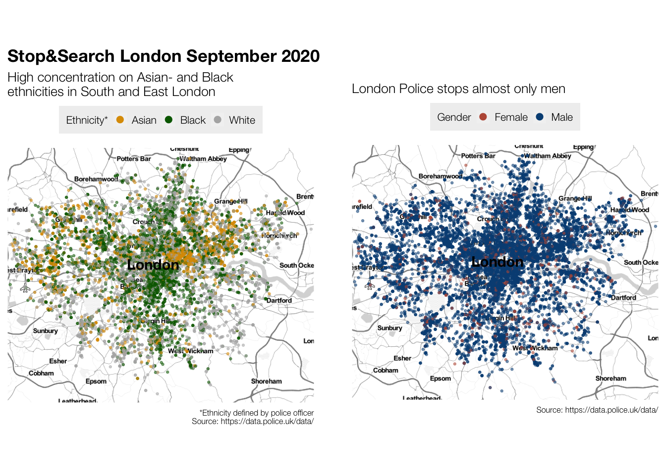
Next, we want to investigate if there are any differences in stops and searches according to the different times of the day.
# splitting date column into date column and time column
sasldn$date2 <- as.Date(sasldn$date, "%YYYY-%MM-%DD")
sasldn$time <- format(sasldn$date, "%H:%M:%S")
# create time specific data sets (1 set per 2 hours in the day)
sasldn_00to2 <- sasldn %>% filter(time >= '00:00:00', time < '02:00:00')
sasldn_2to4 <- sasldn %>% filter(time >= '02:00:00', time < '04:00:00')
sasldn_4to6 <- sasldn %>% filter(time >= '04:00:00', time < '06:00:00')
sasldn_6to8 <- sasldn %>% filter(time >= '06:00:00', time < '08:00:00')
sasldn_8to10 <- sasldn %>% filter(time >= '08:00:00', time < '10:00:00')
sasldn_10to12 <- sasldn %>% filter(time >= '10:00:00', time < '12:00:00')
sasldn_12to14 <- sasldn %>% filter(time >= '12:00:00', time < '14:00:00')
sasldn_14to16 <- sasldn %>% filter(time >= '14:00:00', time < '16:00:00')
sasldn_16to18 <- sasldn %>% filter(time >= '16:00:00', time < '18:00:00')
sasldn_18to20 <- sasldn %>% filter(time >= '18:00:00', time < '20:00:00')
sasldn_20to22 <- sasldn %>% filter(time >= '20:00:00', time < '22:00:00')
sasldn_22to00 <- sasldn %>% filter(time >= '22:00:00', time <= '23:59:59')
#create time specific maps
map00to2 <- ggmap(ldn, extent = "device") +
# add scatterplot to the map with coordinates
geom_point(data = sasldn_00to2,
aes(x = longitude,
y = latitude),
# colour by time of day (sky)
colour = "#061d37",
# adjust size and transparency of the points
size = 0.8,
alpha = 0.8)+
theme(
# edit text size and font
text = element_text(size=10, family="Helvetica Neue Light"),
# edit plot caption size and font
plot.caption = element_text(size=6, family = "Helvetica Neue Light"),
# edit plot title size and font
plot.title = element_text(size=13, family = "Helvetica Neue Bold"),
# add plot margins
plot.margin = unit(c(0.5,0.5,0.5,0.5), "lines")
) +
# add time stamp
geom_label(aes(label = "Time: 00:00-02:00"),
hjust = "left", vjust = "top",
size = 4,
family = "Helvetica Neue Bold",
colour = "#c94c4c") +
# add labels
labs(title = "Stop&Search London September 2020",
subtitle = "Most people stopped and searched in the afternoon and evening",
caption = "Source: https://data.police.uk/data/")+
NULL
map2to4 <- ggmap(ldn, extent = "device") +
# add scatterplot to the map with coordinates
geom_point(data = sasldn_2to4,
aes(x = longitude,
y = latitude),
# colour by time of day (sky)
colour = "#102849",
# adjust size and transparency of the points
size = 0.8,
alpha = 0.8)+
theme(
# edit text size and font
text = element_text(size=10, family="Helvetica Neue Light"),
# edit plot caption size and font
plot.caption = element_text(size=6, family = "Helvetica Neue Light"),
# edit plot title size and font
plot.title = element_text(size=13, family = "Helvetica Neue Bold"),
# add plot margins
plot.margin = unit(c(0.5,0.5,0.5,0.5), "lines")
) +
# add time stamp
geom_label(aes(label = "Time: 02:00-04:00"),
hjust = "left", vjust = "top",
size = 4,
family = "Helvetica Neue Bold",
colour = "#c94c4c") +
# add labels
labs(title = "Stop&Search London September 2020",
subtitle = "Most people stopped and searched in the afternoon and evening",
caption = "Source: https://data.police.uk/data/")+
NULL
map4to6 <- ggmap(ldn, extent = "device") +
# add scatterplot to the map with coordinates
geom_point(data = sasldn_4to6,
aes(x = longitude,
y = latitude),
# colour by time of day (sky)
colour = "#3c5a8c",
# adjust size and transparency of the points
size = 0.8,
alpha = 0.8)+
theme(
# edit text size and font
text = element_text(size=10, family="Helvetica Neue Light"),
# edit plot caption size and font
plot.caption = element_text(size=6, family = "Helvetica Neue Light"),
# edit plot title size and font
plot.title = element_text(size=13, family = "Helvetica Neue Bold"),
# add plot margins
plot.margin = unit(c(0.5,0.5,0.5,0.5), "lines")
) +
# add time stamp
geom_label(aes(label = "Time: 04:00-06:00"),
hjust = "left", vjust = "top",
size = 4,
family = "Helvetica Neue Bold",
colour = "#c94c4c") +
# add labels
labs(title = "Stop&Search London September 2020",
subtitle = "Most people stopped and searched in the afternoon and evening",
caption = "Source: https://data.police.uk/data/")+
NULL
map6to8 <- ggmap(ldn, extent = "device") +
# add scatterplot to the map with coordinates
geom_point(data = sasldn_6to8,
aes(x = longitude,
y = latitude),
# colour by time of day (sky)
colour = "#7194cc",
# adjust size and transparency of the points
size = 0.8,
alpha = 0.8)+
theme(
# edit text size and font
text = element_text(size=10, family="Helvetica Neue Light"),
# edit plot caption size and font
plot.caption = element_text(size=6, family = "Helvetica Neue Light"),
# edit plot title size and font
plot.title = element_text(size=13, family = "Helvetica Neue Bold"),
# add plot margins
plot.margin = unit(c(0.5,0.5,0.5,0.5), "lines")
) +
# add time stamp
geom_label(aes(label = "Time: 06:00-08:00"),
hjust = "left", vjust = "top",
size = 4,
family = "Helvetica Neue Bold",
colour = "#c94c4c") +
# add labels
labs(title = "Stop&Search London September 2020",
subtitle = "Most people stopped and searched in the afternoon and evening",
caption = "Source: https://data.police.uk/data/")+
NULL
map8to10 <- ggmap(ldn, extent = "device") +
# add scatterplot to the map with coordinates
geom_point(data = sasldn_8to10,
aes(x = longitude,
y = latitude),
# colour by time of day (sky)
colour = "#89b7dc",
# adjust size and transparency of the points
size = 0.8,
alpha = 0.8)+
theme(
# edit text size and font
text = element_text(size=10, family="Helvetica Neue Light"),
# edit plot caption size and font
plot.caption = element_text(size=6, family = "Helvetica Neue Light"),
# edit plot title size and font
plot.title = element_text(size=13, family = "Helvetica Neue Bold"),
# add plot margins
plot.margin = unit(c(0.5,0.5,0.5,0.5), "lines")
) +
# add time stamp
geom_label(aes(label = "Time: 08:00-10:00"),
hjust = "left", vjust = "top",
size = 4,
family = "Helvetica Neue Bold",
colour = "#c94c4c") +
# add labels
labs(title = "Stop&Search London September 2020",
subtitle = "Most people stopped and searched in the afternoon and evening",
caption = "Source: https://data.police.uk/data/")+
NULL
map10to12 <- ggmap(ldn, extent = "device") +
# add scatterplot to the map with coordinates
geom_point(data = sasldn_10to12,
aes(x = longitude,
y = latitude),
# colour by time of day (sky)
colour = "#78b6fa",
# adjust size and transparency of the points
size = 0.8,
alpha = 0.8)+
theme(
# edit text size and font
text = element_text(size=10, family="Helvetica Neue Light"),
# edit plot caption size and font
plot.caption = element_text(size=6, family = "Helvetica Neue Light"),
# edit plot title size and font
plot.title = element_text(size=13, family = "Helvetica Neue Bold"),
# add plot margins
plot.margin = unit(c(0.5,0.5,0.5,0.5), "lines")
) +
# add time stamp
geom_label(aes(label = "Time: 10:00-12:00"),
hjust = "left", vjust = "top",
size = 4,
family = "Helvetica Neue Bold",
colour = "#c94c4c") +
# add labels
labs(title = "Stop&Search London September 2020",
subtitle = "Most people stopped and searched in the afternoon and evening",
caption = "Source: https://data.police.uk/data/")+
NULL
map12to14 <- ggmap(ldn, extent = "device") +
# add scatterplot to the map with coordinates
geom_point(data = sasldn_12to14,
aes(x = longitude,
y = latitude),
# colour by time of day (sky)
colour = "#6ab6fa",
# adjust size and transparency of the points
size = 0.8,
alpha = 0.8)+
theme(
# edit text size and font
text = element_text(size=10, family="Helvetica Neue Light"),
# edit plot caption size and font
plot.caption = element_text(size=6, family = "Helvetica Neue Light"),
# edit plot title size and font
plot.title = element_text(size=13, family = "Helvetica Neue Bold"),
# add plot margins
plot.margin = unit(c(0.5,0.5,0.5,0.5), "lines")
) +
# add time stamp
geom_label(aes(label = "Time: 12:00-14:00"),
hjust = "left", vjust = "top",
size = 4,
family = "Helvetica Neue Bold",
colour = "#c94c4c") +
# add labels
labs(title = "Stop&Search London September 2020",
subtitle = "Most people stopped and searched in the afternoon and evening",
caption = "Source: https://data.police.uk/data/")+
NULL
map14to16 <- ggmap(ldn, extent = "device") +
# add scatterplot to the map with coordinates
geom_point(data = sasldn_14to16,
aes(x = longitude,
y = latitude),
# colour by time of day (sky)
colour = "#78b6fa",
# adjust size and transparency of the points
size = 0.8,
alpha = 0.8)+
theme(
# edit text size and font
text = element_text(size=10, family="Helvetica Neue Light"),
# edit plot caption size and font
plot.caption = element_text(size=6, family = "Helvetica Neue Light"),
# edit plot title size and font
plot.title = element_text(size=13, family = "Helvetica Neue Bold"),
# add plot margins
plot.margin = unit(c(0.5,0.5,0.5,0.5), "lines")
) +
# add time stamp
geom_label(aes(label = "Time: 14:00-16:00"),
hjust = "left", vjust = "top",
size = 4,
family = "Helvetica Neue Bold",
colour = "#c94c4c") +
# add labels
labs(title = "Stop&Search London September 2020",
subtitle = "Most people stopped and searched in the afternoon and evening",
caption = "Source: https://data.police.uk/data/")+
NULL
map16to18 <- ggmap(ldn, extent = "device") +
# add scatterplot to the map with coordinates
geom_point(data = sasldn_16to18,
aes(x = longitude,
y = latitude),
# colour by time of day (sky)
colour = "#89b7dc",
# adjust size and transparency of the points
size = 0.8,
alpha = 0.8)+
theme(
# edit text size and font
text = element_text(size=10, family="Helvetica Neue Light"),
# edit plot caption size and font
plot.caption = element_text(size=6, family = "Helvetica Neue Light"),
# edit plot title size and font
plot.title = element_text(size=13, family = "Helvetica Neue Bold"),
# add plot margins
plot.margin = unit(c(0.5,0.5,0.5,0.5), "lines")
) +
# add time stamp
geom_label(aes(label = "Time: 16:00-18:00"),
hjust = "left", vjust = "top",
size = 4,
family = "Helvetica Neue Bold",
colour = "#c94c4c") +
# add labels
labs(title = "Stop&Search London September 2020",
subtitle = "Most people stopped and searched in the afternoon and evening",
caption = "Source: https://data.police.uk/data/")+
NULL
map18to20 <- ggmap(ldn, extent = "device") +
# add scatterplot to the map with coordinates
geom_point(data = sasldn_18to20,
aes(x = longitude,
y = latitude),
# colour by time of day (sky)
colour = "#7194cc",
# adjust size and transparency of the points
size = 0.8,
alpha = 0.8)+
theme(
# edit text size and font
text = element_text(size=10, family="Helvetica Neue Light"),
# edit plot caption size and font
plot.caption = element_text(size=6, family = "Helvetica Neue Light"),
# edit plot title size and font
plot.title = element_text(size=13, family = "Helvetica Neue Bold"),
# add plot margins
plot.margin = unit(c(0.5,0.5,0.5,0.5), "lines")
) +
# add time stamp
geom_label(aes(label = "Time: 18:00-20:00"),
hjust = "left", vjust = "top",
size = 4,
family = "Helvetica Neue Bold",
colour = "#c94c4c") +
# add labels
labs(title = "Stop&Search London September 2020",
subtitle = "Most people stopped and searched in the afternoon and evening",
caption = "Source: https://data.police.uk/data/")+
NULL
map20to22 <- ggmap(ldn, extent = "device") +
# add scatterplot to the map with coordinates
geom_point(data = sasldn_20to22,
aes(x = longitude,
y = latitude),
# colour by time of day (sky)
colour = "#3c5a8c",
# adjust size and transparency of the points
size = 0.8,
alpha = 0.8)+
theme(
# edit text size and font
text = element_text(size=10, family="Helvetica Neue Light"),
# edit plot caption size and font
plot.caption = element_text(size=6, family = "Helvetica Neue Light"),
# edit plot title size and font
plot.title = element_text(size=13, family = "Helvetica Neue Bold"),
# add plot margins
plot.margin = unit(c(0.5,0.5,0.5,0.5), "lines")
) +
# add time stamp
geom_label(aes(label = "Time: 20:00-22:00"),
hjust = "left", vjust = "top",
size = 4,
family = "Helvetica Neue Bold",
colour = "#c94c4c") +
# add labels
labs(title = "Stop&Search London September 2020",
subtitle = "Most people stopped and searched in the afternoon and evening",
caption = "Source: https://data.police.uk/data/")+
NULL
map22to00 <- ggmap(ldn, extent = "device") +
# add scatterplot to the map with coordinates
geom_point(data = sasldn_22to00,
aes(x = longitude,
y = latitude),
# colour by time of day (sky)
colour = "#102849",
# adjust size and transparency of the points
size = 0.8,
alpha = 0.8)+
theme(
# edit text size and font
text = element_text(size=10, family="Helvetica Neue Light"),
# edit plot caption size and font
plot.caption = element_text(size=6, family = "Helvetica Neue Light"),
# edit plot title size and font
plot.title = element_text(size=13, family = "Helvetica Neue Bold"),
# add plot margins
plot.margin = unit(c(0.5,0.5,0.5,0.5), "lines")
) +
# add time stamp
geom_label(aes(label = "Time: 22:00-00:00"),
hjust = "left", vjust = "top",
size = 4,
family = "Helvetica Neue Bold",
colour = "#c94c4c") +
# add labels
labs(title = "Stop&Search London September 2020",
subtitle = "Most people stopped and searched in the afternoon and evening",
caption = "Source: https://data.police.uk/data/")+
NULL
# save each map as png
map00to2 + ggsave('map00to2.jpeg', height=6, width = 6, units = 'in')
map2to4 + ggsave('map2to4.jpeg', height=6, width = 6, units = 'in')
map4to6 + ggsave('map4to6.jpeg', height=6, width = 6, units = 'in')
map6to8 + ggsave('map6to8.jpeg', height=6, width = 6, units = 'in')
map8to10 + ggsave('map8to10.jpeg', height=6, width = 6, units = 'in')
map10to12 + ggsave('map10to12.jpeg', height=6, width = 6, units = 'in')
map12to14 + ggsave('map12to14.jpeg', height=6, width = 6, units = 'in')
map14to16 + ggsave('map14to16.jpeg', height=6, width = 6, units = 'in')
map16to18 + ggsave('map16to18.jpeg', height=6, width = 6, units = 'in')
map18to20 + ggsave('map18to20.jpeg', height=6, width = 6, units = 'in')
map20to22 + ggsave('map20to22.jpeg', height=6, width = 6, units = 'in')
map22to00 + ggsave('map22to00.jpeg', height=6, width = 6, units = 'in')
# create gif
list.files(pattern = '*.jpeg', full.names = TRUE) %>%
image_read() %>% # reads each path file
image_join() %>% # join images
image_animate(fps=4) %>% # animates, opt for number of loops
image_write("ldnmap_sept_timeofday.gif") # save to current folderFinally we can see through the visualization that the police stops most people during the afternoon and in the evening, especially from 2pm onward. This is most likely also the time when the most crimes occur as well as when the most people are on the streets or generally outside (e.g. after work, commuting, sports, shopping, etc.).

In a future analysis, it would be interesting to compare the share of stops and searches between weekday and weekend as well.
Analysis with plots
Let’s have a closer look at the objects that were most searched when people were stopped. We’ll also consider the age range of the people that were stopped.
# edit data frame
sasldn_3 <- sasldn %>%
  # only keep top 3 objects of search
  filter(object_of_search != "Fireworks",
         object_of_search != "Anything to threaten or harm anyone",
         object_of_search != "Articles for use in criminal damage",
         object_of_search != "Firearms",
         object_of_search != "Evidence of offences under the Act",
         # delete under 10 age range (only few/no values)
         age_range != "under 10")

# redefine age_range order
sasldn_3$age_range <- factor(sasldn_3$age_range, levels = c("over 34", "25-34", "18-24", "10-17"))

# define label
label = "~47% of all stops and searches\nare targeted at young adults \nwith controlled drugs*"

# create bar plot
 object_age_plot <- ggplot(sasldn_3, aes(x = object_of_search,
                      fill = age_range)) +
  geom_bar(width = 0.6) +
   theme(
     # change plot ratio
     aspect.ratio = (9/12),
                # edit text size and font
                text = element_text(size=9, family="Helvetica Neue Light"),
                # edit plot caption size and font
                plot.caption = element_text(size=6, family = "Helvetica Neue Light"),
                # edit plot title size and font
                plot.title = element_text(size=13, family = "Helvetica Neue Bold"),
                # edit legend
                legend.position = "top",
                legend.background = element_rect(fill = "white"),
                legend.title = element_text(size = 8, family="Helvetica Neue Bold"),
                legend.key = element_rect(size = 10),
                legend.key.size = unit(8,"point"),
                #edit axes
         axis.title.y = element_text(size = 0),
         axis.line.x = element_line(size = 0),
         axis.ticks.x = element_line(size = 0),
         axis.ticks.length = unit(.2, "cm"),
         axis.ticks.y = element_line(size = 0),
         # edit panel
        panel.grid.major = element_line(size = 0),
        panel.grid.minor = element_line(size = 0),
        panel.background = element_rect(fill = NA),
        panel.grid.major.y = element_line(size = 0.15,
                                          linetype = 1,
                                          colour = "gray")
        ) +
   # limit y scale
   scale_y_continuous(limits = c(0,10000))+
   # use blue brewer colour palette
   scale_fill_brewer(palette = "Blues")+
   # insert labels
   labs(title = "Stop&Search biggest target:\nYoung adults with drugs",
        subtitle = "Top 3 searched objects in London's Stop&Search in Sep 2020",
        caption = "*18.322% 25-34 year-olds and 28.487% 18-24 year-olds\nSource: https://data.police.uk/data/",
        fill = "Age range",
        x = "",
        y = "Amount")+
   # insert descriptive text
   geom_text(data = data.frame(x = 2.3, y = 8000, label = label),
          aes(x = x, y = y, label = label),
          colour="black",
          family="Helvetica Neue Medium",
          size = 2.5,
          inherit.aes = FALSE
          )+
   # insert arrow
   geom_curve(aes(x = 2.3, y = 7000, xend = 1.5, yend = 5000),
              arrow = arrow(length = unit(0.04, "npc")),
              curvature = -0.5,
              size = 0.2)+
   NULL

 # checked percentages with this code:
  #ggplot(sasldn_3, aes(x = object_of_search, fill = age_range, label = scales::percent(prop.table(stat(count))))) +
  #geom_bar(width = 0.6, position = "dodge") +
  # geom_text(stat = 'count',
   #          position = position_dodge(1),
    #         vjust = -0.5,
     #        size = 3) +
We find that the police mostly stops and searches young adults (almost 50% of the time). The most frequent object of search are controlled drugs.
# save plot
object_age_plot +
ggsave('object_age_plot.png', height=15, width = 25, units = 'cm')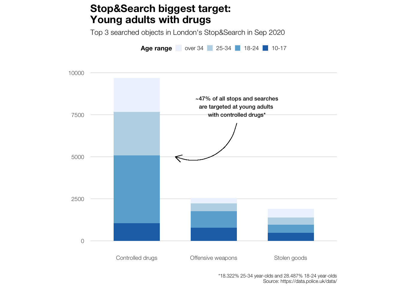
Lastly, we’ll have a look at the consequences (outcomes) of the stops and searches.
sasldn_4 <- sasldn_3 %>%
              mutate(outcome_simple = case_when(
                        outcome == "A no further action disposal" ~ "No further action",
                        outcome == "Arrest" ~ "Arrest",
                        outcome == "Community resolution" ~ "Community resolution",
                        TRUE ~ "Other"))

#sasldn_4$outcome_simple <- factor(sasldn_4$outcome_simple, levels = c("No further action", "Arrest", "Community resolution", "Other"))

##### plot to find numbers
##### i know this usually works differently but I couldn't get my summarise/count functions to work :-( sorry for the static df

#sasldn_4 %>%
 # ggplot(aes(x = outcome_simple, fill = outcome_simple, label = (stat(count)))) +
  #geom_bar()+
  #geom_text(stat = 'count',
   #                 position = position_dodge(1),
    #                vjust = -0.5,
     #               size = 3) +
  #NULL

sasldn_4_set <- data.frame(
  outcome_simple = c("No further action", "Arrest", "Community resolution", "Other"),
  values = c(10287, 1952, 1271, 637))
data_points_sum <- 10287 + 1952 + 1271 + 637

sasldn_4_set$outcome_simple <- factor(sasldn_4_set$outcome_simple,
                                      levels = c("No further action", "Arrest", "Community resolution", "Other"))

outcome_plot <- sasldn_4_set %>%
    ggplot(aes(x = "", y = values, fill = outcome_simple))+
    geom_bar(width = 1, stat = "identity")+
    coord_polar("y", start = 0)+
    theme(
    # edit text size and font
    text = element_text(size=9, family="Helvetica Neue Light"),
    # edit plot caption size and font
    plot.caption = element_text(size=6, family = "Helvetica Neue Light"),
    # edit plot title size and font
    plot.title = element_text(size=13, family = "Helvetica Neue Bold"),
    # edit legend
    legend.position = "right",
    legend.background = element_rect(fill = "white"),
    legend.title = element_text(size = 8, family="Helvetica Neue Bold"),
    legend.key = element_rect(size = 10),
    legend.key.size = unit(8,"point"),
    #edit axes
    axis.title.x = element_blank(),
    axis.title.y = element_blank(),
    axis.text.x=element_blank(),
    panel.border = element_blank(),
    panel.grid=element_blank(),
    axis.ticks = element_blank()
  ) +
    # edit colour palette
    scale_fill_manual(values=c("#618685", "#93beae", "#b1cbbb", "#deeaee"))+
    # add pie piece labels
    geom_text(aes(label = percent(round(values/data_points_sum,2),1)),
              position = position_stack(vjust = 0.5),
              size = 3,
              family="Helvetica Neue Bold")+
    # edit plot labels
    labs(title = "Stop&Search targets often let off the hook",
          subtitle = "Most frequent consequences of London's Stop&Search in September 2020",
          caption = "Source: https://data.police.uk/data/",
          fill = "Stop&Search Consequence"
          )+
  NULL
We find that almost three quarters of the people that are stopped and searched face no further consequences. Perhaps this indicates that a lot of people that are stopped and searched were not actually involved in any criminal activity.
outcome_plot +
ggsave('outcome_plot.png', height=15, width = 25, units = 'cm')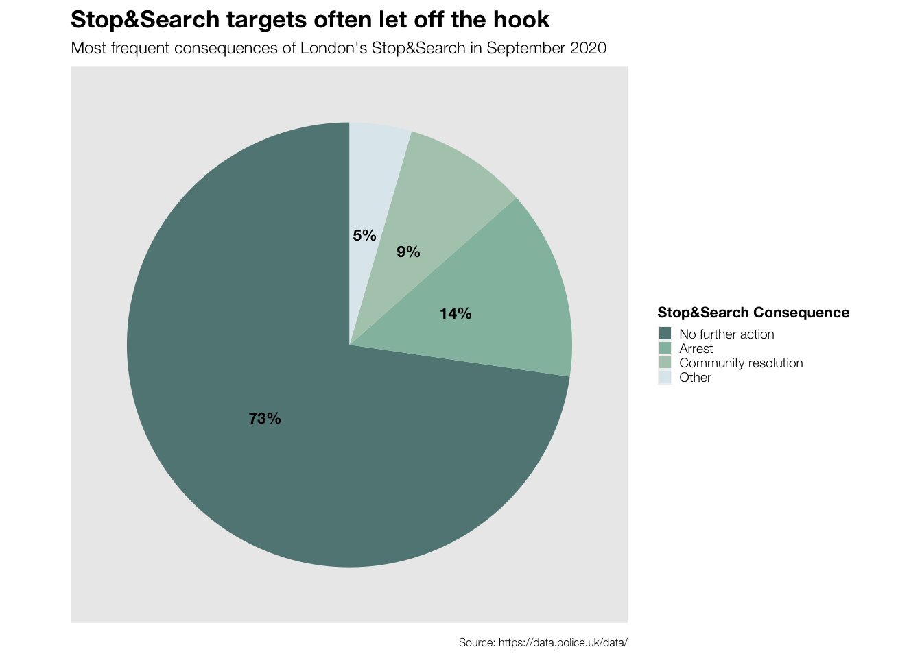
Mini Conclusion
Although also a great share of all Stop&Search targets are White, we find a bias towards stopping and searching people of Black and Asian ethnicities in certain areas of London. At the same time, mostly young adults and men are stopped and searched. Nevertheless, we can see that most of the people that are stopped and searched face no further consequences.
Generally, it looks like women can get away with anything here…