Stop & Search - Data Visualisation Pt 2
Stop and Search in London
Stop and search powers help the police to tackle crime. Without the power of being able to stop and search individuals we suspect of having participated in or are about to commit a crime, the Met would be faced with a much tougher challenge on the streets of London. It’s targeted and intelligence-led and practised on people who are suspected of being involved in crime. Find out how it helps to keep our streets safe and what to expect if you are stopped here.
According to an article in The Guardian from January 2019, written by Vikram Dodd, the London Police “disproportionately use[s] stop and search powers on black people.” The following data analysis and visualisations deal with verifying and further investigating these claims as well as exploring what has changed since then.
The analysis entails Stop&Search data from October 2017 to September 2020. As the data for the last months of 2017 and some of the first months in 2018 is not fully representative, we often filter these months, if looked at in detail, out.
After inspecting the initial data available, it is cleaned and processed so that the data set is ready for further exploration and visualisation.
Loading data
# load data from multiple csvs
data_dir <- here::here("data", "sasdata")

files <- fs::dir_ls(path = data_dir, regexp = "\\.csv$", recurse = TRUE)
#recurse=TRUE will recursively look for files further down into any folde

#read them all in using vroom::vroom()
stop_search_data <- vroom(files, id = "source")
Inspecting data
head(stop_search_data, 10)
glimpse(stop_search_data)
skim(stop_search_data)
Data cleaning, processing, preparation & exploration
  # combine no action outcomes
stop_search_data1 <- data.frame(lapply(stop_search_data, function(x) {
                  gsub("A no further action disposal", "No further action", x)
              }))

stop_search_data2 <- data.frame(lapply(stop_search_data1, function(x) {
                  gsub("Nothing found - no further action", "No further action", x)
              }))

# clean & prepare data
sasldn <- stop_search_data2 %>%
  janitor::clean_names() %>%
   # delete irrelevant columns
    dplyr::select(-source,
                  -policing_operation,
                  -part_of_a_policing_operation,
                  -outcome_linked_to_object_of_search,
                  -removal_of_more_than_just_outer_clothing) %>%
  # delete NAs
  #na.omit() %>%

  mutate(month = month(date),
         month_name = month(date, label=TRUE, abbr = TRUE),
         year= year(date),
         month_year = paste0(year, "-",month_name),
         #convert latitude & longitude from characters into numerics
         latitude = as.numeric(latitude),
         longitude = as.numeric(longitude)) %>%
  filter(month_year != "2017-Sep") %>%
  #remove location outliers
  filter(longitude < 0.4) %>%
  filter(longitude > -0.6) %>%
  filter(latitude > 50) %>%
  filter(latitude < 52)

# order month_year
sasldn$month_year = factor(sasldn$month_year, levels = c("2017-Oct","2017-Nov","2017-Dec",
                               "2018-Jan","2018-Feb","2018-Mar","2018-Apr","2018-May","2018-Jun","2018-Jul","2018-Aug","2018-Sep","2018-Oct","2018-Nov","2018-Dec",
                               "2019-Jan","2019-Feb","2019-Mar","2019-Apr","2019-May","2019-Jun","2019-Jul","2019-Aug","2019-Sep","2019-Oct","2019-Nov","2019-Dec",
                               "2020-Jan","2020-Feb","2020-Mar","2020-Apr","2020-May","2020-Jun","2020-Jul","2020-Aug","2020-Sep"))
# inspect again
glimpse(sasldn)## Rows: 604,928
## Columns: 15
## $ type <chr> "Person search", "Person search", "Person s…
## $ date <chr> "2017-10-01 00:00:00", "2017-10-01 00:00:00…
## $ latitude <dbl> 51.59125, 51.54662, 51.52712, 51.51429, 51.…
## $ longitude <dbl> -0.069101, -0.147042, -0.076155, -0.038099,…
## $ gender <chr> "Male", "Male", "Male", "Male", "Male", "Ma…
## $ age_range <chr> "18-24", "25-34", "25-34", NA, "25-34", "25…
## $ self_defined_ethnicity <chr> "Black/African/Caribbean/Black British - Ca…
## $ officer_defined_ethnicity <chr> "Black", "White", "Black", NA, "White", "Wh…
## $ legislation <chr> "Police and Criminal Evidence Act 1984 (sec…
## $ object_of_search <chr> "Articles for use in criminal damage", "Con…
## $ outcome <chr> "No further action", "Offender given drugs …
## $ month <dbl> 10, 10, 10, 10, 10, 10, 10, 10, 10, 10, 10,…
## $ month_name <ord> Oct, Oct, Oct, Oct, Oct, Oct, Oct, Oct, Oct…
## $ year <dbl> 2017, 2017, 2017, 2017, 2017, 2017, 2017, 2…
## $ month_year <fct> 2017-Oct, 2017-Oct, 2017-Oct, 2017-Oct, 201…# some quick counts...
sasldn %>%
dplyr::count(gender, sort=TRUE)## gender n
## 1 Male 556975
## 2 Female 39323
## 3 <NA> 8307
## 4 Other 323sasldn %>%
dplyr::count(object_of_search, sort=TRUE)## object_of_search n
## 1 Controlled drugs 364308
## 2 Offensive weapons 104989
## 3 Stolen goods 65032
## 4 Evidence of offences under the Act 28519
## 5 Anything to threaten or harm anyone 22106
## 6 Articles for use in criminal damage 13116
## 7 Firearms 3857
## 8 <NA> 1503
## 9 Fireworks 1498sasldn %>%
dplyr::count(officer_defined_ethnicity, sort=TRUE)## officer_defined_ethnicity n
## 1 Black 240100
## 2 White 223869
## 3 Asian 104064
## 4 Other 24807
## 5 <NA> 12088sasldn %>%
dplyr::count(age_range, sort = TRUE)## age_range n
## 1 18-24 212074
## 2 25-34 130536
## 3 10-17 104521
## 4 over 34 94939
## 5 <NA> 62749
## 6 under 10 109sasldn %>%
dplyr::count(outcome, sort = TRUE)## outcome n
## 1 No further action 456532
## 2 Arrest 73635
## 3 Community resolution 43506
## 4 Penalty Notice for Disorder 13195
## 5 Summons / charged by post 6799
## 6 Suspect arrested 5169
## 7 Offender given drugs possession warning 2393
## 8 Khat or Cannabis warning 1957
## 9 Offender given penalty notice 646
## 10 Caution (simple or conditional) 396
## 11 Local resolution 345
## 12 Suspect summonsed to court 330
## 13 Offender cautioned 25# concentrate in top searches, age_ranges, and officer defined ethnicities
which_searches <- c("Controlled drugs", "Offensive weapons","Stolen goods" )
which_ages <- c("10-17", "18-24","25-34", "over 34")
which_ethnicity <- c("White", "Black", "Asian")
which_gender <- c("Male", "Female")
sasldn <- sasldn %>%
# concentrate in top searches, age_ranges, and officer defined ethnicities & gender
filter(object_of_search %in% which_searches) %>%
filter(age_range %in% which_ages) %>%
filter(officer_defined_ethnicity %in% which_ethnicity) %>%
filter(gender %in% which_gender)
# check
# sasldn %>%
# dplyr::count(outcome, sort = TRUE)# prep london map
london_wards <- sf::read_sf(here::here("data/London-wards-2018_ESRI/London_Ward.shp"))
st_geometry(london_wards)## Geometry set for 657 features
## geometry type: POLYGON
## dimension: XY
## bbox: xmin: 503568.2 ymin: 155850.8 xmax: 561957.5 ymax: 200933.9
## projected CRS: OSGB 1936 / British National Grid
## First 5 geometries:# transfrom CRS to 4326, or pairs of latitude/longitude numbers
london_wards2 <- london_wards %>%
st_transform(4326)
london_wards2$geometry## Geometry set for 657 features
## geometry type: POLYGON
## dimension: XY
## bbox: xmin: -0.5103751 ymin: 51.28676 xmax: 0.3340155 ymax: 51.69187
## geographic CRS: WGS 84
## First 5 geometries:# transform sasldn to a common CRS.
sasldn_map <- st_as_sf(sasldn,
coords=c('longitude', 'latitude'),
crs=4326)
sasldn_wo17 <- sasldn %>% filter(year != 2017)
sasldn_wo17_map <- st_as_sf(sasldn_wo17,
coords=c('longitude', 'latitude'),
crs=4326)sasldn_wo17 %>%
dplyr::group_by(object_of_search) %>%
dplyr::summarise(n = n()) %>%
mutate(freq = n / sum(n))## # A tibble: 3 x 3
## object_of_search n freq
## <chr> <int> <dbl>
## 1 Controlled drugs 296632 0.673
## 2 Offensive weapons 88210 0.200
## 3 Stolen goods 55996 0.127#Controlled drugs 296604 0.6728812
#Offensive weapons 88203 0.2000989
#Stolen goods 55990 0.1270199
sasldn %>%
dplyr::group_by(gender) %>%
dplyr::summarise(n = n()) %>%
mutate(freq = n / sum(n))## # A tibble: 2 x 3
## gender n freq
## <chr> <int> <dbl>
## 1 Female 32567 0.0714
## 2 Male 423662 0.929Analysis
Stopped and Searched - Where?
# coordinates for London
londonOSM <- c(left = -0.5, bottom = 51.28, right = 0.31, top = 51.7)

# map for London
ldn <- get_stamenmap(londonOSM,  maptype = "terrain-lines")

# creating filtered data sets
sasldn_asian <- sasldn %>%
  filter(officer_defined_ethnicity == "Asian")

sasldn_black <- sasldn %>%
  filter(officer_defined_ethnicity == "Black")

sasldn_white <- sasldn %>%
  filter(officer_defined_ethnicity == "White")

# plotting maps
# Asian
p_Asian <- ggmap(ldn, extent = "device")+
  geom_bin2d(data = sasldn_asian,
             aes(x = longitude, y = latitude),
             bins = 75,
             alpha = 0.9)+
  scale_fill_gradient(low = "#c4d9a5", high = "#293617")+
  scale_x_continuous(limits = c(-0.5, 0.3))+
  scale_y_continuous(limits = c(51.3, 51.7))+
  theme(aspect.ratio = 10/10,
    # edit text size and font
    text = element_text(size = 10, colour = "#333333", family = "Helvetica Neue Light"),
    # edit plot caption size and font
    plot.caption = element_text(size = 6, colour = "#333333", family = "Helvetica Neue Light"),
    # edit plot title size and font
    plot.title = element_text(size = 16, colour = "#333333", family = "Helvetica Neue Bold"),
    plot.subtitle = element_text(size = 10, colour = "#333333", family = "Helvetica Neue Medium", hjust = 0.5),
     # design plot and panel background
    plot.background = element_rect(fill = "white"),
    panel.grid = element_blank(),
    panel.background = element_rect(fill = "white"),
    axis.text.y = element_blank(),
    axis.text.x = element_blank(),
    axis.ticks = element_blank(),
    # remove legend
    legend.position = "none",
    # adding margins around the plot
    plot.margin = unit(c(0.4,0.4,0.4,0.4), "lines")
    ) +
  # add labels
  labs(subtitle = "Asian",
       caption = " \n ",
       y = "",
       x = "")+
  NULL

# black
p_Black <- ggmap(ldn, extent = "device")+
  geom_bin2d(data = sasldn_black,
             aes(x = longitude, y = latitude),
             bins = 75,
             alpha = 0.9)+
  scale_fill_gradient(low = "#ddaca1", high = "#381b14")+
  scale_x_continuous(limits = c(-0.5, 0.3))+
  scale_y_continuous(limits = c(51.3, 51.7))+
  theme(aspect.ratio = 10/10,
    # edit text size and font
    text = element_text(size = 10, colour = "#333333", family = "Helvetica Neue Light"),
    # edit plot caption size and font
    plot.caption = element_text(size = 6, colour = "#333333", family = "Helvetica Neue Light"),
    # edit plot title size and font
    plot.title = element_text(size = 16, colour = "#333333", family = "Helvetica Neue Bold"),
    plot.subtitle = element_text(size = 10, colour = "#333333", family = "Helvetica Neue Medium", hjust = 0.5),
     # design plot and panel background
    plot.background = element_rect(fill = "white"),
    panel.grid = element_blank(),
    panel.background = element_rect(fill = "white"),
    axis.text.y = element_blank(),
    axis.text.x = element_blank(),
    axis.ticks = element_blank(),
    # remove legend
    legend.position = "none",
    # adding margins around the plot
    plot.margin = unit(c(0.4,0.4,0.4,0.4), "lines")
    ) +
  # add labels
  labs(subtitle = "Black",
       caption = " \n ",
       y = "",
       x = "")+
  NULL

# white
p_White <- ggmap(ldn, extent = "device")+
  geom_bin2d(data = sasldn_white,
             aes(x = longitude, y = latitude),
             bins = 75,
             alpha = 0.9)+
  scale_fill_gradient(low = "#9fbfdf", high = "#132639")+
  scale_x_continuous(limits = c(-0.5, 0.3))+
  scale_y_continuous(limits = c(51.3, 51.7))+
  theme(aspect.ratio = 10/10,
    # edit text size and font
    text = element_text(size = 10, colour = "#333333", family = "Helvetica Neue Light"),
    # edit plot caption size and font
    plot.caption = element_text(size = 6, colour = "#333333", family = "Helvetica Neue Light"),
    # edit plot title size and font
    plot.title = element_text(size = 16, colour = "#333333", family = "Helvetica Neue Bold"),
    plot.subtitle = element_text(size = 10, colour = "#333333", family = "Helvetica Neue Medium", hjust = 0.5),
     # design plot and panel background
    plot.background = element_rect(fill = "white"),
    panel.grid = element_blank(),
    panel.background = element_rect(fill = "white"),
    axis.text.y = element_blank(),
    axis.text.x = element_blank(),
    axis.ticks = element_blank(),
    # remove legend
    legend.position = "none",
    # adding margins around the plot
    plot.margin = unit(c(1,1,1,1), "lines")
    ) +
  # add labels
  labs(subtitle = "White",
       caption = "",
       y = "",
       x = "")+
  NULL

p_Asian + p_Black + p_White +
  plot_annotation(title = "In the East, Asian ethnicities are mostly stopped;\nin the South, mostly Black",
                  subtitle = "Where different ethnicities* are stopped and searched in London",
                  caption = "*Note: Officer-defined ethnicity\nSource: https://data.police.uk/data/ (10/2017-09/2020)",
                  theme = theme(plot.title = element_text(size = 16, colour = "#333333", family = "Helvetica Neue Bold"),
                                plot.subtitle = element_text(size = 10, colour = "#333333", family = "Helvetica Neue Light"),
                                plot.caption = element_text(size = 6, colour = "#333333", family = "Helvetica Neue Light"),
                                plot.background = element_rect(fill = "#deeaee")))
Looking at the density of where which ethnicities are mostly stopped, it is visible that Asian ethnicities are mainly stopped in East and North-East London. Black ethnicities are widely stopped throughout London but compared to White ethnicities that are also stopped throughout the city, Black ethnicities seem to be the only ones frequently stopped in South London.
But does the location of stops and searches already determine a racial bias?
###Stopped and Searched - with racial bias?
Comparing the share of people of different ethnicities that were stopped throughout the last three years, the following picture emerges:
sasldn %>%
  dplyr::group_by(officer_defined_ethnicity) %>%
  dplyr::summarise(n = n()) %>%
  mutate(freq = n / sum(n))
## # A tibble: 3 x 3
## officer_defined_ethnicity n freq
## <chr> <int> <dbl>
## 1 Asian 87546 0.192
## 2 Black 188092 0.412
## 3 White 180591 0.396ethnicity_colours <- c('#8ab44b', '#d9c4bf', '#bfccd9')
plot3 <- sasldn %>%
group_by(month_year, officer_defined_ethnicity) %>%
dplyr::summarise(n = n()) %>%
mutate(pct = n / sum(n)) %>%
ggplot(aes(x = month_year, y = pct, fill = officer_defined_ethnicity))+
geom_col(colour = "#deeaee",
position = position_fill(reverse = TRUE),
aes(
text = paste0("\nTime period: ", month_year,
"\nEthnicity: ", officer_defined_ethnicity,
"\n% of total: ", round(pct*100, digits = 1))))+
scale_fill_manual(values = ethnicity_colours)+
theme(
# edit text size and font
text = element_text(size = 10, colour = "#333333", family = "Helvetica Neue Light"),
# edit plot caption size and font
plot.caption = element_text(size = 6, colour = "#333333", family = "Helvetica Neue Light"),
# edit plot title size and font
plot.title = element_text(size = 16, colour = "#333333", family = "Helvetica Neue Bold"),
plot.subtitle = element_text(size = 10, colour = "#333333", family = "Helvetica Neue Light"),
# design plot and panel background
plot.background = element_rect(fill = "#deeaee"),
panel.grid = element_blank(),
panel.background = element_rect(fill = "#deeaee"),
axis.text.y = element_blank(),
axis.text.x = element_text(size = 8, colour = "#333333", family = "Helvetica Neue Bold"),
axis.ticks = element_blank(),
strip.text = element_text(colour = "#333333", family = "Helvetica Neue Bold", hjust = 0),
strip.background = element_rect(fill = "#44506b"),
# edit legend
legend.position = "top",
legend.background = element_rect(fill = "#deeaee"),
legend.title = element_text(size = 8, family = "Helvetica Neue Bold", colour = "#333333"),
legend.text = element_text(size = 8, family = "Helvetica Neue Bold", colour = "#333333"),
legend.key = element_rect(size = 15),
legend.key.size = unit(6,"point"),
# add margins around the plot
plot.margin = unit(c(2,2,1,1), "lines")
) +
# overwriting legend aes and making points bigger and non-transparent
guides(colour = guide_legend
(override.aes = list(alpha = 1,
size = 6)))+
# add labels
labs(title = "No racial bias towards Asian ethnicities",
subtitle = "Less than one fifth of all Stop&Search targets in London in the last three years is Asian",
caption = "*Note: Officer-defined ethnicity\nSource: https://data.police.uk/data/ (10/2017-09/2020)",
fill = "Ethnicity*",
y = "Share of total",
x = "")+
scale_x_discrete(breaks = c("2017-Oct", "2018-Jan", "2019-Jan", "2020-Jan","2020-Sep"),
labels = c("Oct 2017", "2018", "2019", "2020", "Sep 2020"))
plot3
For a more detailed look into the data, hover over this chart…
ggplotly(
  p = plot3, tooltip = "text",
  dynamicTicks = FALSE,
  layerData = 1,
  originalData = TRUE,
  source = "A")
Over the last three years, less than one fifth of all stops and searches targeted people of Asian ethnicity. It becomes clear that there is – at least – no racial bias towards Asian ethnicities.
But what about Black and White people? Why were there news about a racial bias unfavourable of Black people in London?
# prepare data set
sasldn_bw <- sasldn %>%
  filter(officer_defined_ethnicity != "Asian") %>%
  filter(month_year != "2017-Oct") %>%
  filter(month_year != "2017-Nov") %>%
  filter(month_year != "2017-Dec") %>%
  filter(month_year != "2018-Jan") %>%
  filter(month_year != "2018-Mar")

# look at individual percentages
sasldn_bw %>%
  dplyr::group_by(month_year, officer_defined_ethnicity) %>%
  dplyr::summarise(n = n()) %>%
  mutate(freq = n / sum(n))
## # A tibble: 60 x 4
## # Groups: month_year [30]
## month_year officer_defined_ethnicity n freq
## <fct> <chr> <int> <dbl>
## 1 2018-Apr Black 4093 0.555
## 2 2018-Apr White 3280 0.445
## 3 2018-May Black 4269 0.573
## 4 2018-May White 3183 0.427
## 5 2018-Jun Black 3539 0.560
## 6 2018-Jun White 2785 0.440
## 7 2018-Jul Black 3334 0.581
## 8 2018-Jul White 2406 0.419
## 9 2018-Aug Black 3939 0.574
## 10 2018-Aug White 2919 0.426
## # … with 50 more rows#set colours
ethnicity_colours2 <- c('#c26a56', '#6699cc')
# set labels
label1 <- "In July 2018,\nAlmost 40% more Black\nthan White people\nwere stopped"
label2 <- "Throughout 2019\nboth ethnicities were stopped\nalmost equally often"
label3 <- "Today, even slightly more\nWhite people are stopped"
# create plot
plot4 <- sasldn_bw %>%
filter(officer_defined_ethnicity != "Asian") %>%
group_by(month_year, officer_defined_ethnicity) %>%
dplyr::summarise(n = n()) %>%
mutate(pct = n / sum(n)) %>%
ggplot(aes(x = month_year, y = pct, colour = officer_defined_ethnicity))+
geom_point(size = 2.25,
aes(
text = paste0("\nTime period: ", month_year,
"\nEthnicity: ", officer_defined_ethnicity,
"\n% of total White&Black: ", round(pct*100, digits = 1))))+
geom_segment(aes(x= month_year, xend=month_year, y=0.5, yend=pct))+
geom_hline(yintercept=0.5,
color = "#333333", size=0.1)+
scale_colour_manual(values = ethnicity_colours2)+
theme(
# edit text size and font
text = element_text(size = 10, colour = "#333333", family = "Helvetica Neue Light"),
# edit plot caption size and font
plot.caption = element_text(size = 6, colour = "#333333", family = "Helvetica Neue Light"),
# edit plot title size and font
plot.title = element_text(size = 16, colour = "#333333", family = "Helvetica Neue Bold"),
plot.subtitle = element_text(size = 10, colour = "#333333", family = "Helvetica Neue Light"),
# design plot and panel background
plot.background = element_rect(fill = "#deeaee"),
panel.grid = element_blank(),
panel.background = element_rect(fill = "#deeaee"),
axis.text.x = element_text(size = 8, colour = "#333333", family = "Helvetica Neue Bold"),
axis.ticks = element_blank(),
strip.text = element_text(colour = "#333333", family = "Helvetica Neue Bold", hjust = 0),
strip.background = element_rect(fill = "#44506b"),
# edit legend
legend.position = "top",
legend.background = element_rect(fill = "#deeaee"),
legend.title = element_text(size = 8, family = "Helvetica Neue Bold", colour = "#333333"),
legend.text = element_text(size = 8, family = "Helvetica Neue Bold", colour = "#333333"),
legend.key = element_rect(size = 1),
legend.key.size = unit(0.5,"point"),
# add margins around the plot
plot.margin = unit(c(1.5,1.5,1.5,1.5), "lines")
) +
# add labels
labs(title = "Bias towards Black ethnicities was addressed",
subtitle = "Significant divide between Black and White ethnicities until 2019",
caption = "*Note: Officer-defined ethnicity\nNote: Asian and other ethnicities excluded\nSource: https://data.police.uk/data/ (10/2017-09/2020)",
colour = "Ethnicity*",
y = "",
x = "")+
# edit axes
scale_x_discrete(breaks = c("2018-Apr", "2019-Jan", "2020-Jan","2020-Sep"),
labels = c("April 2018", "2019", "2020", "Today"))+
scale_y_continuous(limits = c(0.3, 0.7),
breaks = c(0.4, 0.5, 0.6),
labels = c("<40%", "50:50", ">60%"))+
# insert labels
geom_text(data = data.frame(x = "2018-Jul", y = 0.65, label = label1),
aes(x = x, y = y, label = label1),
colour="#333333",
family="Helvetica Neue Medium",
size = 2.5,
inherit.aes = FALSE)+
geom_text(data = data.frame(x = "2019-Jun", y = 0.6, label = label2),
aes(x = x, y = y, label = label2),
colour="#333333",
family="Helvetica Neue Medium",
size = 2.5,
inherit.aes = FALSE)+
geom_text(data = data.frame(x = "2020-May", y = 0.63, label = label3),
aes(x = x, y = y, label = label3),
colour="#333333",
family="Helvetica Neue Medium",
size = 2.5,
inherit.aes = FALSE)+
# insert arrows
geom_curve(aes(x = "2018-Oct", y = 0.64, xend = "2019-Mar", yend = 0.62),
arrow = arrow(length = unit(0.04, "npc")),
curvature = -0.3,
size = 0.2,
colour = "#333333")+
geom_curve(aes(x = "2019-Sep", y = 0.62, xend = "2020-Feb", yend = 0.65),
arrow = arrow(length = unit(0.04, "npc")),
curvature = -0.4,
size = 0.2,
colour = "#333333")+
NULL
plot4
For a more detailed look into the data, hover over this chart…
ggplotly(
  p = plot4, tooltip = "text",
  dynamicTicks = FALSE,
  layerData = 1,
  originalData = TRUE,
  source = "A")
Finally, we can see that until 2019, there was a large divide between Black and White ethnicities that were stopped and searched. Although, in January 2019, Black people made up 15.6% of London’s population and white people made up 59.8%, (source), in 2018, Black people were stopped up to 40% more than White people. Nevertheless, we can also see that after the word got out and the Metropolitan Police Service was accused of racial bias in early 2019, they addressed this issue and the inequality evened out. Today, we can even see that more White than Black people are stopped – in line with more White people than Black living in London.
Today the Metropolitan Police says “Stop and search is never used lightly and police officers will only exercise their legal right to stop members of the public and search them when they genuinely suspect that doing so will further their investigations into criminal activity – whether that means looking for weapons, drugs or stolen property.”(source).
This seems to be indeed somewhat truer today – at least in terms of ethnicities. But this may also raise the question: Is there any bias towards what crimes are assumed per ethnicities?
###Stopped and Searched - with further bias?
object_colours <- c('#ff99ff', '#00cccc', '#000033')

# object
p_object <- ggplot()+
  #set background
geom_sf(data = london_wards, fill = "#fafaea", alpha = 1, size = 0.125, colour = "#333333")+
  # add data points
  geom_sf(data = sasldn_wo17_map,
          aes(colour = object_of_search,
              fill = object_of_search),
          size = 0.005,
          alpha = 0.7,
          shape = 21)+
  # add ward lines on top
  geom_sf(data = london_wards, fill = "#fafaea", alpha = 0, size = 0.125, colour = "#333333")+
  #remove coordinates
  coord_sf(datum = NA)+
  scale_colour_manual(name = "Object of search",
                      labels = c("Controlled drugs", "Offensive weapons", "Stolen goods"),
                                 values = object_colours)+
  scale_fill_manual(name = "Object of search",
                      labels = c("Controlled drugs", "Offensive weapons", "Stolen goods"),
                                 values = object_colours)+
  facet_wrap(~year)+
  theme(aspect.ratio = 4/4,
    # edit text size and font
    text = element_text(size = 10, colour = "#333333", family = "Helvetica Neue Light"),
    # edit plot caption size and font
    plot.caption = element_text(size = 6, colour = "#333333", family = "Helvetica Neue Light"),
    # edit plot title size and font
    plot.title = element_text(size = 16, colour = "#333333", family = "Helvetica Neue Bold"),
    plot.subtitle = element_text(size = 10, colour = "#333333", family = "Helvetica Neue Light"),
     # design plot and panel background
    plot.background = element_rect(fill = "#deeaee"),
    panel.grid = element_blank(),
    panel.background = element_rect(fill = "#deeaee"),
    axis.text.y = element_blank(),
    axis.text.x = element_blank(),
    axis.ticks = element_blank(),
    strip.text = element_text(colour = "#333333", size = 10, family = "Helvetica Neue Bold", hjust = 0.5),
    strip.background = element_rect(fill = "#deeaee"),
     # edit legend
    legend.position = "top",
    legend.background = element_rect(fill = "#deeaee"),
    legend.title = element_text(size = 8, family = "Helvetica Neue Bold", colour = "#333333"),
    legend.text = element_text(size = 8, family = "Helvetica Neue Bold", colour = "#333333"),
    legend.key = element_rect(size = 15),
    legend.key.size = unit(6,"point"),
    plot.margin = unit(c(1,1,1,1), "lines")
    ) +
  # overwriting legend aes and making points bigger and non-transparent
  guides(colour = guide_legend(override.aes = list(alpha = 1, size = 3)))+
  # add labels
  labs(title = "Theft concentrated on Central London",
       subtitle = "Distribution of top 3 Stop&Search target objects in London",
       caption = "Source: https://data.police.uk/data/ (01/2018-09/2020)")

p_object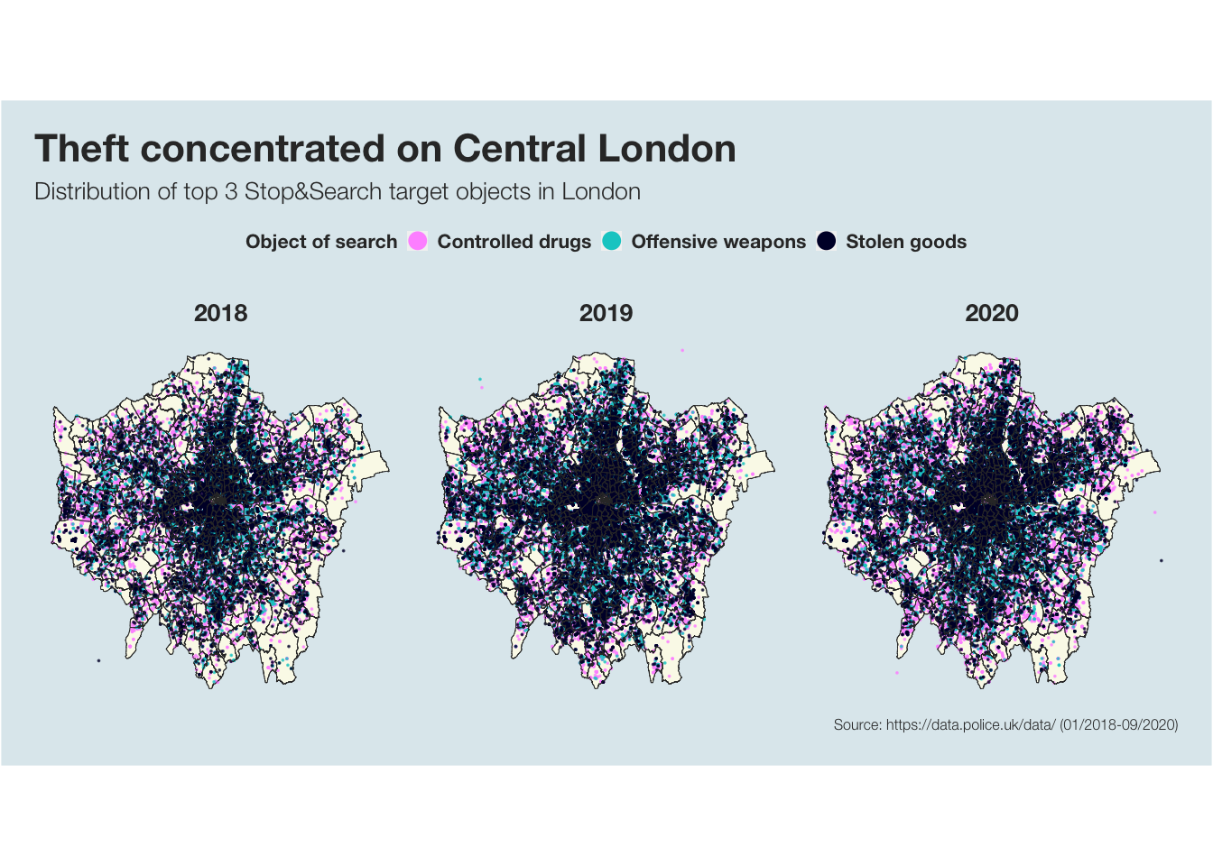
It is clearly visible that most stops and searches in the city centre are conducted because of stolen goods. The further into the outskirts of London you look, the more offensive weapons and drugs are targeted objects of search. While it seems like theft is a greater issue in Central London, there is no correlation between the searched objects and where the respective ethnicities are mainly targeted.
Seems like the Metropolitan Police Service in London is indeed able to focus on the potential crimes at hand – slowly shedding their reputation for racial bias.
Although – despite the population being about 50% male and 50% female, the Metropolitan Police stops about 93% male suspect. Talking about gender bias?
(A visualisation on that can be found in Pt 1 ;-))
Memo
Process & Story
Please find the process and story behind the visualisations between the plots above.
In short:
Process
- Data loading, inspecting, cleaning, exploring
- Visualising
- Summarising main findings & building a story
Story
- Investigating the racial bias the Metropolitan Police in London is supposed to have
- Finding that certain ethnicities are stopped more frequently in certain parts of the city
- Investigating the overall distribution of ethnicities over the last three years, Asian people are not disproportionately stopped; Black people are
- But, this was mainly the case until 2019 and seems to have been addressed since the bad press accused the Metropolitan police of racial bias
- Today, more White than Black people (more in line with population distribution) are stopped
Alberto Cairo’s five qualities of great visualisations
1. Truthful
All visualisations above are truthful. I did not hide any data or leave any important data points out. Although the data before April 2018 showed an even bigger divide on Black vs. White ethnicities, I left all months before that out because, e.g. March 2018 considered only 19 data points for Black and 11 for White. This may have yielded an even better message but the truth is that this data is not representative as all other months have several thousand data points.
2. Functional
I used several techniques to simplify the data and make it clear as well as interesting without it being too complex. Firstly, I worked with different colours to make all plots better understandable. I used the same colours (e.g. per ethnicity) throughout all plots to make the data points easily understandable. I used maps to visualise the data in a familar format that allows an audience to easily understand the connection of the data to a location on a map. I also used plotly to make visuals simple at first sight but allow the audience to find out more about the details of a plot if they want to.
3. Beautiful
I created all plots with specific focus on the little details to make them beautiful. I used bright colours for the data that is supposed to attract attention and interest and subtle colours for all background information or data that was not relevant to attract immediate attention. I used a clear and simple but beautiful font and made sure that all elements are cohesive in size and format.
4. Insightful
I went beyond the obvious plots to show interesting patters in the data. This is especially true here: In the plot “No racial bias towards Asian ethnicities”, it seems almost as if there is an equal share of White and Black people targeted. Nevertheless, I eliminated all data points with people of Asian ethnicities to investigate this further. This enabled me to find and show the significant difference between share of Black and White people targeted throughout 2018. Further, this plot “Bias towards Black ethnicities was addressed” shows how the divide ever since evened out and today, actually slightly more White people are targeted.
5. Enlightening
I believe that, although the article from The Guardian “Met police ‘disproportionately’ use stop and search powers on black people” is from 2019, it is still commonly believed that the police stopps more Black than White people - at least so did I. I am certain that a lot of people do not know that this issue has been addressed and is slowly being improved over time. This is an enlightening insight that helps people understand and change their mind about expectations that were formed at the beginning of this analysis when the The Guardian article was introduced.
C.R.A.P. principles
1. Contrast
I used several contrasting colours to distinguish and highlight different items. For example, I used green for Asian ethnicities, red for Black and blue for White throughout the analysis. This shows that these are different items (ethnicities) within a plot. The three objects of search in the last plot are also contrastingly coloured to show their difference. Further, in the “No racial bias towards Asian ethnicities” plot, I faded out the Black and White ethnicity bar stacks because the attention is supposed to be driven to the Asian ethnicity bars.
2. Repetition
I used a repetitive plot design and format throughout the entire analysis, enabling visual recognition of these visualisations as part of a whole. I used the same font in all plots, repeating the same boldness and lightness for each plot element. I used the same colour scheme for all elements in each plot, most importantly, always using green for Asian ethnicities, red for Black and blue for White.
3. Alignment
All elements within the plots and all plots among each other (when several plots are in one visualisation) are aligned to show their visual connection.
4. Proximity
I designed all plots in a way that elements that are associated with each other are placed closely together. For example, in the “Bias towards Black ethnicities plot”, each text field is close to the month/time period it describes.